Product quiz mistakes ranked by industry data
The content, technical and marketing mistakes that make a product recommendation quiz underperform, ranked by impact, with industry benchmarks across 1,905 Shopify quizzes and the data-backed fix for each.
The mistakes that quietly kill quiz conversion rate optimisation fall into three categories: content (wrong questions, wrong tone, wrong volume of recommendations), technical (broken tests, inconsistent design, no mobile QA), and marketing (no promotion, weak CTAs, no follow-up, no incentive). Each one is correctable, and the fixes below are drawn from RevenueHunt platform data across 1,905 Built for Shopify quizzes (last 180 days, 1,092 in the deduplicated stat set) plus the broader benchmark across 20,000+ stores and $370M+ in merchant revenue (2026 benchmark report). For the broader build playbook, see how to build a successful product recommendation quiz; this article is the audit companion.
Quick answer
The two patterns that recur across underperforming quizzes in RevenueHunt platform data: quiz length outside the industry-specific 5-7 question sweet spot (top-third median by revenue per completion), and email gating before the result page in industries where shoppers don't tolerate it (Fashion, Food/Drink, Pets).
Content mistakes leak the most revenue (they break the consultation contract before the result page is ever seen). Technical mistakes are the easiest to catch with a 20-minute QA pass. Marketing mistakes leave a working quiz invisible. The 12 below are ranked by leverage; the industry benchmark table further down lets you audit your own quiz against your category's median.
What you'll learn
- →The 12 mistakes ranked across content, technical and marketing categories, with the symptom to look for and the fix that works.
- →An industry benchmark table covering median conversion rate, RPC, question count and email strategy across seven categories.
- →Three anonymised real-store cases showing what each pattern looks like when it costs revenue.
- →A self-audit checklist you can run against your own quiz in 60 seconds.
Mistakes at a glance
Twelve mistakes, grouped by category. The content mistakes leak the most revenue because they break the consultation contract before the customer ever sees a results page; technical mistakes are the easiest to catch with a quick QA pass; marketing mistakes leave a working quiz invisible.
Content mistakes (highest revenue impact)
- Brand-first copy that reads like a brochure instead of a consultation.
- Recommending too many products on the results page.
- Wrong quiz length for your industry (the "keep it short" myth).
- Forcing text where images would help, or images where text would do.
- Category jargon that customers can't decode.
Technical mistakes (easiest to catch)
- No end-to-end test before launch.
- Quiz design that doesn't match the store.
- Skipping mobile QA entirely.
Marketing mistakes (most overlooked)
- Burying the quiz on a help page instead of treating it as a primary CTA.
- Weak or unclear CTA buttons on the results page.
- Wrong email strategy for your industry (gated when it shouldn't be, or no ask at all).
- Avoiding discounts on the results page.
Benchmark your quiz against your industry
Before diagnosing specific mistakes, know what “good” looks like in your category. The table below summarises RevenueHunt platform data for 1,905 Built for Shopify quizzes with at least 25 responses each over the last 180 days, deduplicated to one quiz per store per industry (1,092 in the final stat set). If your conversion or revenue per completion is well below your industry’s median, the mistakes that follow are where the gap usually lives.
| Industry | Median conv. | Median RPC (USD) | Top-third Q count | Top-third products | Top-third email |
|---|---|---|---|---|---|
| Skincare | 8% | $6.88 | 6 | 5 (bundle) | Gated |
| Haircare | 7% | $5.12 | 7 | 5 (bundle) | Gated |
| Cosmetics & makeup | 6% | $3.84 | 5 | 4 (bundle) | Gated |
| Supplements & wellness | 7% | $7.98 | 7 | 3 (bundle) | Gated |
| Fashion & apparel | 4% | $3.56 | 7 | 5 (bundle) | None |
| Food & drink | 6% | $4.53 | 6 | 3 (bundle) | None |
| Pets | 6% | $4.59 | 6 | 3 (bundle) | None |
Two patterns to take away before reading the mistakes below:
- Bundle/routine recommendations dominate the top third in every category (between 59% and 82% share). Single-product results pages are the minority pattern, even where you’d expect them (Pets, Food, Fashion). If your results page shows one product, you’re swimming against the data.
- Email gating splits by industry. Skincare, Haircare, Cosmetics and Supplements top performers gate (the consultation justifies the ask). Fashion, Food/Drink and Pets top performers do not (impulse buys won’t tolerate the friction).
The email-gating tradeoff
The headline finding when gating strategy is analysed cross-category, regardless of industry:
| Email strategy | Quizzes | Median completion | Median conv. | Median RPC (USD) |
|---|---|---|---|---|
| Gated (email required before results) | 432 | 76% | 7% | $6.06 |
| Optional (asked, skippable) | 225 | 85% | 9% | $7.77 |
| None (no email ask) | 435 | 90% | 5% | $3.99 |
Read it as a tradeoff. Gating lifts captured emails (close to 100% of completers by design), but completion and revenue per completion both drop. The “optional, skippable” middle path wins on revenue per completion across the full sample. Gating still wins in high-AOV consultative categories (Skincare, Supplements) where the consultation is the value the customer came for; in low-AOV impulse categories (Food, Fashion, Pets), the gate is the mistake.
For the underlying analysis of how the email decision unlocks revenue downstream once the address lands in Klaviyo, see how Klaviyo segmentation unlocks once zero-party data lands in profiles.
Content mistakes
Not focusing on the customer
The biggest mistake most stores make when creating quizzes is focusing too much on their products and not enough on their customers. Quizzes should provide value to the shopper: help them solve a problem, learn something they can act on, or discover products that match their stated preferences. Avoid coming across as salesy. The quiz is a consultation, not a brochure.
RevenueHunt: Recommender Quiz for Shopify has a simple way to make the quiz feel more personal: information recalls. The customer’s name, stated concern, or preference can be pulled into subsequent questions and the results page copy, so the experience reads as a one-to-one consultation rather than a templated form.
Beyond product recommendations, consider adding personalised advice or tips based on the quiz results. That kind of consultation copy builds trust and signals that the brand understands the customer, not just the catalogue.
Recommending too many products (or too few, or the wrong shape)
The dominant top-performer pattern across every industry in the benchmark above is a bundle/routine recommendation, not a single product. Bundles take 59-82% of the top third by revenue per completion, depending on industry. Single-product results pages are the minority pattern even in categories where you might expect them (Pets, Food, Fashion).
Inside a bundle, the right product count is industry-specific: 3 products in Supplements, Food/Drink and Pets; 4 products in Cosmetics; 5 products in Skincare, Haircare and Fashion. More than 5 typically overwhelms the customer; fewer than 3 doesn’t feel like a routine. For the underlying single-results-page architecture (and why 79% of top-converting quizzes use exactly one results page), see how to build a successful product recommendation quiz, rule 7.
Show confidence on the results page: “Based on your answers, this is your routine.” Hedging language (“you might also like…”) undoes the work the quiz did. Map every answer choice to a product or collection; unmapped answers mean the recommendation engine has a blind spot and the result page feels generic.
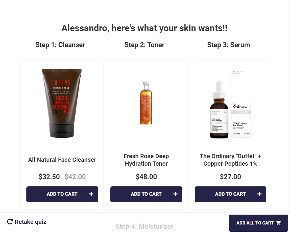
Fig. 01 The RevenueHunt results page editor with a confident recommendation framing. Map every answer choice; show 3-5 products framed as a routine, not 12 framed as a catalogue.
Being too long, or too short
The conventional advice to “keep it under 6 questions” is wrong, but so is “longer is always better”. The sweet spot is industry-conditional, and which spot you want depends on what you’re optimising for.
Median question count in the top third by revenue per completion ranges from 5 (Cosmetics) to 7 (Haircare, Supplements, Fashion) depending on category. Skincare, Pets and Food/Drink land at 6. That’s the band the best-monetising Built for Shopify quizzes cluster in over the last 180 days.
The broader cross-platform benchmark across 20,000 stores tells a slightly different story when the optimisation target is conversion rate alone, not revenue per completion: the highest conversion rate sits at 9-12 questions, where the extra questions buy more confidence in the recommendation. Different optimisation targets, different answers. Practical rule: start at the industry median for your category, then only extend toward 9-12 if you see a meaningful conversion lift on the longer variant that survives the resulting completion-rate drop.
Too few questions feels superficial: the customer hasn’t told you enough for the recommendation to feel personalised, so they don’t trust the result, and they certainly won’t tolerate an email gate before they’ve seen value. Too many produces drop-off without proportional recommendation gain. For the cross-platform conversion-rate-by-question-count table, see how to build a successful product recommendation quiz, rule 6.
Real example (anonymised)
A cosmetics store running a 21-question, email-gated quiz with ~567 responses over 180 days. The mistakes compound. 21 questions sits well past the 5-question top-third median for the category, which produces fatigue and drop-off. The email gate then blocks the result before the customer has been rewarded for completing the long quiz.
Result: 0% conversion, revenue per completion of $0.10. Almost certainly the longest path possible to zero revenue.
Real example (anonymised)
A skincare store running a 3-question, email-gated quiz with ~978 responses over 180 days. Inverse mistake. 3 questions sits half the 6-question top-third median for skincare, which means the recommendation can't feel personalised enough to justify the email ask. The result: 0% conversion, RPC $0.20. Shorter is not safer.
Too much text, no images where they help
Images are not required for high conversion. Relevance drives conversion. But in some question types (skin tone matching, hair texture identification, shade matching), images do work that text alone can’t replicate, because the customer is being asked to identify something visually rather than describe it. Use a picture question for those cases.
The inverse mistake is equally common: forcing image grids on questions that work better as plain text. “How often do you exercise?” or “What’s your primary goal?” doesn’t gain anything from photographic answer choices and loads slower for the customer. Keep answer choices to 3-6 per question regardless of format (top performers cluster around 3.3-4.4 choices per question across every industry); more than 6 recreates the paradox of choice the quiz exists to solve.
Using jargon or technical language
Not all customers will be experts in your category. Avoid jargon that could confuse or alienate potential quiz-takers. “What’s your main skin concern?” is answerable. “Which of the following dermatological presentations most affects your purchase decisions?” is not. Phrase questions the way your best sales associate would phrase them, not the way a product manager would write a spec.
Technical mistakes
Failing to test your quiz
Before launching, test the quiz end-to-end on multiple devices and browsers. Check that the correct product is recommended for each combination of answers, that the email captures route to the right Klaviyo segment, and that the discount code actually applies at checkout. The quiz is a five-stage funnel; a broken stage anywhere along it kills the conversion.
A useful pre-launch protocol: write down the five most common answer combinations you expect, walk through each one as a customer (on both desktop and mobile), and verify the recommended product, the email confirmation and the cart state. Five test runs takes under twenty minutes and catches the vast majority of misconfigurations before they cost real revenue.
Inconsistent design
The quiz should fit seamlessly into your store’s design and branding. Nothing erodes trust faster than a quiz that looks like it belongs to a different company; jarring colours or a mismatched font the moment the customer clicks “Start quiz” breaks the immersive experience that makes consultative selling work.
The Built for Shopify version of RevenueHunt addresses this at the infrastructure level: as a native theme block, the quiz automatically inherits your theme’s typography, colours and button styles. For deeper control, the block editor lets you adjust fonts, colours, background images and layout, and custom CSS is available on higher-tier plans. Browse customisation examples for design inspiration.
Forgetting about mobile
More shoppers complete quizzes on mobile than on desktop, by a wide margin. Platform traffic split across the top quizzes runs 74-88% mobile depending on industry (Cosmetics is the most mobile-heavy at 88%; Supplements the least at 74%). Test on iOS Safari and Android Chrome explicitly. Check that image-based picture questions display readably on smaller screens. Confirm the results page CTA is tap-friendly and the cart flow works without keyboard input.
Marketing mistakes
Not promoting your quiz
Even the best quiz won’t perform if nobody finds it. Treat the quiz as a primary CTA, not a hidden feature: homepage hero, main navigation, collection page banners, paid ads and email. Most quiz takers see the quiz a few times before they complete it; visibility compounds, and the more touchpoints reference the quiz the more shoppers come back to it.
For 11 placement and promotion ideas, see our guide on how to promote your product recommendation quiz.
Weak or unclear CTAs on the results page
The recommended product can be perfect and the customer can still bounce if the call-to-action button doesn’t tell them what to do. “Continue”, “Submit”, “See result” are all weak verbs that don’t direct intent. The customer reads them as one more abstract step and the cart momentum dies.
The fix is direct: use action-and-outcome verbs that match the next step the customer should take. “Shop now”, “Add to cart”, “Get your routine”, “Claim my discount”. The button text on the results page is the most direct conversion lever you have once the recommendation lands; testing two or three button-copy variants A/B for a week typically produces a measurable lift without any quiz redesign.
Fig. 02 The Built for Shopify quiz builder. CTA labels on the results page are editable inline on the block itself, which makes A/B testing button copy a configuration change rather than a code change.
Inside the RevenueHunt: Recommender Quiz for Shopify, every button label is editable in the Messages settings (or directly on each question), so A/B testing CTA copy doesn’t require a code change. For the deeper discount-and-CTA pairing, see product quiz discounts: the conversion playbook.
Wrong email strategy for your industry
This is the mistake that compounds with the rest. Two ways to get it wrong:
- No email ask at all (or asked only as an afterthought): you lose the entire Klaviyo segmentation layer, which is where 1 in 5 quiz-attributed orders lands more than 30 days after the quiz. The follow-up sequence keeps converting for weeks; if you didn’t capture the email, none of that compounds.
- Email gated before the result page in the wrong industry: gating works in consultative high-AOV categories (Skincare, Supplements) where the customer expects a clinical experience and is willing to pay the friction in advance. In impulse categories (Fashion, Food/Drink, Pets) gating is the conversion killer. The benchmark table at the top of this article shows which side your category sits on.
Real example (anonymised)
A Pets store running an 8-question, email-gated quiz with ~1,250 responses over 180 days. The quiz itself converts well: 31% of completers place an attributed order, RPC $18. But the gate blocks 43% of starters from ever reaching the result page: completion drops to 57%. In a category where the top-third top performers don't gate (54% of Pets top performers use no email ask), the gate is the single largest revenue leak. Industry-conditional advice means: in Pets, ask after results, not before.
Once the email lands, the post-quiz email sequence is where the quiz’s value compounds into lifetime customer revenue. With RevenueHunt: Recommender Quiz for Shopify, you can send a personalised results email seconds after completion, and the quiz answers sync to Klaviyo as custom properties so segmented welcome, replenishment and win-back flows reference the shopper’s stated preferences explicitly.
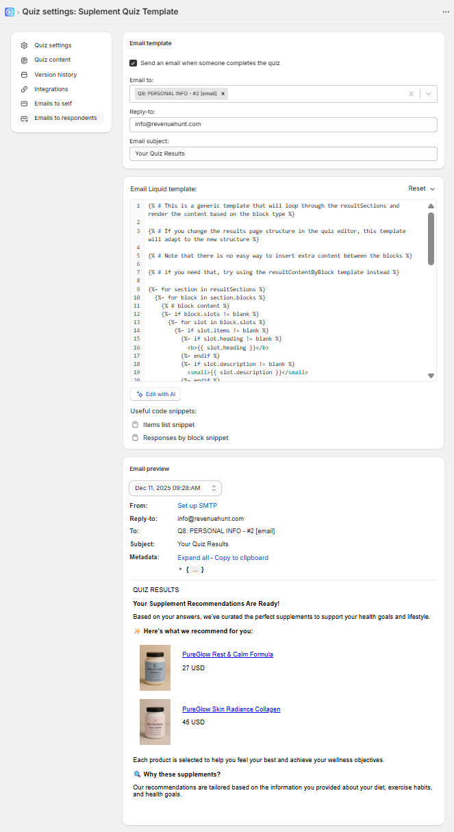
Fig. 03 The Built for Shopify Notifications panel ("To Respondent" tab). Reference the customer's stated answer in the subject line and body, then drop the discount code as the call to action.
For the full follow-up sequence that consistently outperforms generic blasts, see quiz follow-up emails: the revenue lever you’re missing. For the Klaviyo mapping chain, see how Klaviyo segmentation unlocks once zero-party data lands in profiles. For Shopify Flow as the automation layer, see how to automate post-quiz emails using Shopify Flows.
Being afraid of discounts
A 10-15% discount on the results page rewards completion and removes the last barrier between recommendation and purchase. The Recommender Quiz syncs your existing discount codes from Shopify and can apply them automatically to the cart.
For premium or luxury brands, a dollar-amount discount ($15 off first order) often converts better than a percentage; for lower-AOV products, percentages perform better. For the full discount placement playbook (one of the four placements is teased at the start of the quiz, not the end), see discounts in product quizzes: the conversion playbook.
Self-audit checklist
Run through these twelve questions against your own quiz. Each “no” is a mistake quietly costing you conversion:
- ☐Does my opening question speak to the customer's problem (not the brand's product line)?
- ☐Does my results page show a routine/bundle of 3-5 products on a single page (not 1 lone product, and not 11+ pages of options)?
- ☐Is my quiz length within ±1 of the top-third median for my industry (see benchmark table)?
- ☐Are my answer choices in plain language, 3-6 options per question?
- ☐Do my picture questions actually require visual identification (vs cosmetic image use)?
- ☐Have I tested all five most-common answer combinations end-to-end on mobile?
- ☐Does my quiz inherit my theme's typography, colours and button styles?
- ☐Is the quiz a primary CTA on my homepage hero and in my main navigation?
- ☐Are my results-page CTA buttons action-and-outcome verbs ("Shop now", "Claim my discount") rather than generic "Continue" or "Submit"?
- ☐Does my email strategy match my industry (gated for Skincare/Haircare/Cosmetics/Supplements, ask-after-results for Fashion/Food/Pets)?
- ☐Does the quiz trigger a personalised follow-up email referencing the customer's stated answers?
- ☐Do I offer a discount on the results page (or in the follow-up email) to remove the last barrier?
Where the fixes compound
Creating an effective product recommendation quiz isn’t a single design decision. It’s a stack of small choices that each contribute to (or detract from) the conversion rate, the AOV and the email RPR downstream. The fixes above are ordered roughly by leverage: content mistakes hurt the most because they break the consultation contract before the quiz even gets to a results page; technical mistakes are easier to catch but easy to miss; marketing mistakes leave a working quiz invisible.
If you only have time to fix one thing this week: open the quiz on mobile, take it as a customer, and write down every moment of friction or confusion. Most quiz problems are visible inside that 60-second exercise.
For 11 real funnels that put the corrections above into practice, see our real funnel examples. For the underlying data category that makes the quiz work, see our zero-party data guide.
Free tools & data
Put these benchmarks to work on your own store.
Free tool
Quiz ROI calculator
Estimate the extra revenue and ROI a product recommendation quiz could add to your store. Built on real data, no email required.
Calculate your ROIFree report
Ecommerce quiz benchmark report
How product recommendation quizzes really perform: conversion by category, AOV uplift, and completion, from 45M+ real quiz responses.
Read the report

Most shoppers leave because they can't find the right product