How to build a successful product recommendation quiz
11 evidence-based rules from 20,000+ stores and $370M+ in merchant revenue. The data-driven checklist for high-converting product recommendation quizzes.
The 11 rules below are derived from platform data across 20,000+ stores running RevenueHunt, covering 45M+ quiz responses and $370M+ in merchant revenue (2026 benchmark report). Every recommendation is grounded in real performance data, and several contradict the conventional wisdom in older guides (including ours from 2021). For the broader category (definition, the 5 quiz formats, real brand examples), start with the complete guide for the umbrella term; the rules below are the build playbook for the recommendation-quiz subtype.
What separates a quiz that consistently drives 15-25% conversion rates from one that collects dust? The findings below were sometimes surprising and they contradict a lot of the conventional wisdom you’ll find on older guides, including our own from 2021. This guide replaces that original article entirely. Whether you’re building your first quiz or auditing one that isn’t converting, this is the definitive checklist for getting it right.
For the broader data category that makes quizzes work, see our zero-party data guide. For the funnel mechanics around the quiz, see our step-by-step funnel build guide.
Here are the 11 things every high-converting product recommendation quiz must have.
Jump to a rule:
- Make the quiz visible
- Match your store’s design
- Choose a professional name
- Keep your quiz simple and linear
- Ask questions customers can actually answer
- Find the right length
- Limit the recommended products
- Make it personalised
- Collect email and connect to Klaviyo
- Offer a discount after completing
- Go global with Shopify Markets
1. Make the quiz visible
A quiz no one finds is a quiz that doesn’t exist. Use every available placement.
The single most common mistake we see from new quiz builders is publishing a quiz and burying it on a hidden page. The RevenueHunt app, now rebuilt as a Built for Shopify native app, gives you multiple placement options: embed it as a native Shopify block directly in your theme, display it as a floating button that follows the user across the page, trigger it as a popup, embed it inline anywhere in your store, or link to it directly from your navigation menu.
The old approach required iframe embedding with manual code injections. The new native block integration means your quiz loads as part of your theme: no iframe lag, no broken layouts, no developer required. You drag a block into your homepage, product page, or collection page directly from the Shopify editor.
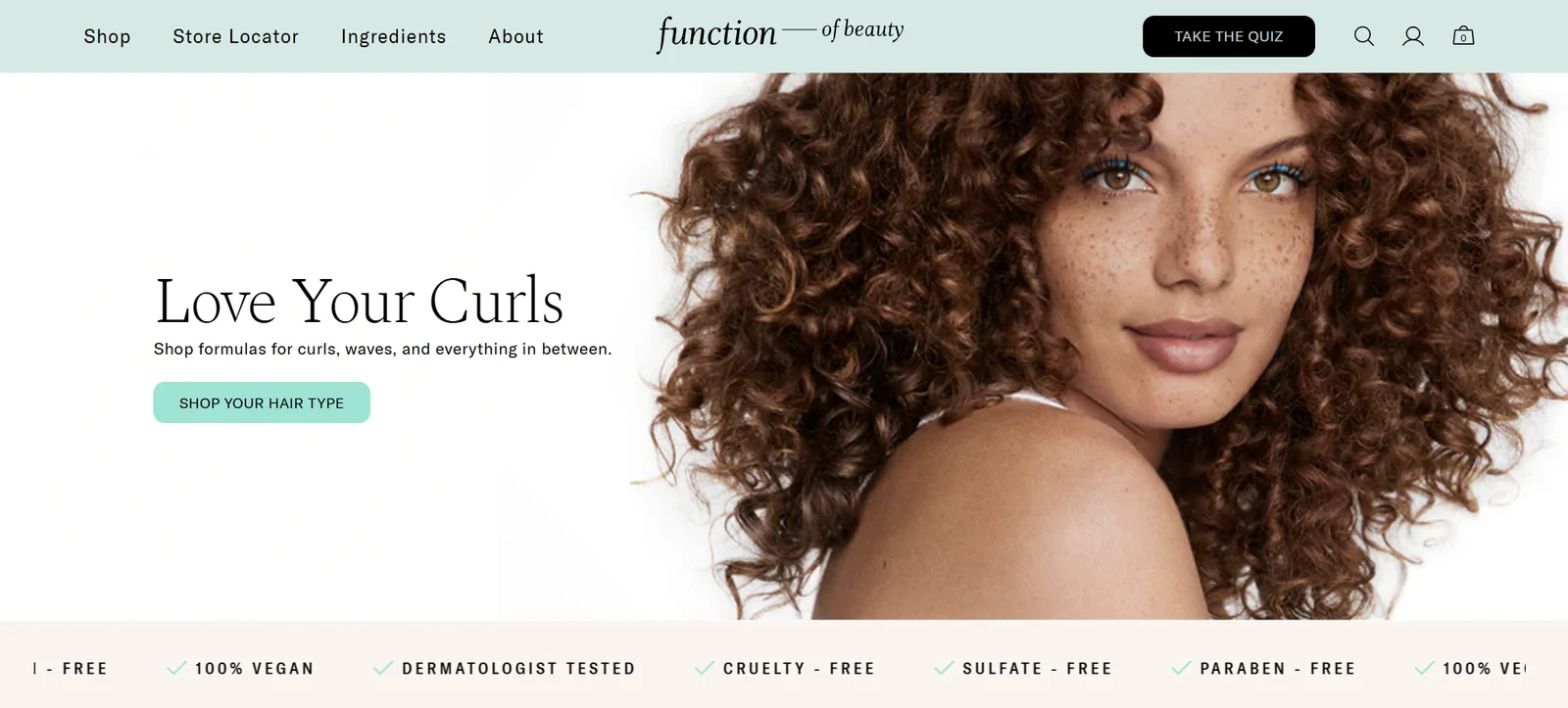
Fig. 01 Function of Beauty places its quiz as a primary CTA above the fold. Visibility is the multiplier on every other rule in this guide.
High-performing stores treat the quiz as a primary CTA, not a secondary feature. Place it above the fold on your homepage with a compelling invitation (“Find your perfect routine,” “Take the skin type quiz”) and link to it from your main navigation. The more visible your quiz, the more data it collects, and the more data it collects, the smarter your Klaviyo segmentation becomes. Visibility is the multiplier on everything else in this guide.
For detailed setup instructions on each placement option, visit our quiz placement documentation.
2. Match your store’s design
Your quiz should feel like part of your brand, not a third-party widget bolted onto it.
Nothing erodes trust faster than a quiz that looks like it belongs to a different company. When a customer sees a jarring colour scheme or mismatched font the moment they click “Start quiz,” you’ve already broken the immersive experience that makes consultative selling work. Design consistency is not a vanity metric: it directly affects completion rates and purchase confidence.
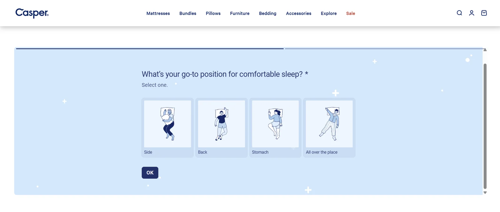
Fig. 02 Casper's sleep quiz inherits the store's brand colours and typography, so it reads as a native part of the storefront, not a bolted-on widget.
The new Built for Shopify version of RevenueHunt addresses this at the infrastructure level. When you add a quiz as a native Shopify block, it automatically inherits your theme’s typography, colours, and button styles. For brands that want deeper customisation, the block editor gives you full control over fonts, colours, background images, and layout, and for developers or design-forward teams, custom CSS and JavaScript are available on higher-tier plans.
Start with the auto-inherited theme styles, then adjust. Don’t spend days perfecting the design before you’ve published a single question. A well-matched but imperfect quiz that’s live will always outperform a beautifully designed quiz that never launches.
3. Choose a professional name
The name of your quiz is the first copy your customer reads. Make it outcome-focused.
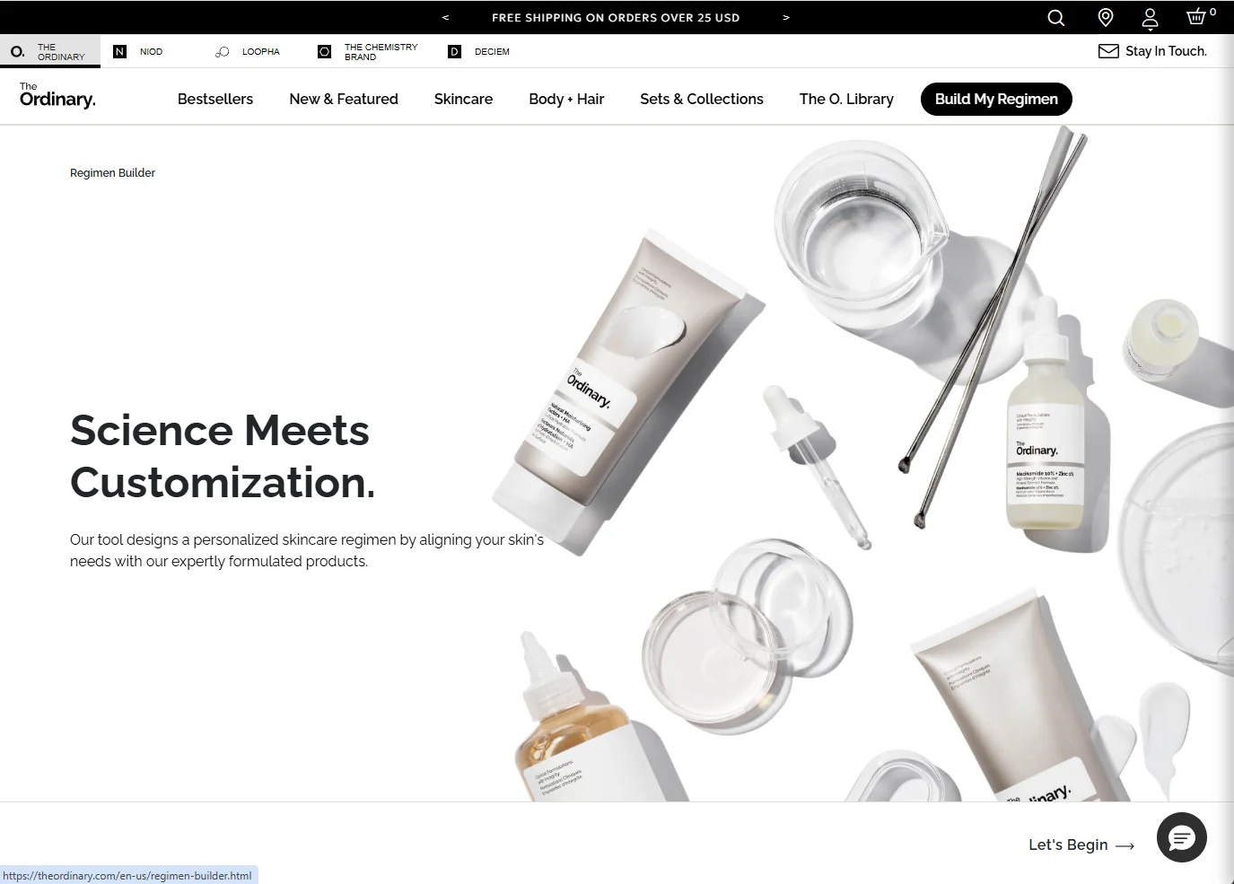
Fig. 03 An outcome-focused name ("Regimen builder") tells the shopper exactly what they get. Product-finder framing consistently beats "personality quiz" framing.
What you call your quiz has a measurable impact on click-through and completion rates. Quizzes framed as “product finders” consistently outperform those labelled as “personality quizzes” because the customer’s primary motivation is finding the right product, not learning something abstract about themselves. Names like “Skin type finder,” “Shade matcher,” “Routine builder,” or “Your personalised supplement plan” communicate a direct, tangible outcome.
Avoid generic names like “Quiz” or “Product quiz.” They signal nothing about the value the customer will receive. A professional name also signals that the brand takes personalisation seriously, which builds pre-quiz trust, especially important for beauty, skincare, and supplement brands where the stakes of a wrong recommendation feel personal.
The best names follow a simple formula: [Desired outcome] + [Specific category]. “Perfect foundation finder.” “Hair type routine builder.” “Protein supplement selector.” Keep it short, specific, and benefit-forward.
The same outcome-focused framing applies to the opening question, the other big lever on quiz start rate. Here are category-specific examples that consistently work, pairing a title with a natural first question:
| Quiz type | Title | First question |
|---|---|---|
| Fitness equipment | Find the perfect workout gear for your fitness goals | What's your primary fitness objective? |
| Haircare | Get your ideal haircare routine in minutes | What's your main hair concern? |
| Supplements | Discover the best supplements for your health goals | What's your primary health goal? |
| Pet care | Find the best products for your pet's needs | What type of pet do you have? |
| Makeup | Find your perfect makeup match | What's your go-to makeup look? |
| Outdoor gear | Gear up for your next adventure | What's your favourite outdoor activity? |
| Skincare | Discover your perfect skincare routine | What's your primary skincare goal? |
4. Keep your quiz simple and linear
Data from 20,000+ stores shows that most top converters are completely linear. Start simple, branch only when you must.
This is the biggest change from our 2021 guide, and it’s worth being direct: the conventional wisdom about branching logic has been overstated. When we analysed our top-converting quizzes, the majority were built with completely linear question flows: every respondent sees every question in the same order. No conditional branches, no jump logic, no decision trees.
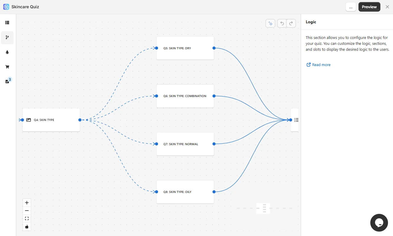
Fig. 04 The conditional-logic panel. Powerful, but most top converters stay linear; add branching only when a question is genuinely irrelevant to some shoppers.
Why? Because linear quizzes are faster to build, easier to test, simpler to maintain, and critically they tend to have higher completion rates because there are fewer technical failure points and the user experience is more predictable. Complexity in the quiz builder does not translate to complexity in the customer’s experience if the extra logic isn’t doing meaningful work.
When should you use conditional logic? There are two legitimate use cases. First, if you have a very large catalogue with truly irrelevant products for certain customer types (for example, a pet food brand where dog owners and cat owners should never see each other’s products), branching avoids confusion. Second, if a question only makes sense based on a prior answer (asking about beard care only if the respondent identified as male), you can skip it for other respondents. Outside these cases, linear is almost always the better starting point.
Build linear first. Publish it. Collect real data. Only add conditional logic when you have evidence that a specific branch will meaningfully improve the experience or results. The best quiz is not the most complex quiz: it’s the one your customers actually complete.
5. Ask questions customers can actually answer
Relevance drives conversion, not image complexity. Use 3 to 6 answer choices and only add images where they genuinely help.
The quality of your answer choices determines how useful your recommendation engine can be. Questions should be phrased in plain, customer-friendly language: the way your best sales associate would phrase them, not the way a product manager would write a spec. “What’s your main skin concern?” is answerable. “Which of the following dermatological presentations most affects your purchase decisions?” is not.
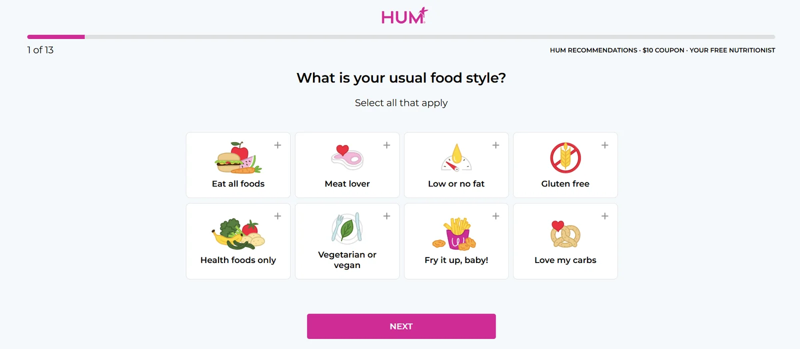
Fig. 05 HUM Nutrition keeps answer choices in the plain-language 3-to-6 range. Relevance drives conversion, not image complexity.
Our platform data shows that 3 to 6 answer choices per question is the optimal range. Fewer than 3 often feels too binary; more than 6 creates the same paradox of choice you’re trying to solve for the customer. Keep each answer choice distinct and mutually exclusive where possible.
On the question of images: images are not required for high conversion. This is a common misconception. Quizzes with purely text-based answer choices convert just as well as image-heavy ones, sometimes better, because they load faster and feel less cluttered. Use images only where they genuinely help the customer make a better choice: shade matching, hair texture identification, or skin condition recognition are great examples, as shown above. For questions like “What’s your primary goal?” or “How often do you exercise?” text options are cleaner and equally effective.
Focus on relevance, not aesthetics. Every question should either (a) improve the accuracy of the recommendation or (b) collect a data point you’ll actively use in your Klaviyo flows. If a question does neither, remove it.
6. Find the right length
The old “max 5-6 questions” rule is wrong. Platform data shows 6 to 12 questions is the sweet spot, and longer quizzes actually convert better.
The 2021 version of this guide, like most older quiz resources, advised keeping quizzes to a maximum of 5 to 6 questions. The data from our platform tells a different story. Here is the actual conversion rate breakdown by question count across 20,000+ stores:
| Number of questions | Average conversion rate |
|---|---|
| 1-5 questions | 9.8% |
| 6-8 questions | 10.4% |
| 9-12 questions | 11.0% (highest) |
| 13-20 questions | 9.9% |
The highest-converting quizzes in our dataset contain 9 to 12 questions. Very short quizzes (1 to 5 questions) actually underperform: they don’t collect enough signal to make a confident recommendation, and customers often don’t feel the result is personalised enough to trust. The sweet spot is 6 to 12 questions, with the upper range of that band performing best.
What explains this? A longer quiz builds perceived value and investment. By the time a customer reaches the results page after answering 9 thoughtful questions, they feel they’ve received a personalised consultation, not a generic filter. That psychological commitment translates directly to purchase confidence. Beyond 12-13 questions, drop-off begins to outweigh the benefit of additional data, so the 6-12 range is where to aim. The deeper signal in the data is that finishing matters more than length: converters and non-converters answer about the same number of questions, and even very long quizzes (20+) still convert near 10% because the shoppers who finish them are highly qualified. Optimise for completion, not brevity.
If your current quiz has fewer than 6 questions and conversion feels flat, consider adding 2 to 4 questions that capture actionable data points you can use in follow-up flows: concerns, goals, lifestyle factors, or budget. Every question you add should earn its place by either improving the recommendation or enriching the Klaviyo profile.
7. Limit the recommended products
One focused results page with mapped answer choices outperforms a multi-page catalogue dump every time.
Our platform data contains one of the most actionable statistics in this entire guide: 79% of top-converting quizzes use exactly ONE results page, and that single-results-page configuration achieves an average conversion rate of 10.6%. Quizzes with 11 or more results pages drop to just 7.1%.
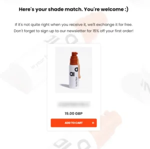
Fig. 06 A single results page with one confident recommendation. 79% of top-converting quizzes use exactly one results page (10.6% vs 7.1% conversion).
The implication is clear: your recommendation engine should do the work of narrowing down, not present the customer with another overwhelming list of options. Show them 1 to 3 products with strong, confident framing (“Based on your answers, this is exactly what your skin needs”) rather than 10 products with hedging language. The quiz has already built trust and investment. The results page needs to convert that trust into a purchase, not restart the decision-making process.
RevenueHunt supports fixed recommendations (you manually assign specific products to specific answer combinations), dynamic recommendations (the engine scores products based on all answers and surfaces the best matches), and collection recommendations (recommend a filtered collection rather than individual SKUs). For most stores, dynamic recommendations with a display limit of 1 to 3 products performs best.
Map every answer choice. This is the most commonly skipped step in quiz setup and one of the highest-impact fixes you can make. Every answer choice a customer can select must be mapped to at least one product or collection. Unmapped answers mean the recommendation engine has a blind spot. A customer who selects “sensitive skin” and receives a recommendation identical to someone who selected “oily skin” will immediately distrust the result. Audit your answer-to-product mappings before you publish. When you do this well, the quiz doesn’t just recommend: it explains why, which is where purchase confidence comes from.
8. Make it personalised
Use information recalls and dynamic content to make the customer feel genuinely seen.
Personalisation within the quiz itself (beyond just the final recommendation) dramatically increases the sense of a tailored experience. RevenueHunt supports information recalls, which allow you to pull a respondent’s earlier answers into subsequent questions or the results page. If you asked for the customer’s name in question one, you can address them by name throughout the rest of the quiz and on the results page.
Fig. 07 Information recalls pull the customer's earlier answers into later questions and the results page, replicating a sales associate who remembers what you said.
Beyond name recalls, the Content Dynamic Source feature allows you to pull quiz answers into the results page copy. Instead of a generic “You have oily skin” statement, the results page can say “Since your main concern is shine control and you mentioned you have combination skin, here’s your personalised routine.” This level of copy-level personalisation requires no coding; it’s configured in the results page editor using dynamic tags that reference earlier question responses.
These features work together to replicate the experience of speaking to a knowledgeable sales associate. The customer feels heard, not processed. That emotional experience is directly correlated with purchase intent and with the quality of the zero-party data profile you’re building in Klaviyo, because customers who feel the quiz is genuinely personalised are more likely to answer honestly and completely.
9. Collect email and connect to Klaviyo
71% of top-converting quizzes collect email, and segmented Klaviyo campaigns earn over 3x the revenue per recipient of generic sends.
If there’s one section of this guide that will have the most direct impact on your revenue, this is it. The email and Klaviyo integration is not a nice-to-have feature of your quiz. Based on our platform data, it is a defining characteristic of every high-performing setup. The numbers:
- 71% of top-converting quizzes collect email as part of the quiz flow.
- Of those, 75% make email collection required, not optional.
- Segmented Klaviyo campaigns earn over 3x the revenue per recipient of generic sends (Klaviyo segmentation benchmark).
- Quizzes with Klaviyo connected convert at 12.0% versus 9.7% without it (a 24% lift) and average 66% more orders per quiz (242 vs 146).
- Across the platform, 1 in 5 quiz-attributed orders lands more than 30 days after the quiz, so the segmentation layer keeps converting for months.
The reason making email required outperforms optional is straightforward: when the email field is optional, customers who are on the fence about sharing their address simply skip it. You lose the most valuable leads: the ones who were interested enough to complete 9 questions but not yet committed enough to buy immediately. These are exactly the customers your Klaviyo follow-up sequence is designed to close.
Think about the full funnel: the quiz builds trust and captures intent signals. The email field converts that intent into a marketing-qualified lead. The Klaviyo sync transforms that lead into a rich customer profile, tagged with every answer they gave: skin type, concerns, goals, preferences. That profile then triggers targeted automated flows: an “Acne solutions” flow for acne-prone respondents, an “Anti-aging routine” flow for others. Generic blast emails become a thing of the past. The same tagged answers also export as Meta, Google, and TikTok custom audiences, so the zero-party data sharpens your paid retargeting, not just your email. For the full mapping chain, see how Klaviyo segmentation unlocks once zero-party data lands in profiles.
To set up the Klaviyo connection, navigate to the Integrations section of your RevenueHunt dashboard and follow the OAuth flow. Once connected, configure your question mappings to sync as Klaviyo profile properties or custom properties, then build your flows using those properties as filters. For a step-by-step walkthrough, see our Klaviyo integration guide.
10. Offer a discount after completing
A post-quiz discount rewards completion and removes the last barrier to purchase.
Fig. 08 A discount block on the results page rewards completion and removes the last barrier to purchase.
The quiz has done the hard work. It has identified the right product, built purchase confidence, and created a moment of genuine personalisation. The final friction point is often hesitation at checkout. A discount code displayed on the results page or included in the follow-up email removes that final barrier and rewards the customer for the time they invested in completing the quiz.
In RevenueHunt’s new Built for Shopify version, you can add a discount block directly to your results page using the drag-and-drop block editor. You can display either a static code (the same for all respondents) or connect to Shopify’s discount API to generate unique codes per respondent, which reduces sharing and gives you better attribution data. The discount block can be shown immediately on the results page or withheld until the follow-up email, creating a reason for the customer to open that email.
If conversion rate optimisation is a priority, A/B test the discount value and placement. For premium or luxury brands, a dollar-amount discount (“$15 off your first order”) often converts better than a percentage (“10% off”), because it feels like a more concrete gift. For lower-AOV products, percentage discounts tend to perform better. Test both with a meaningful sample size before locking in your approach.
11. Go global with Shopify Markets
If you sell internationally, your quiz must speak your customer’s language: literally and commercially.
This section did not exist in the 2021 guide, and its absence was a significant gap. For any brand selling across multiple regions, a quiz that isn’t localised is a conversion killer and a compliance risk. When a UK customer sees dollar amounts, or a German customer encounters data collection with no GDPR consent flow, the quiz instantly signals that the brand doesn’t take their experience seriously.
RevenueHunt’s deep integration with Shopify Markets solves this at the infrastructure level. The app can automatically detect which Shopify Market a visitor is in and serve them a localised version of the quiz: displaying the correct currency, pulling region-specific product availability, and rendering the quiz in the appropriate language. For brands with EU customers, built-in GDPR-compliant consent flows ensure that data collection is transparent and legally sound without requiring custom development. The operational detail of consent inside a quiz is covered in how to ask for marketing consent inside a quiz.
Multi-language support means you can translate your quiz questions, answer choices, results page copy, and CTAs into as many languages as your Shopify Markets setup supports. You don’t need separate quizzes for each region: the single quiz adapts. This is particularly valuable for beauty and skincare brands scaling into France, Germany, or the APAC markets, where local language trust signals are a prerequisite for conversion.
To configure Shopify Markets integration within RevenueHunt, visit the Shopify Markets localisation guide in our documentation. If you’re currently scaling into the EU and haven’t enabled GDPR consent flows yet, this should be your first priority.
Frequently asked questions
How many questions should a product recommendation quiz have?
Aim for 6 to 12, with 9 to 12 converting highest. Platform data across 20,000+ stores shows 9-12 questions convert at 11.0%, 6-8 at 10.4%, and 1-5 underperform at 9.8%. The old “keep it under 5-6 questions” advice is wrong: a longer quiz builds perceived value, so long as every question earns its place.
Should a product quiz be linear or use branching logic?
Build it linear first. The majority of top-converting quizzes are completely linear, because they are faster to build, easier to maintain, and have fewer failure points. Add conditional logic only in two cases: a large catalogue where some products are truly irrelevant to certain shoppers, or a question that only makes sense after a prior answer.
Do I need to collect email in the quiz?
Yes, and make it required. 71% of top-converting quizzes collect email as part of the flow, and 75% of those require it. The captured email syncs to Klaviyo with every quiz answer as a profile property, and segmented Klaviyo campaigns earn over 3x the revenue per recipient of generic sends.
How many products should the results page recommend?
One to three, on a single results page. 79% of top-converting quizzes use exactly one results page, which converts at 10.6% versus 7.1% for quizzes with 11 or more results pages. Map every answer choice to products so the recommendation is tight and explains itself.
Do quiz questions need images?
No. Text-based answer choices convert as well as image-heavy ones, sometimes better, because they load faster and feel less cluttered. Use images only where they aid visual identification, such as shade matching, hair texture, or skin-condition recognition.
How long until a product quiz starts converting?
The on-site conversion lift is immediate, but the compounding value builds over time: across the platform, 1 in 5 quiz-attributed orders lands more than 30 days after the quiz, because the Klaviyo segmentation layer keeps converting for months.
Ready to build your quiz?
These 11 elements are the foundation of every high-converting product recommendation quiz we’ve seen across our platform. Not all of them will be equally relevant to your specific store, catalogue, or customer base, but the data is clear on the fundamentals: aim for 6 to 12 questions, build linear first, make email required, connect to Klaviyo, and focus your results page on 1 to 3 products per customer. Do those things well and you are already ahead of the vast majority of quizzes running on Shopify today.
For 11 real-world examples of working funnels that follow this playbook, see our roundup of real funnel examples. To estimate the revenue lift on your own store, use our quiz ROI calculator. For more help getting started, explore our tutorial video library, browse the full FAQ, or take our support quiz to get a personalised recommendation on what to build first.
Free tools & data
Put these benchmarks to work on your own store.
Free tool
Quiz ROI calculator
Estimate the extra revenue and ROI a product recommendation quiz could add to your store. Built on real data, no email required.
Calculate your ROIFree report
Ecommerce quiz benchmark report
How product recommendation quizzes really perform: conversion by category, AOV uplift, and completion, from 45M+ real quiz responses.
Read the report
Most shoppers leave because they can't find the right product