App Manual Quiz Builder
The Quiz Builder is divided into several sections.
Dashboard – Click to go back to the Dashboard (exit the Quiz Builder).
Demo Quiz – Displays the quiz name. Quiz name can be changed in Quiz Settings.

The top Success Checklist reminds you of the progress you’ve made in building your quiz. Once a section is completed, the icon changes from ❗ to ✅.

Preview – Opens the quiz preview in a new tab.
Edit – Opens the Quiz Builder section of the Quiz Builder.
Connect – Opens the Connect section of the Quiz Builder. This is where you’ll integrate the quiz with other tools like Klaviyo or Google Analytics.
Share – Opens the Share section of the Quiz Builder. This is where you’ll choose how to publish the quiz on your website or share it.
Metrics – Opens the Metrics section of the Quiz Builder. This is where you’ll check your quiz metrics and responses.
Publish – Sends all the changes to the Preview/Live Quiz. If you have not yet added the quiz to your live website, clicking “Publish” will simply save the changes and update the Preview.
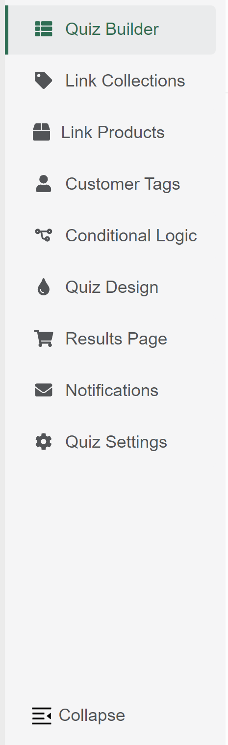
Quiz Builder – Opens the Quiz Builder section of the Quiz Builder. This is where you’ll add questions/slides to your quiz.
Link Collections – Opens the Link Collections section of the Quiz Builder. This is where you’ll link entire collections or tags of products from your store to individual choices.
Link Products – Opens the Link Products section of the Quiz Builder. This is where you’ll link products from your store to individual choices.
Customer Tags – Opens the Customer Tags section of the Quiz Builder. This is where you’ll create custom tags to link to individual choices.
Conditional Logic – Opens the Conditional Logic section of the Quiz Builder. This is where you’ll create branching in your quiz.
Quiz Design – Opens the Quiz Design section of the Quiz Builder. This is where you’ll style your quiz.
Results Page – Opens the Results Page section of the Quiz Builder. This is where you’ll edit your results page.
Notifications – Opens the Notifications section of the Quiz Builder. This is where you’ll set up your quiz result emails.
Quiz Settings – Opens the Quiz Settings section of the Quiz Builder. This is where you’ll change currency, language, and other base settings of the quiz.
Quiz Builder
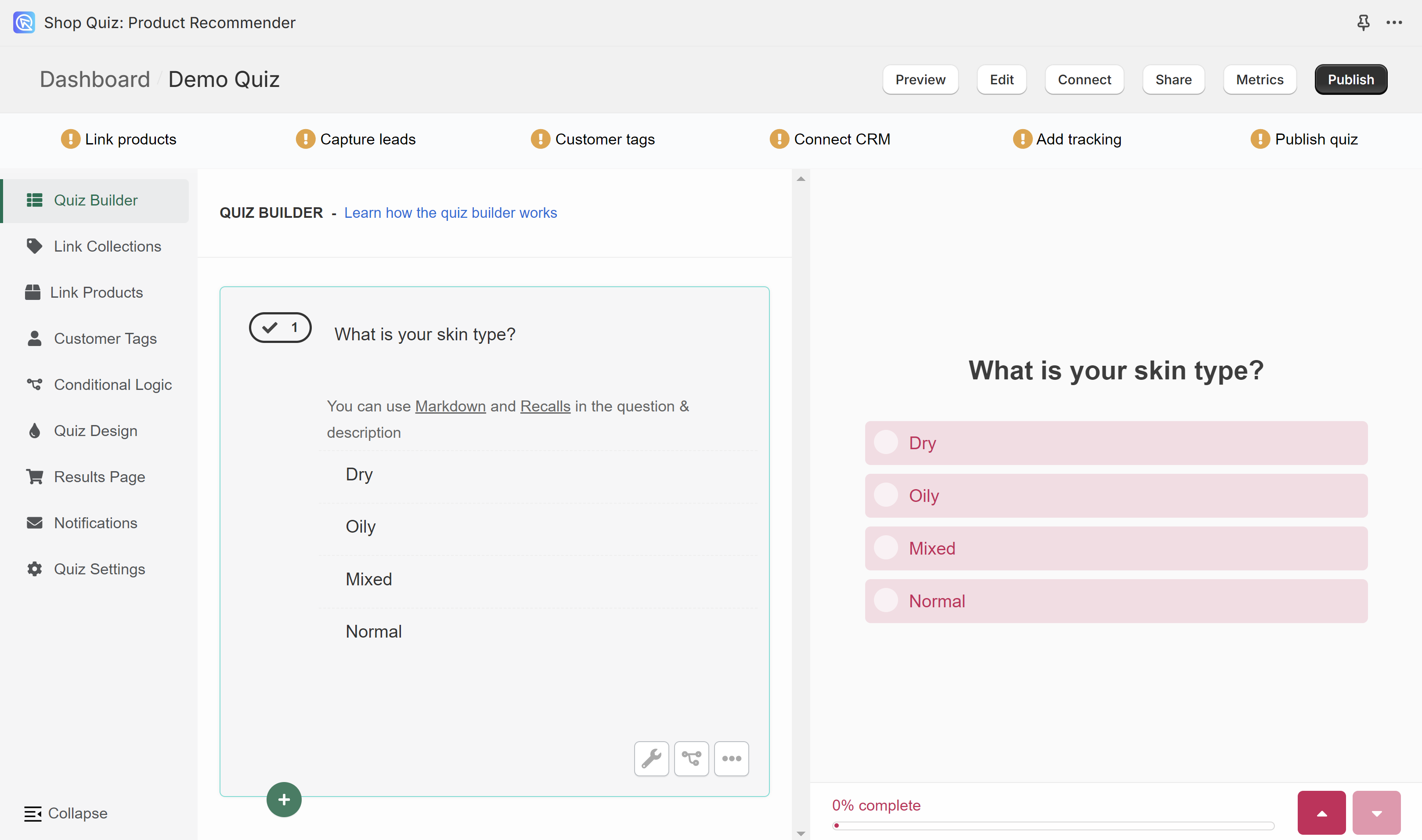
Quiz Builder is composed of two sections: the slides (left) and the preview (right). All the questions that you add to the quiz will be shown on the small preview. To test the whole quiz click Preview in the top menu.
+ / Add new question – Opens a menu of quiz questions to add.
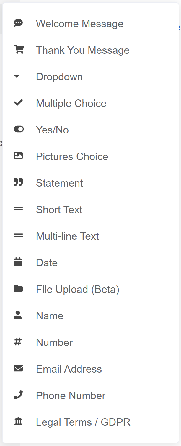
Welcome Message – The first slide in the quiz. The introductory slide of the quiz featuring welcoming text and a ‘Start Quiz’ button.
Thank You Message -The last slide in the quiz. The concluding slide of the quiz displaying gratitude text and a button to view quiz results.
Dropdown – Multiple choice slide which displays choices as a dropdwon menu.
Multiple Choice – A question slide with several clickable options for selecting a single/multiple answers.
Yes/No – Two choices slide which displays choices as a clickable options.
Pictures Choice – Multiple choice slide which displays choices as clickable images. You can uplaod your own image to each choice. It’sd recommended to uplaod square images, max. 400px x 400px.
Statement – A statement slide which displays text and a button to proceed to the next question.
Short-text – An open question slide that allows the user to provide a short text answer.
Multi-line Text – An open question slide that allows the user to provide a short text answer.
Date – A question slide that prompts the user to select or enter a specific date.
File Upload – An interactive slide where users can upload a file as their response.
Name – A slide designed for users to enter their name, featuring a short text field.
Number – A question type where users are prompted to input a numerical answer.
Email Address – A slide dedicated to collecting the user’s email address through a text field.
Phone Number – A slide where participants are asked to enter their phone number, usually in a specified format.
Legal Terms/GDPR – A slide presenting legal terms or GDPR-related information, with options to accept or decline through clickable buttons.
Question settings
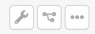
question settings / wrench icon – Opens the Question Settings menu.
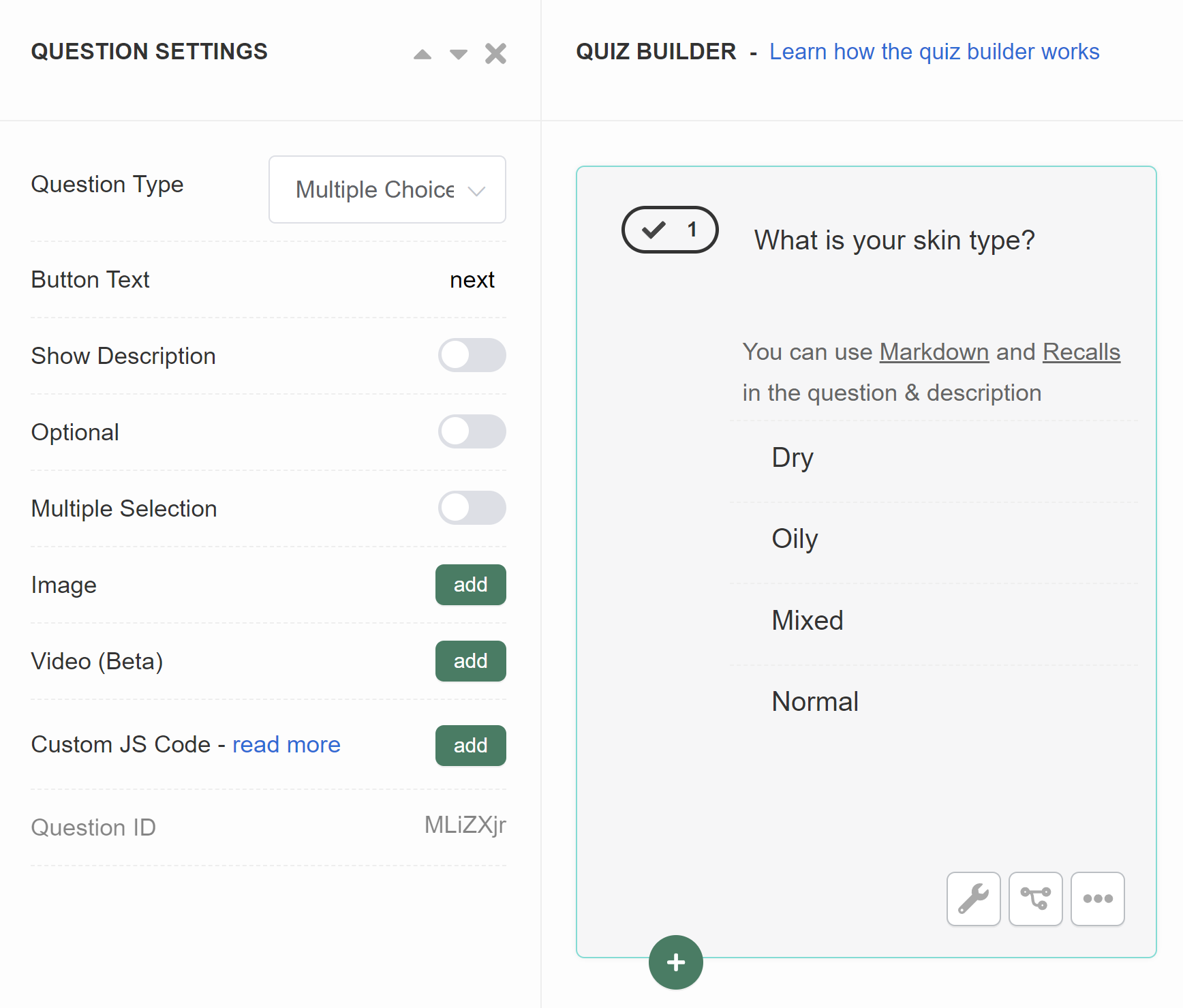
- Question Type – Allows you to switch between similar question types.
- Button Text – Change the text button on the slide.
- Show Description – Activates an extra text field on the slide below the main question field. Allows you to add more text to a slide. Toggle to activate.
- Optional – Makes the question optional. The customer will be able to proceed without providing an answer. Toggle to activate.
- Multiple Selection – Allows the user to select more than one answer. An extra menu appears once activated. Toggle to activate.
- Range – Select the range of answers a cusotmer can cliced.
- Image – Click “Add” to uplaod a featured image to the question. Image should be max 1000px x 1000px. An extra menu appears once activated.
- above – Places the uplaoded image above the question, on top of the slide.
- below – Places the uplaoded image below the question, above the choices.
- background – Places the uplaoded image on the background of the slide (overrides the defautl quiz background).
- split – Places the uploaded image on the side of the slide. Splits the sldie into two. On mobile, the image is placed on top of the question.
- Image Opacity – A slider which allows to adjust the opacity of the uplaoded image.
- Video – Click “Add” to uplaod a featured video to the question. An extra menu appears once activated.
- responsive – Places the uploaded video as a background on the slide. The play/pause menu is active on the slide.
- widget – Places the uploaded video as a small round widget on the slide. The play/pause menu is active on the slide.
- background – Places the uploaded video as a background on the slide. The play/pause menu is deactivated.
- Video Opacity – A slider which allows to adjust the opacity of the uplaoded video.
- Custom JS Code – Click “Add” to open a JavaScript console. Allows you to add custom JavaScript to the quiz question.
- Question ID – Displays the question unique ID.
conditonal logic / tree icon – Opens the Conditional Logic section of the Quiz Builder.
more options / … – Opens more options menu.
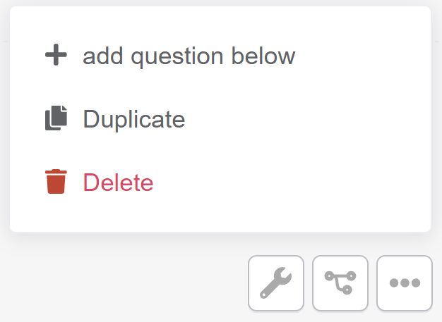
- + add question below – Adds a new blank question of the same type below.
- Duplicate – Duplicate this slide. Creates a copy slide below.
- Delete – Delete this slide.
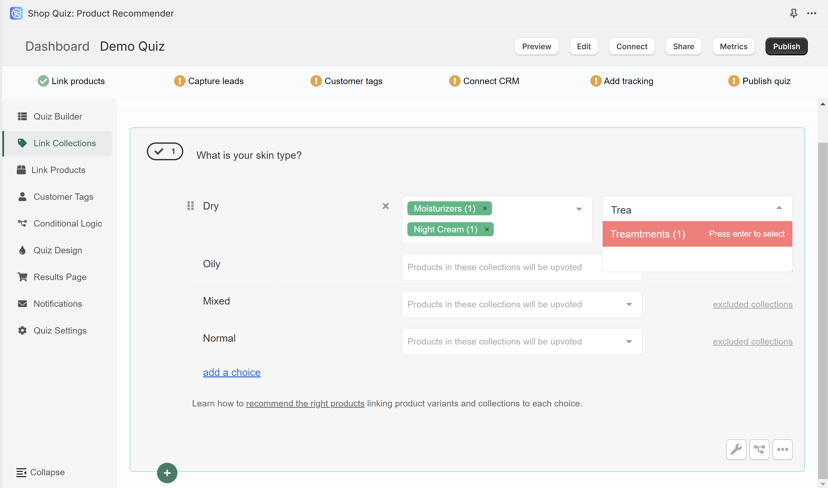
Link Collections
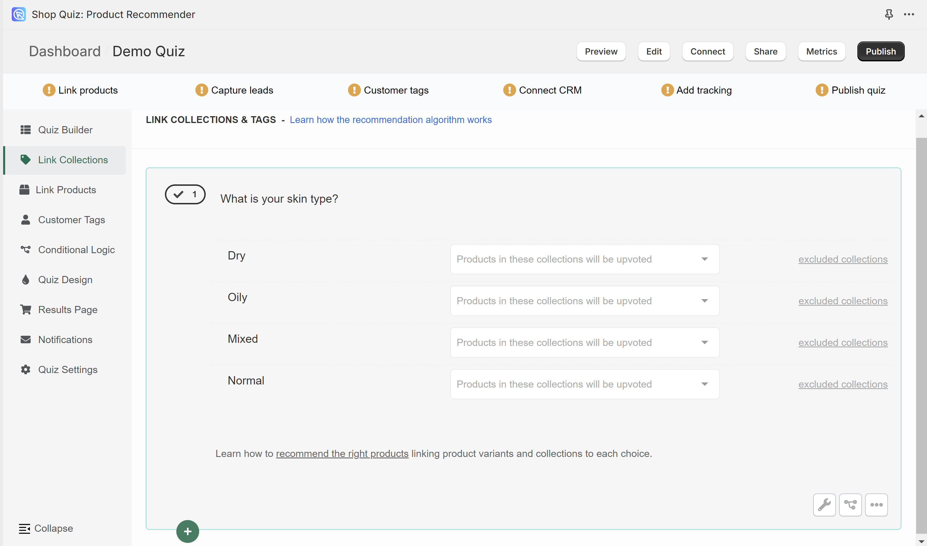
In the Link Collections tab, you can link entire collections of products from your store to choices. This includes Shopify collections, tags, virtual vendors and variants collections.
Once a collection is linked to a choice and the customer picks that choice, all the products in that collection will recieve 1 vote.
To link a collection to a choice click on the white dropdown bar and start typing the name.
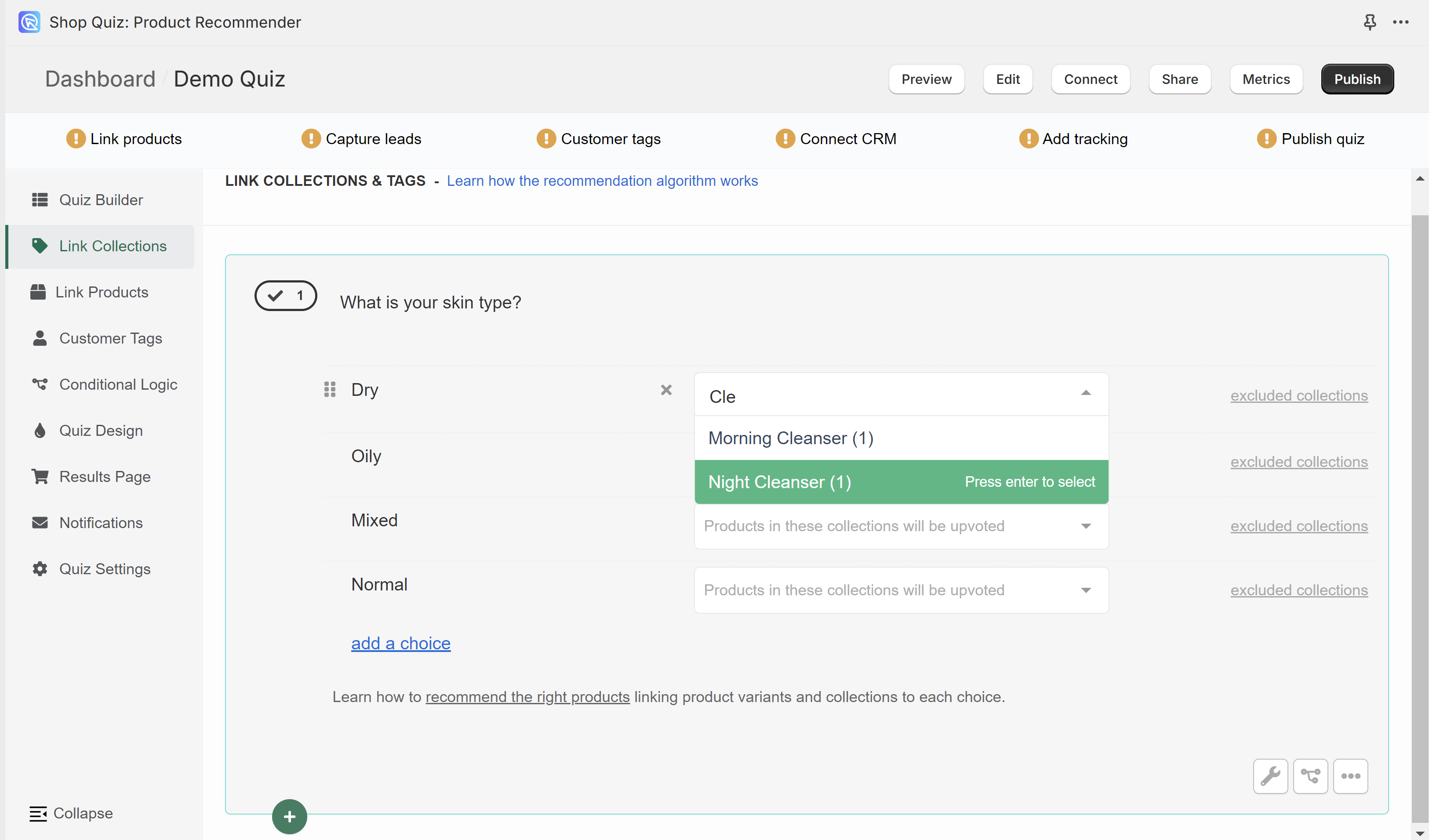
Select a collection and it will be automatically added to the choice.
Moisturizers(1) – (1) The number in the brackets indicates how many product varaints are in that collection.
You can link multiple collections to the same choice but be careful. If a product is part of two collections linked to the same choice, it will receive 2 votes from that choice (one vote from each collection linked to that choice).
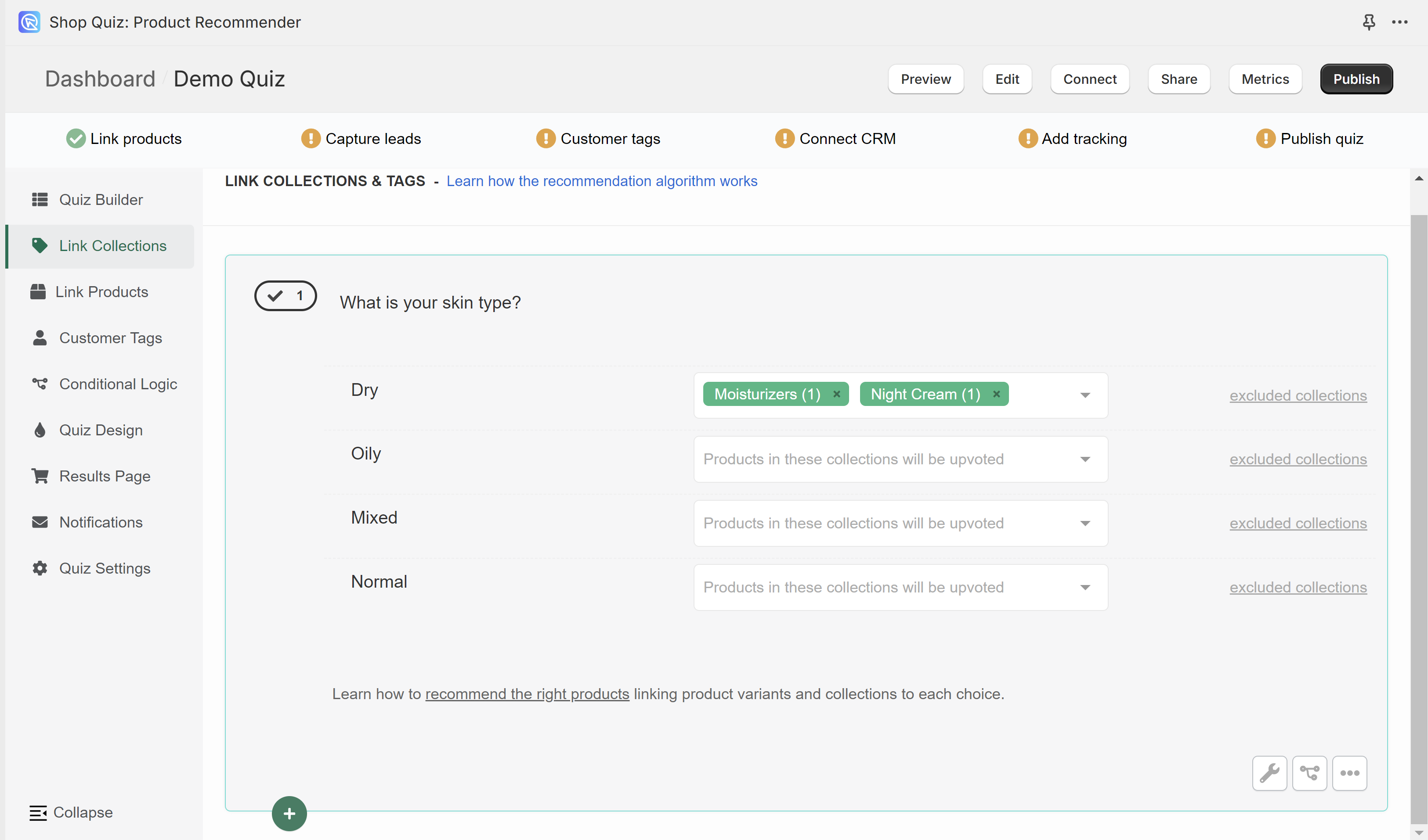
To remove a linked collection click “x” next to the collection name.
excluded collections – Opens the dropdown which allows to exclude collections of products from a choice.
Be careful when using exclusions. Once a collection of products is excluded from a choice, the products from that collection will never show on the resutls page, even if they were upvoted in another choice earlier/later.
Missing collections or collections show (0) products? – You may need to run a Catalog Sync to update the app.
Link Products
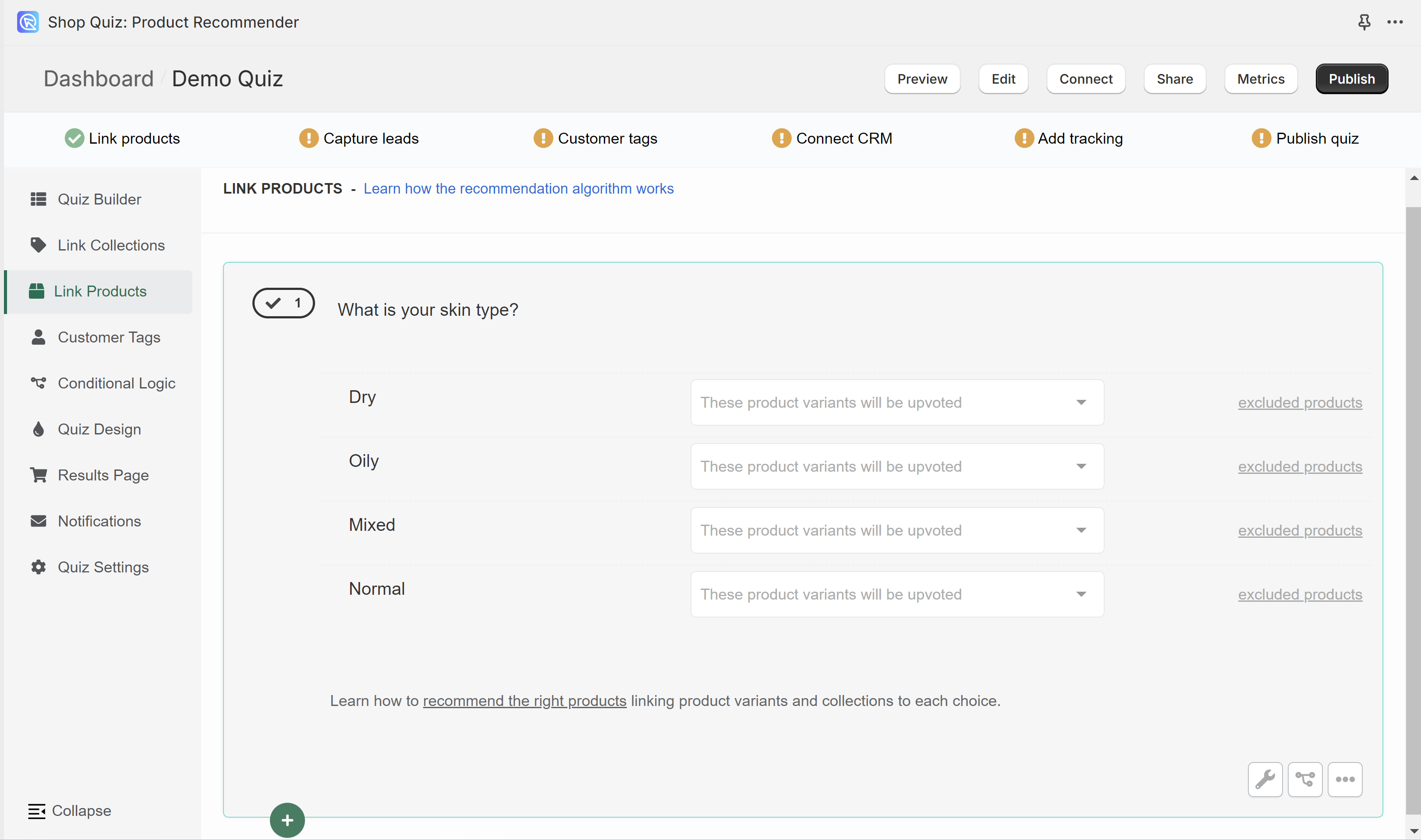
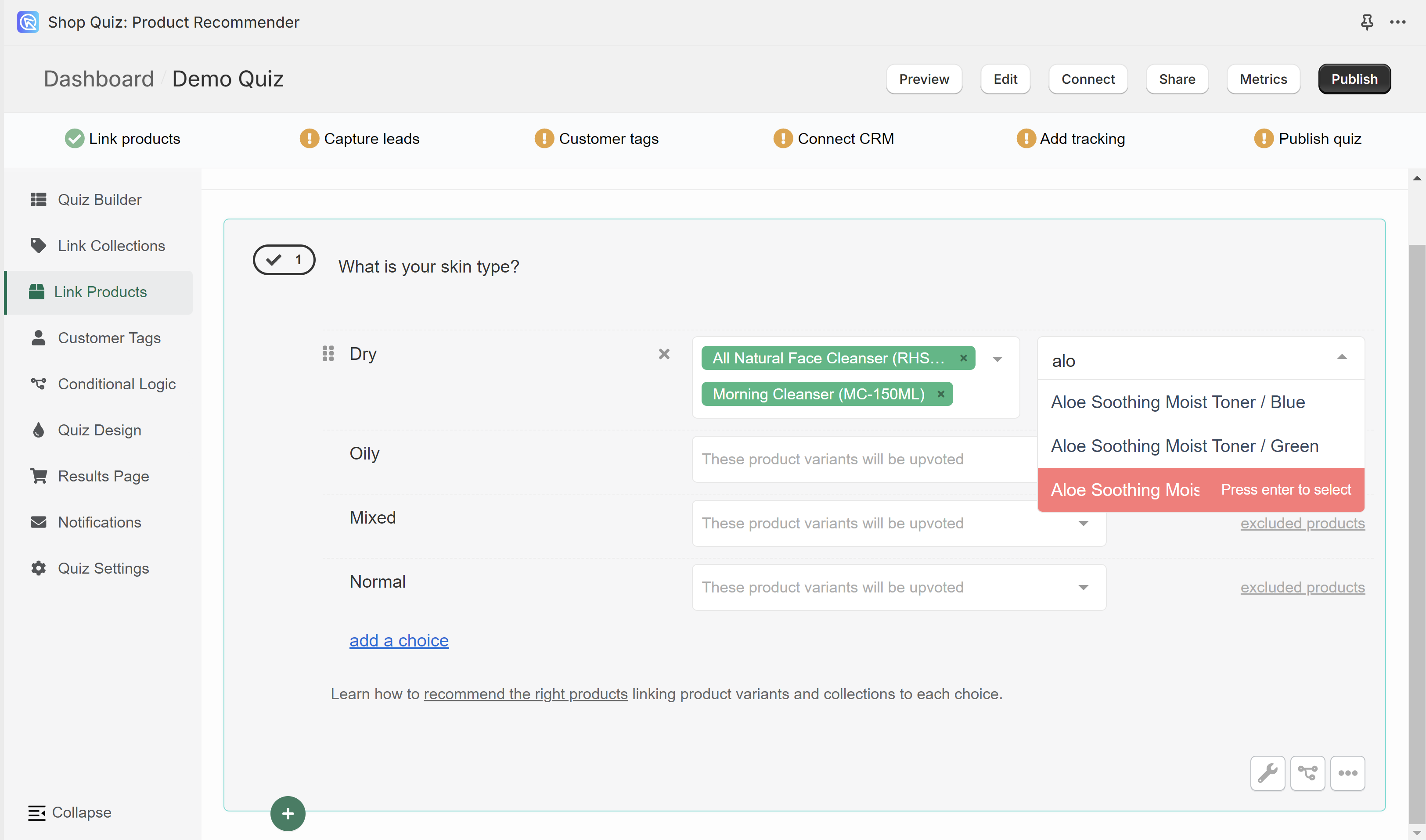
In the Link Products tab, you can link individual product varaints from your store to choices.
Once a product variant is linked to a choice and the customer picks that choice, that product variant will receive 1 vote.
To link a product to a choice click on the white dropdown bar and start typing the name.
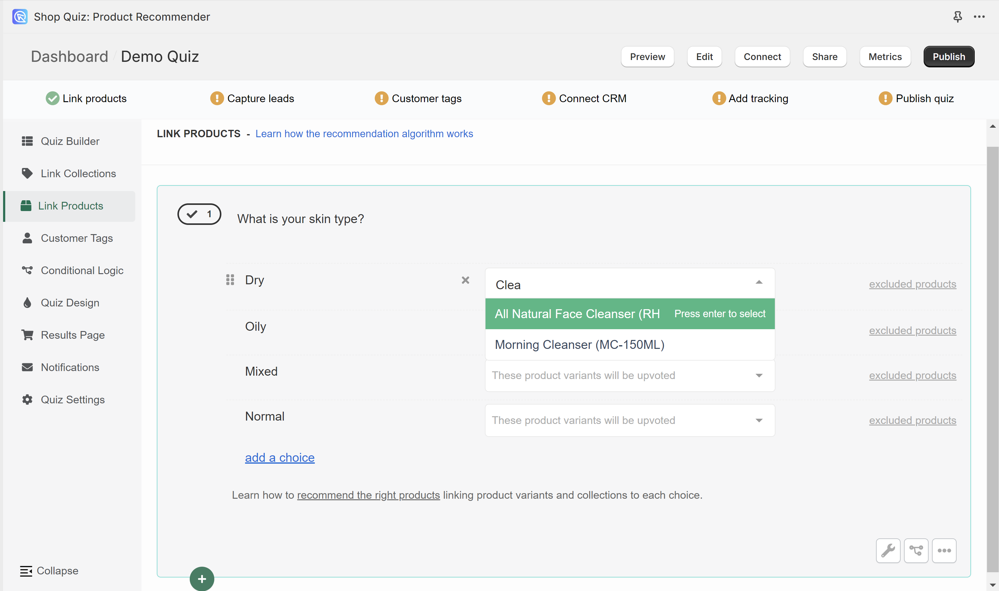
Select a product variant and it will be automatically added to the choice.
You can link multiple product variants to the same choice.
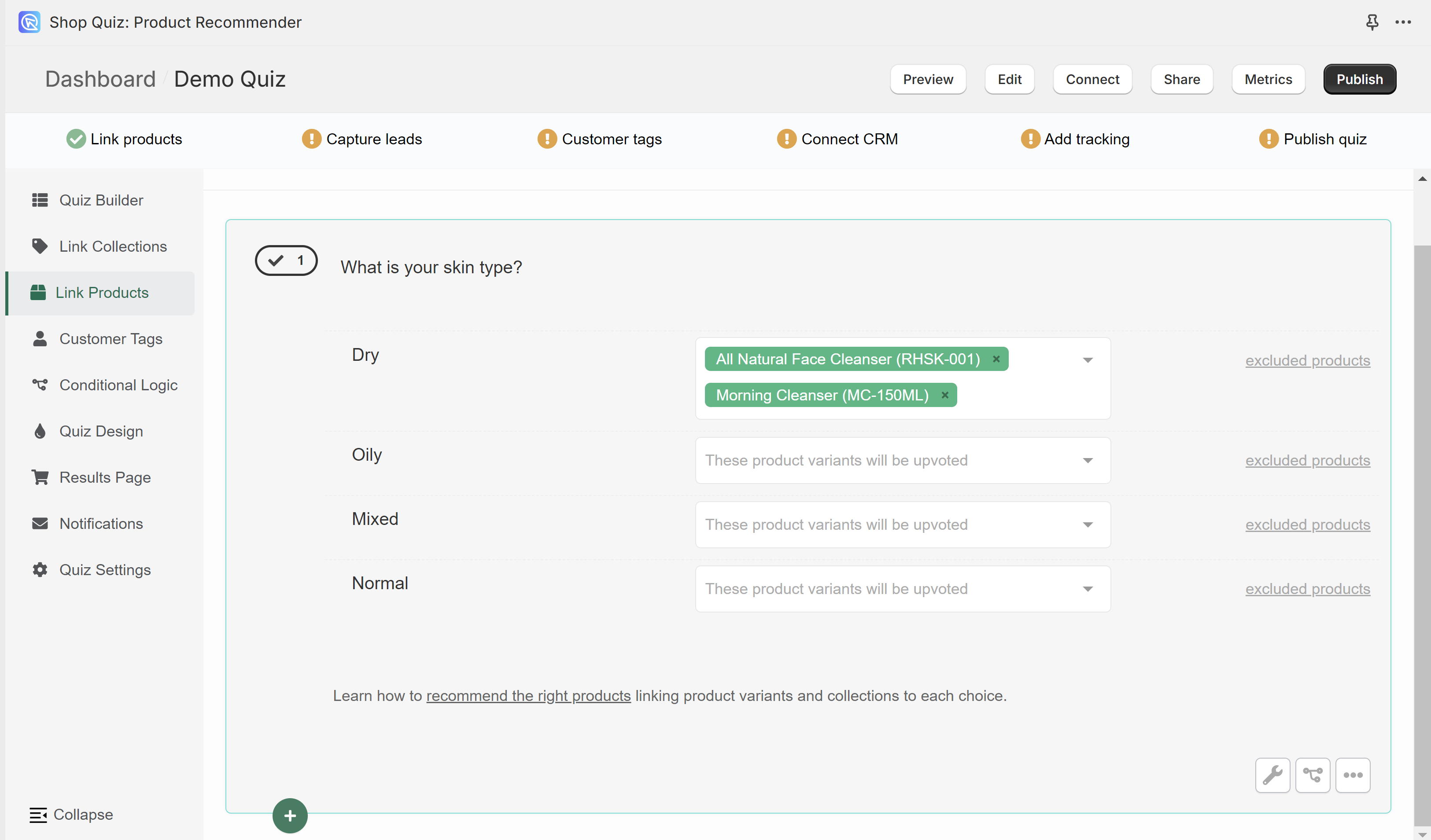
To remove a linked product click “x” next to the product name.
excluded products – Opens the dropdown which allows to exclude products of products from a choice.
Be careful when using exclusions. Once a product is excluded from a choice, that product will never show on the resutls page, even if it was upvoted in another choice earlier/later.
Missing products? – You may need to run a Catalog Sync to update the app.
Customer Tags
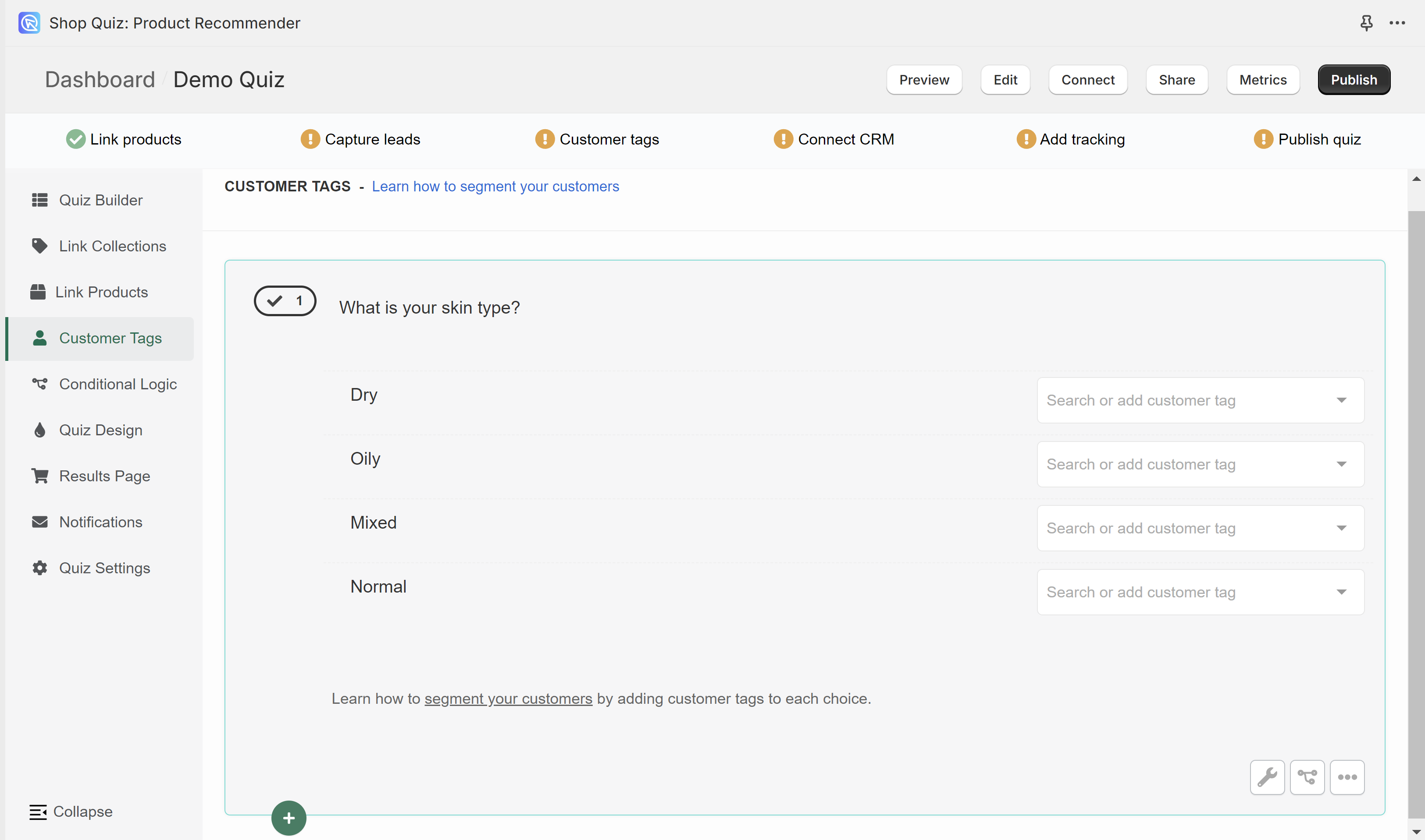
In the Customer Tags section, you can create custom tags and link them to choices in the quiz. Customer tags are useful for segmenting customers and email marketing.
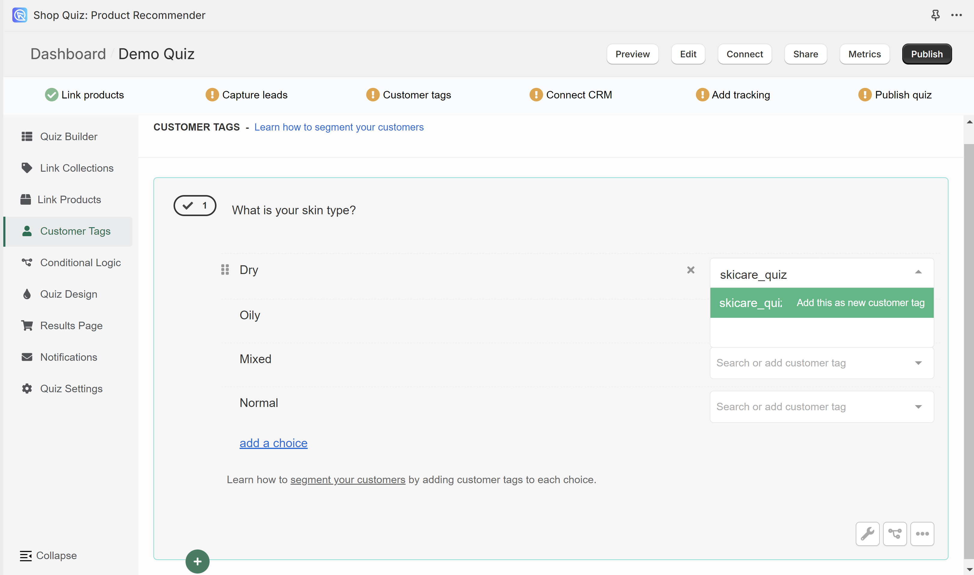
To add a new tag, type its name in the white bar next to one of the choices. Confirm the creation of a new tag by clicking “Add this as a new customer tag”.
Created tag will then show as an available option whenever you select another choice.
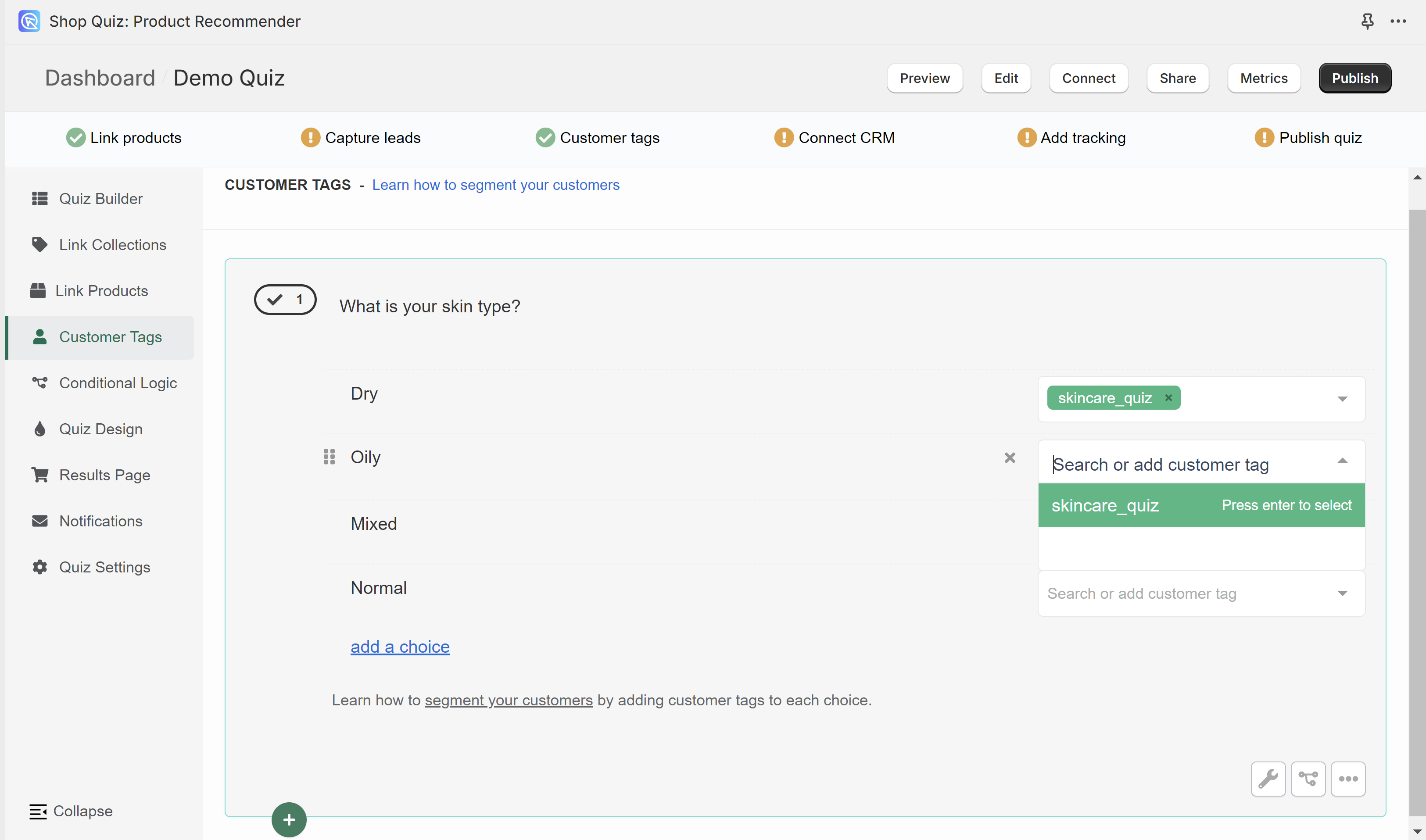
You can create as many tags as you like. You can link as many tags as you like to the same choice.
Conditional Logic
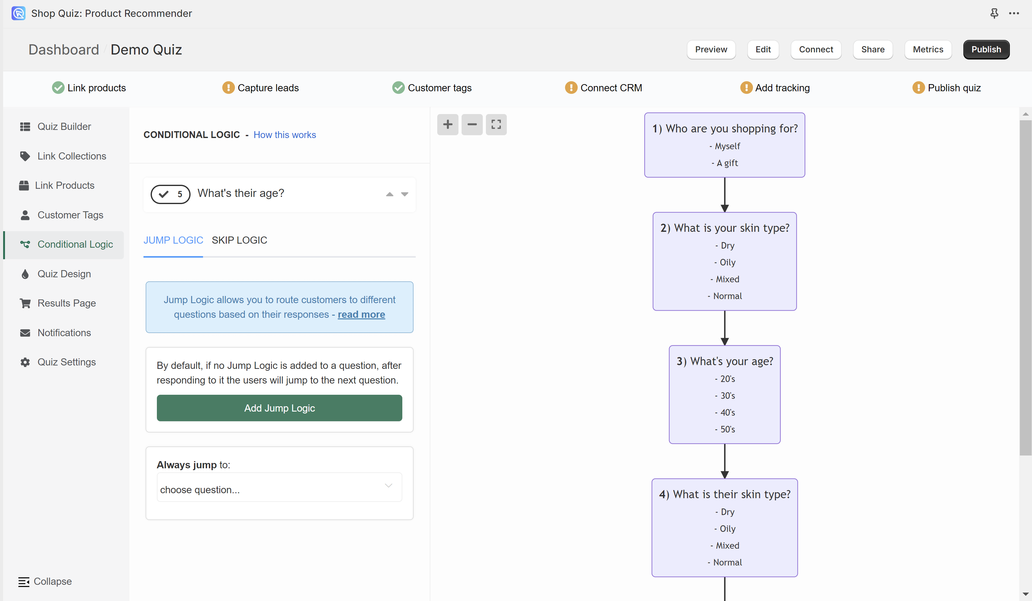
In the Conditional Logic tab, you can branch your quiz or tell it to skip certain questions. The left menu allows you to add conditional logic rules to questions in the quiz. The right menu shows a logic tree of the quiz. Any branching you add will be reflected on the tree preview.
By default, the quiz will progress from one question to another based on the question number. Conditional logic allows you to change this default behavior.
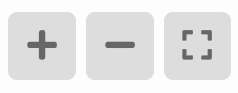
+ – Zoom in on the logic tree preview.
– – Zoom out on the logic tree preview.
[] – Center the logic tree preview and fit into view.
Drag the logic tree with your mouse left button to navigate to specific branches.
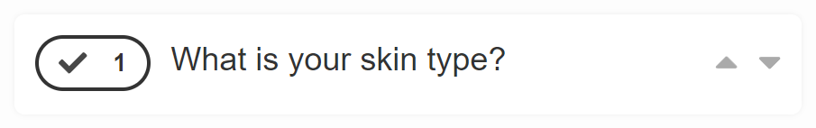
The top menu allows you to switch between questions.
arrow up – Takes you to the question higher.
arrow down – Take you to the question lower.
JUMP LOGIC
Jump Logic allows you to route customers to different questions based on their responses.
Add Jump Logic – Click to add a new Jump Logic rule for the selected question.
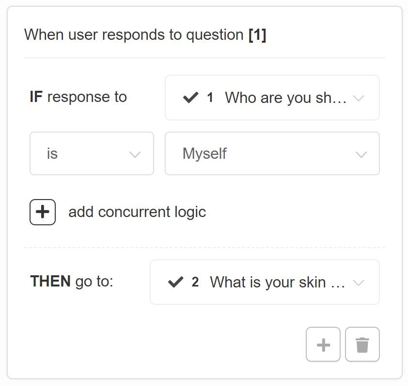
All the Jump Logic rules follow the same format
IF response to pick the question from a dropdown list
is/ is not pick a choice from the dropdown list
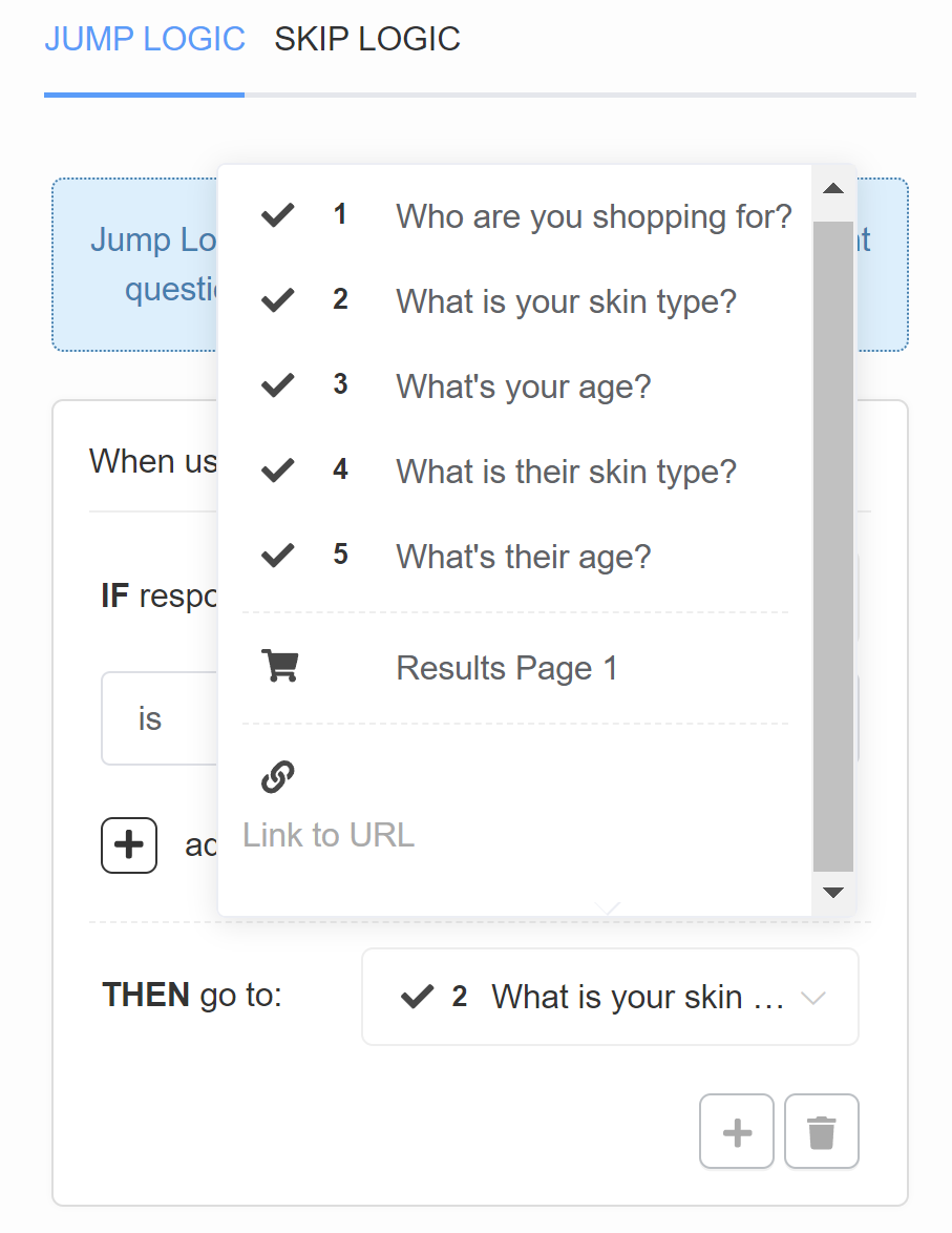
THEN go to: pick a slide from the dropdown list or add a URL
In the example, if a user chooses a choice “Myself” in Question 1 “Who are you shopping for?” then they will be redirected to Question 2 “What is your skin type?”.
+ – Add another Jump Logic rule. Adds a new OR logical rule.
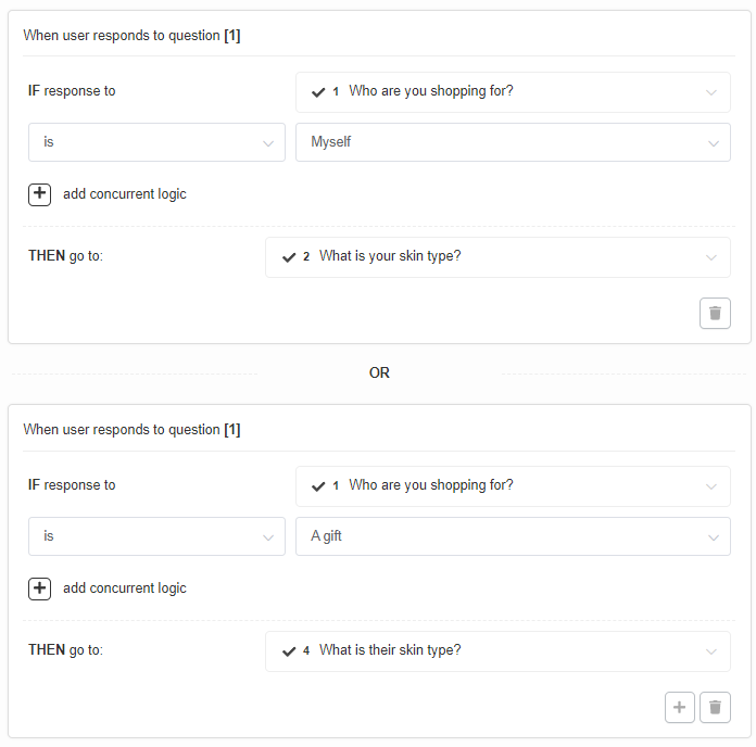
In the example, if a user chooses a choice “Myself” in Question 1 “Who are you shopping for?” then they will be redirected to Question 2 “What is your skin type?” but if the user chooses a choice “A gift” in Question 1 “Who are you shopping for?” then they will be redirected to Question 4 “What is their skin type?”.
bin – Delete the current Jump Logic rule.
+ add concurrent logic – Adds a new AND logical statement to the same rule. AND conditional statements can be tricky, as both statements have to be true for the rule to take effect. For most quizzes, using the OR rule is enough.
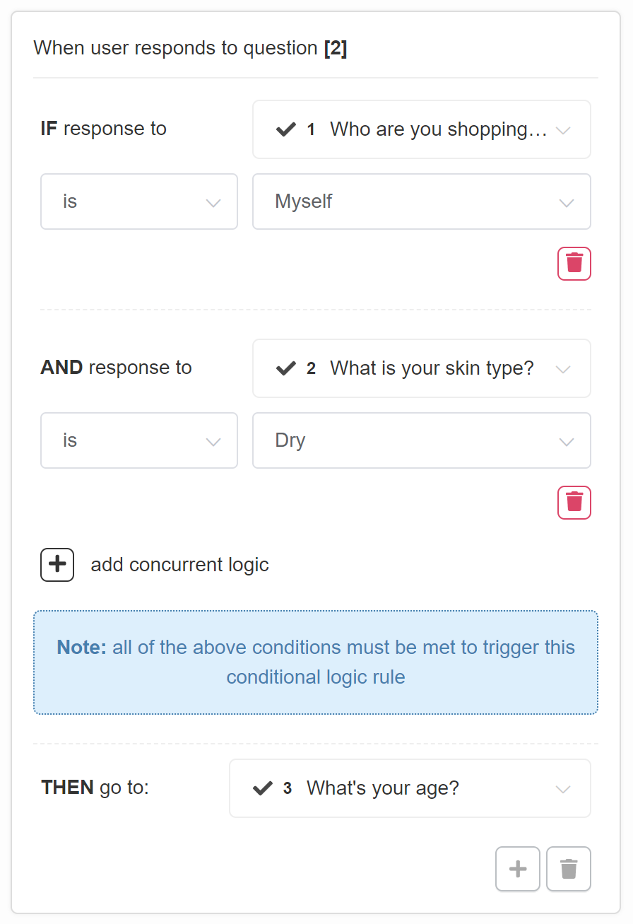
In the example, only if a user chooses a choice “Myself” in Question 1 “Who are you shopping for?” and a choice “Dry” in Question 2 “What is your skin type?” they will be redirected to Question 3 “What’s your age?”.
Always jump to: – Select a slide or URL where the user will be always redirected after this slide.
SKIP LOGIC
Skip Logic determines whether a question is presented or skipped based on responses to previous questions. By default, if no Skip Logic is added to a question, it will be shown.
Add Skip Logic – Click to add a new Skip Logic rule for the selected question.
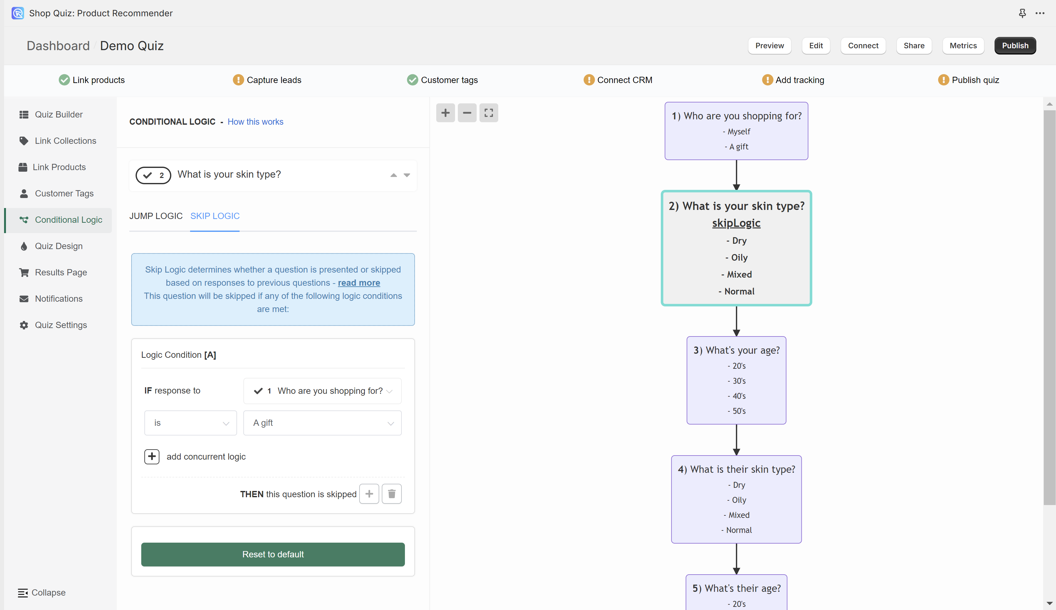
All the Skip Logic rules follow the same format
IF response to pick the question from a dropdown list
is/ is not pick a choice from the dropdown list
THEN this question is skipped
In the example, if a user chooses a choice “A gift” in Question 1 “Who are you shopping for?” then Question 2 “What is your skin type?” will be skipped (it will not be shown).
All slides that contain Skip Logic will be marked with “skip logic” text.
+ – Adds another Skip Logic rule. Adds a new OR logical rule.
bin – Delete the current Skip Logic rule.
+ add concurrent logic – Adds a new AND logical statement to the same rule. AND conditional statements can be tricky, as both statements have to be true for the rule to take effect. For most quizzes, using the OR rule is enough.
Quiz Design
In the Quiz Design section fo the quiz builder you can change how the quiz Questions or the Results Page look.
The top menu allows you to switch between questions to preview them.
arrow up – Takes you to the question higher.
arrow down – Take you to the question lower.
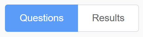
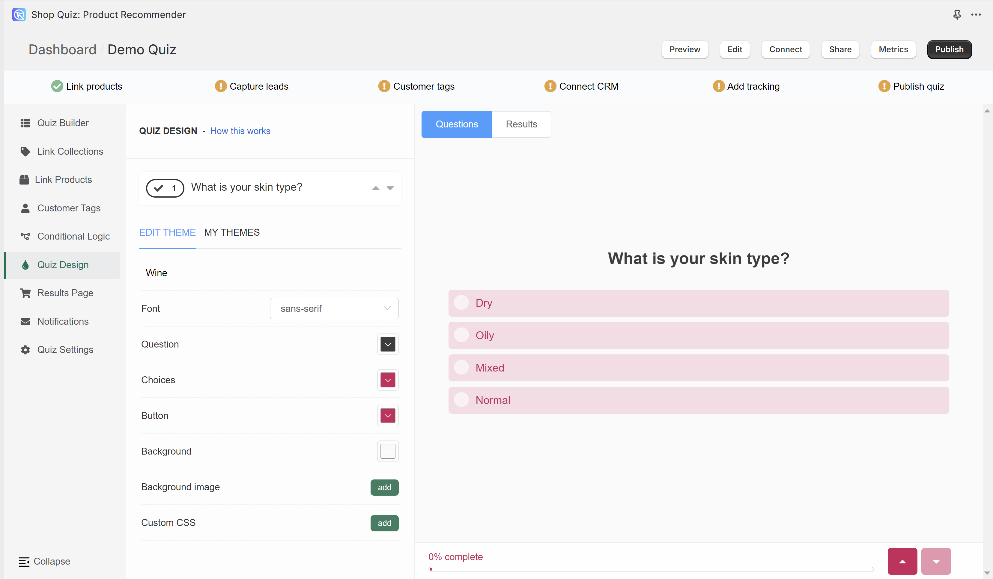
Questions – Shows the preview of how the questions look like.
Results – Shows the preview of how the results page looks like.
EDIT THEME
In the EDIT THEME section, you can change the styling of your current quiz theme. To change a quiz theme or add a new theme, go to MY THEMES tab.
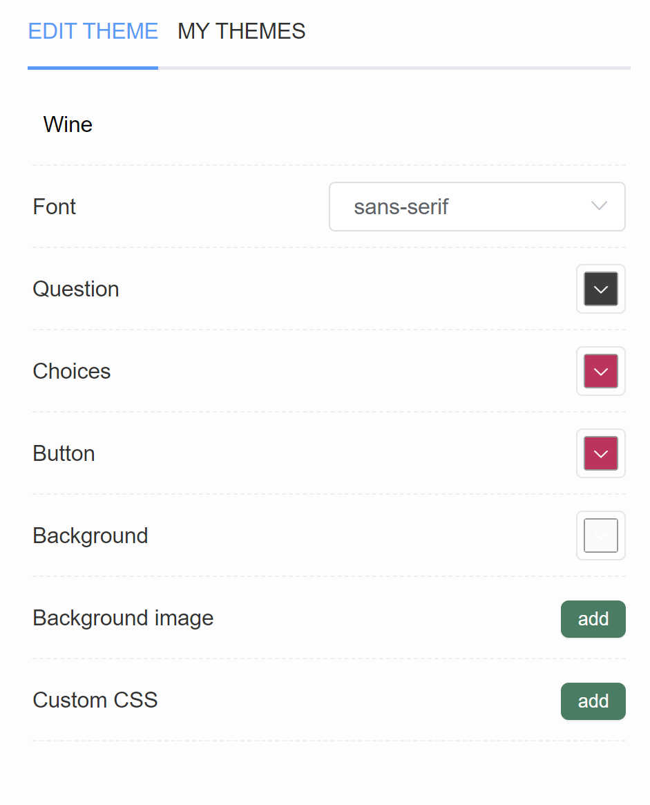
Wine – Displays the name of your current theme.
Font – Shows a dropdown of available fonts. Pick a font from the list to change it.
Question – Opens a color menu that allows you to change the color of quiz questions. You can add a custom color by pasting the #number of the color (for example, #ecb3b3)
Choices – Opens a color menu that allows you to change the color of quiz choices. You can add a custom color by pasting the #number of the color (for example, #ecb3b3)
Button – Opens a color menu that allows you to change the color of quiz buttons (next, star quiz, add to cart, etc.). You can add a custom color by pasting the #number of the color (for example, #ecb3b3)
Background – Opens a color menu that allows you to change the color of the quiz background. You can add a custom color by pasting the #number of the color (for example, #ecb3b3)
Background image – Click “Add” to upload a background image. Image should be max 1000px x 1000px and 2MB. An extra menu appears once activated.
- Background Opacity – A slider that allows you to adjust the opacity of the uploaded background image.
Custom CSS – Opens a CSS console, where you can add any custom styling rules. Any element of the quiz or the resutls page can be customized via CSS. To find a selector for the element, inspect it in your browser by right-clicking.
MY THEMES
In the MY THEMES section you’ll find all the Design Themes that you create. Click on a theme to apply it to the quiz. You can customize it in the EDIT THEME tab.
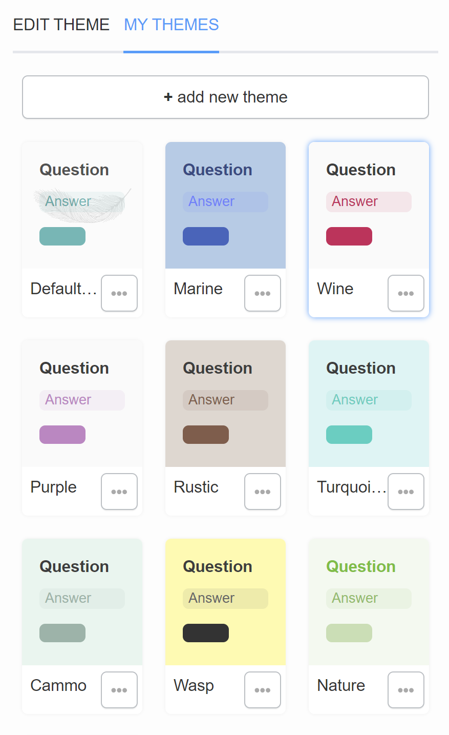
+ add new theme – Adds a new blank theme to your MY THEMES gallery.
… – Opens the theme options.
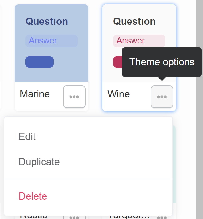
- Edit – Opens the selected theme in EDIT THEME.
- Duplicate – Creates a copy of the selected theme.
- Delete – Deletes the selected theme from MY THEMES gallery.
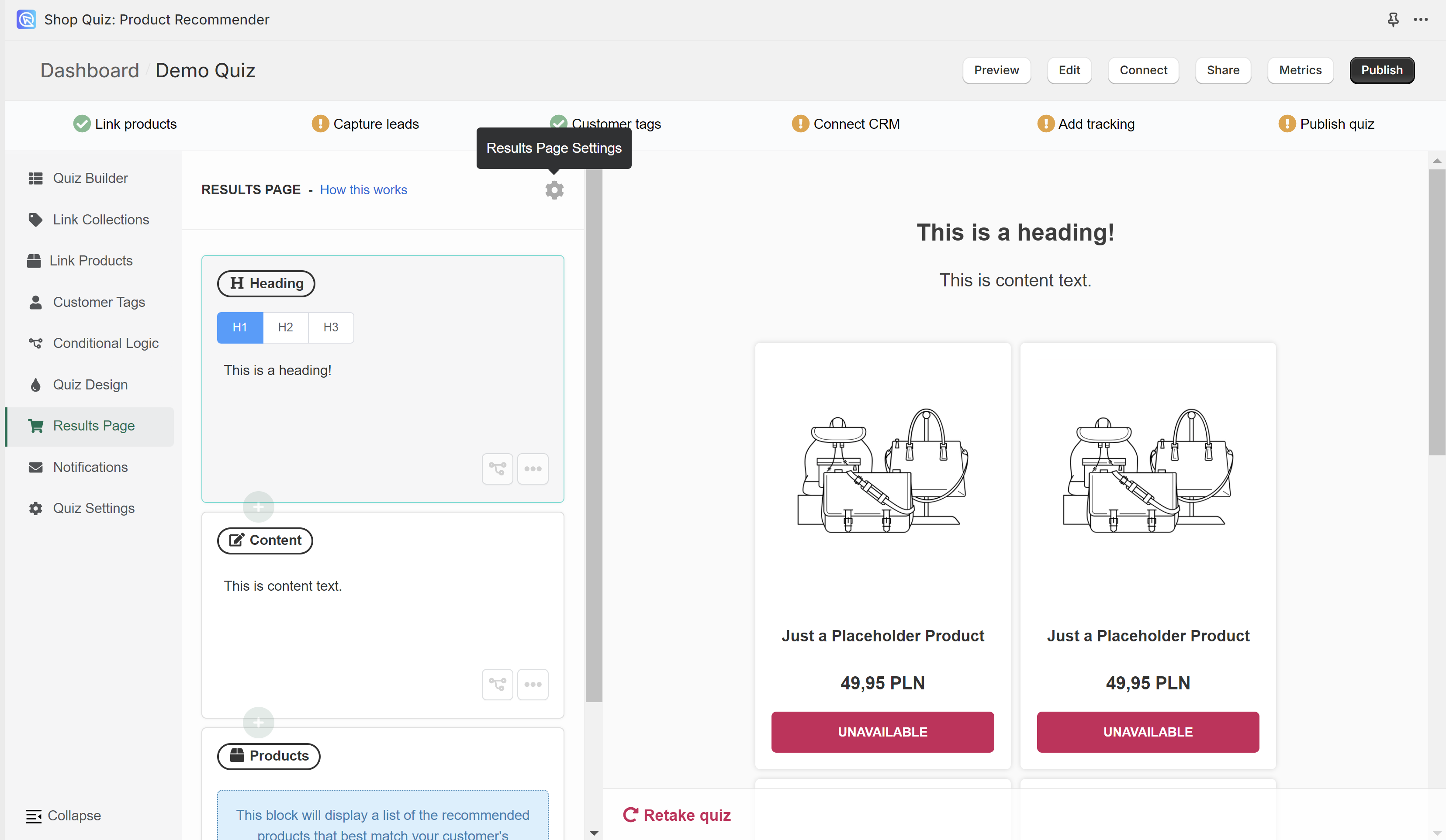
Results Page
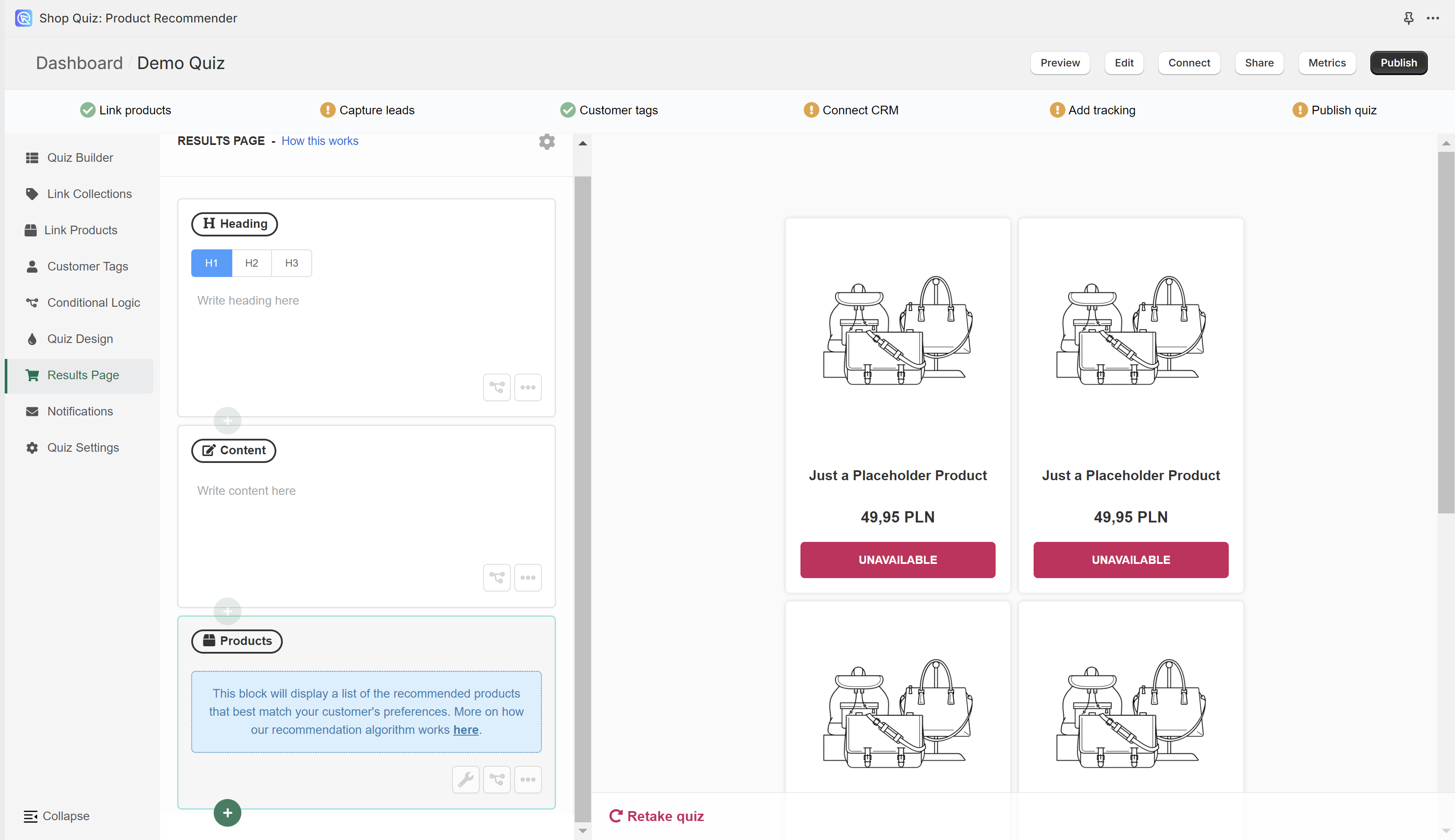
In the Results Page section, you can add content to the results page shown at the end of the quiz. You can adjust the results page settings and see the preview of how the results page looks like.
+ / add block – Opens a menu of content blocks that you can add to your resutls page. You can drag an drop the blocks to change the order.
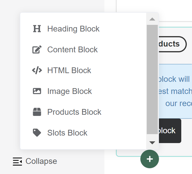
- Heading Block – Adds a new heading to your page, ideal for titles or section breaks.
- Content Block – Adds a new content block to your page, ideal for adding and formatting text, lists, and links.
- HTML Block – Adds a block where you can input custom HTML code for advanced content and styling.
- Image Block – Adds an embedded image block into your page. You can upload your own image. The image should be max 1000px x 1000px and max 2MB.
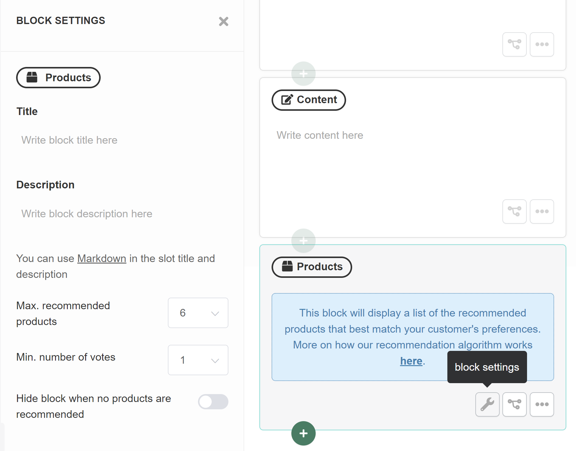
- Products Block – Adds a block specifically designed for displaying a list of recommended products.
- Slots Block – Adds a block specifically designed for displaying the recommended products sorted into slots. Slots allow you to group recommended products into different categories (e.g. cleanser, toner, serum, moisturizer…). Slots show the most voted products from a collection that’s linked to the slot.
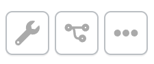
conditional logic / tree icon – Opens the Block Logic menu.
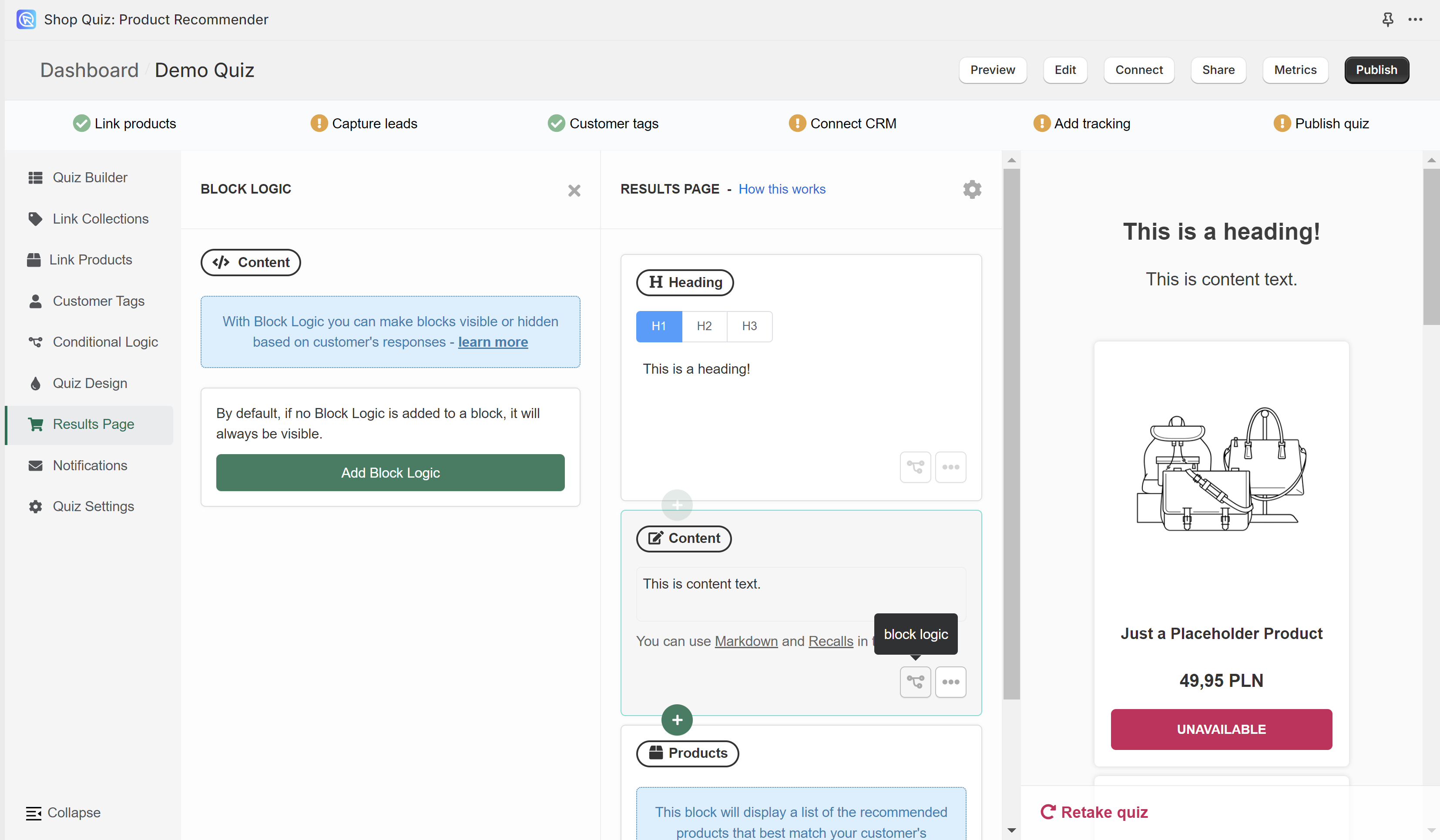
With Block Logic you can make blocks visible or hidden based on customer’s responses.
Add Block Logic – Adds a new block logic rule.
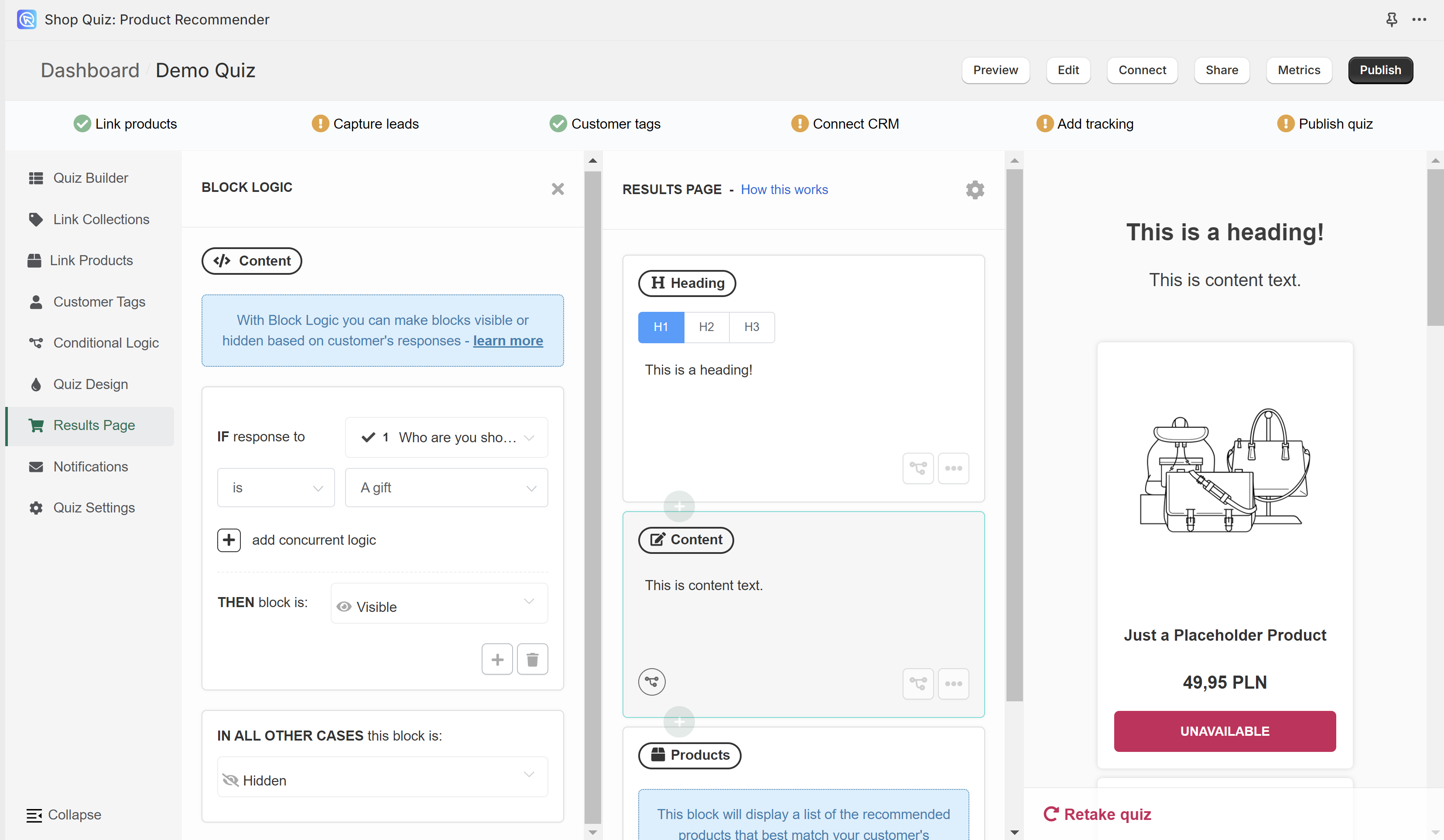
All the Block Logic rules follow the same format
IF response to pick the question from a dropdown list
is/ is not pick a choice from the dropdown list
THEN block is pick either Visible or Hidden
IN ALL OTHER CASES this block is pick pick either Visible or Hidden
In the example, if a users chooses a choice “A gift” in Question 1 “Who are you shopping for?” then this content block with text “This is content text.” will be visible. If they give a different answer in Question 1 this content block will be hidden.
- + – Adds another Block Logic rule. Adds a new OR logical rule.
- bin – Delete the current Block Logic rule.
- + add concurrent logic – Adds a new AND logical statement to the same rule. AND conditional statements can be tricky, as both statements have to be true for the rule to take effect. For most quizzes, using the OR rule is enough.
… – Opens the more options menu.
- + add block below – Opens the + / add block menu.
- bin / delete block – Deletes the current block from the resutls page.
🔧 / wrench icon – Opens the block settings menu.
- Product Block Settings
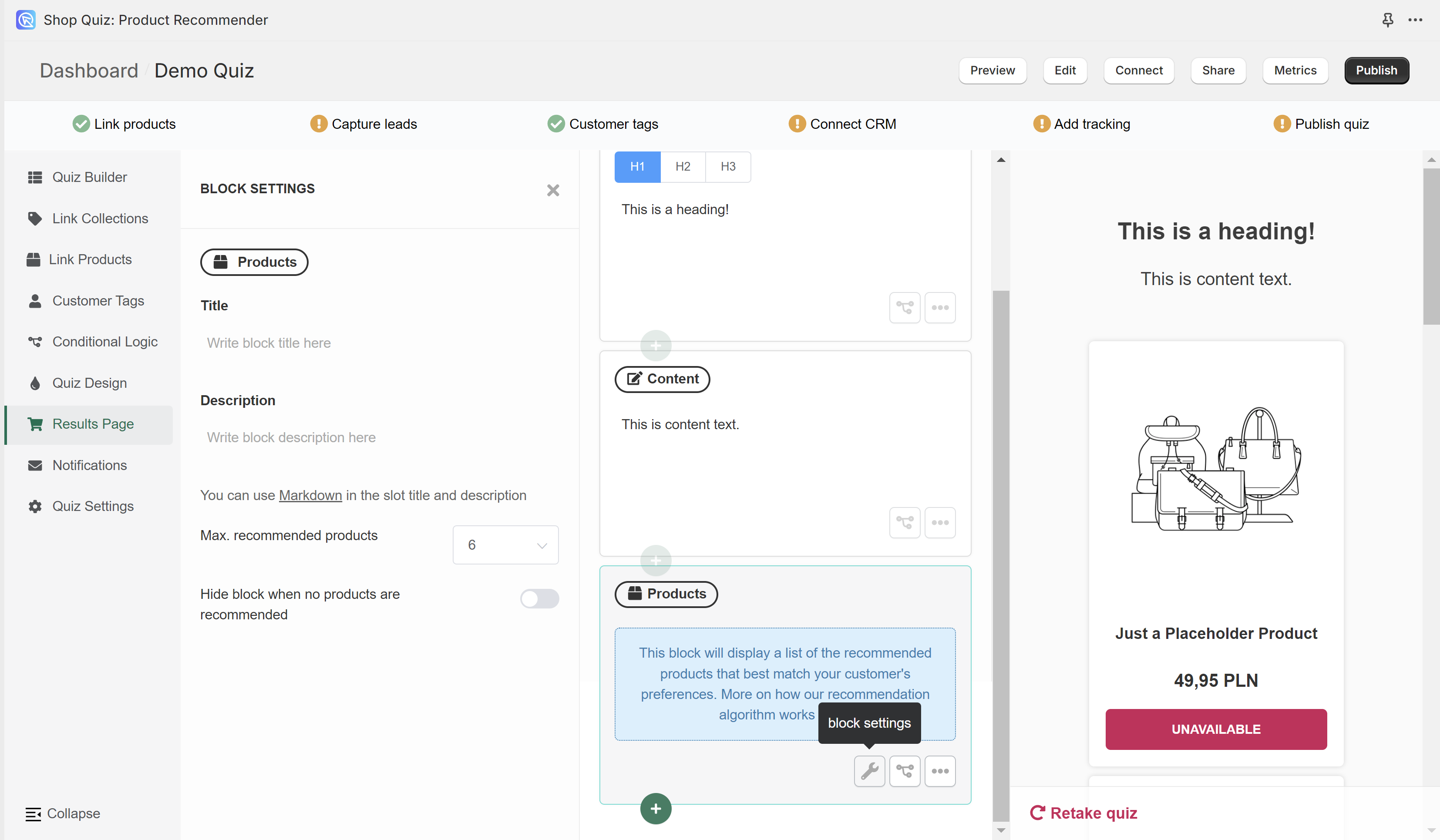
- Title – Type a title to be displayed above the recommended products.
- Description – Add a description to be displayed above the recommended products.
- Max. recommended products – Select how many products should be recommended in this Product Block. Max 15 products can be displayed per block. If you want to show more products, add another Product Block to your results page and make sure that the “Allow duplicated recommendations” settings is off in your Results page settings.
- Hide block when no products are recommended – Activate this setting if you want to hide the product block if there are no recommendations. By default, with no recommendations a “Based on your answers, we need a little more time to give you our recommendations. Please get in touch with us.” text will be displayed instead. This text can be edited in the Quiz Settings> Messages section.
- Slot Block Settings
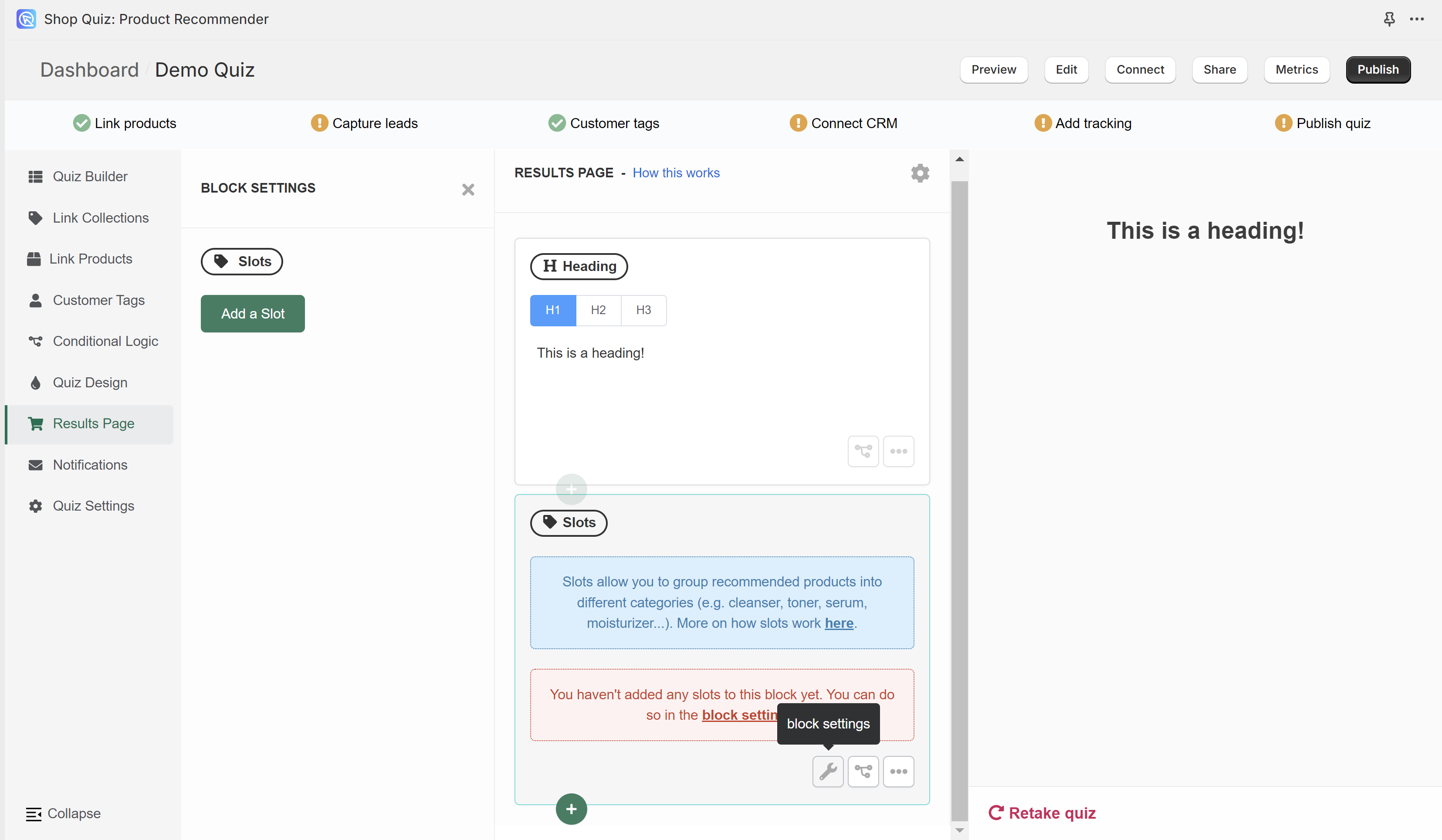
- Add a slot – Adds a new slot to the slot block. You can have multiple slots in a slot block.
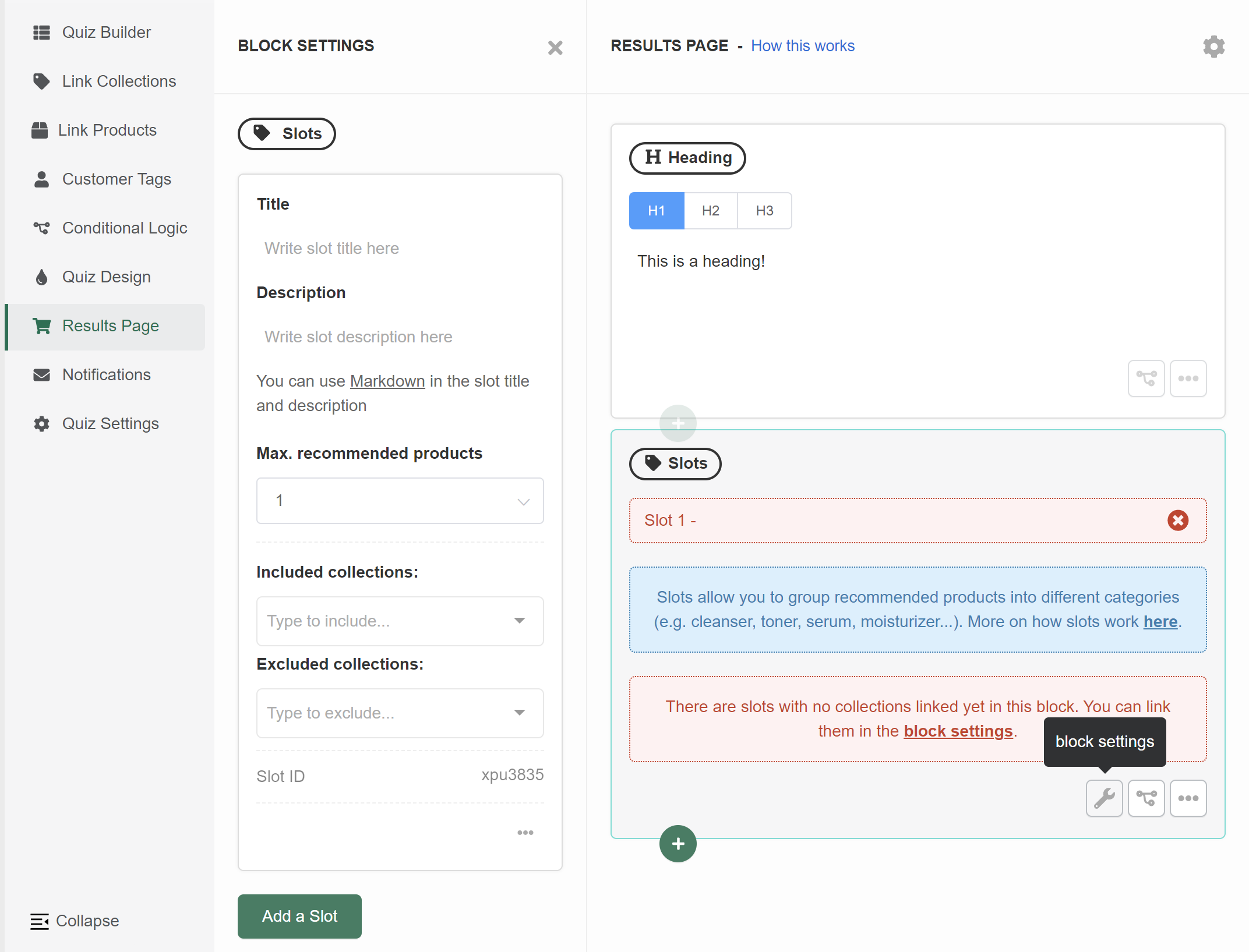
- Title – Type a title to be displayed above the slot.
- Description – Add a description to be displayed above the slot.
- Max. recommended products – Select how many products should be recommended in this Slot. Max 15 products can be displayed per slot.
- Included collections – Select from which collections (or tags) from your store the slot should display the products. Slots show the most voted products from a collection that’s linked to the slot.
- Excluded collections – Select from which collections (or tags) from your store the slot should never display the products. Slots show the most voted products from a collection that’s linked to the slot. If a producrt recevied votes in the quiz but is part of the excluded collection, the slot will not show that product.
Slot ID – Displays the current slot ID.
⚙️ / gear icon – Opens the results page settings.
BASIC
Checkout Settings
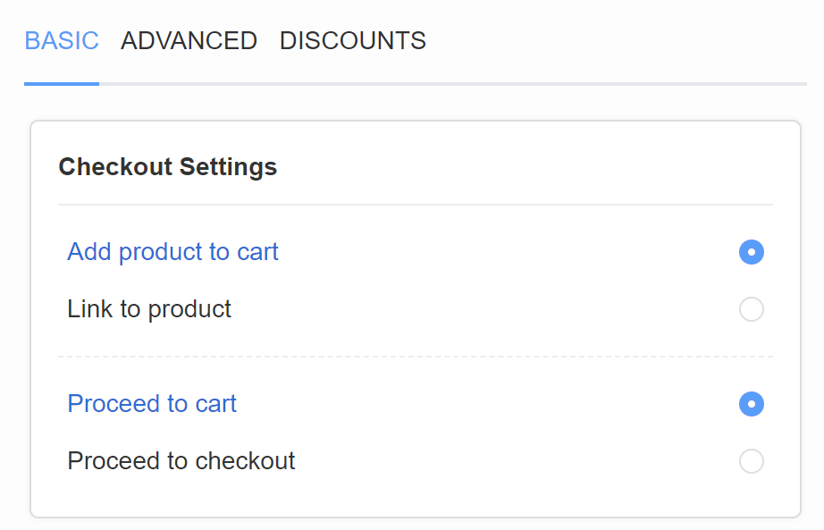
- Add product to cart – Allows the user to add the recommended products to the cart directly from the results page.
- Proceed to cart – After the product are added ot the cart, the customer will proceed to the cart page.
- proceed to checkout – After the product are added ot the cart, the customer will proceed to the checkout page.
- Link to product – Displays a “view product” button that takes the customer to the product page. This option disables the “add to cart” feature.
Individual Product Settings
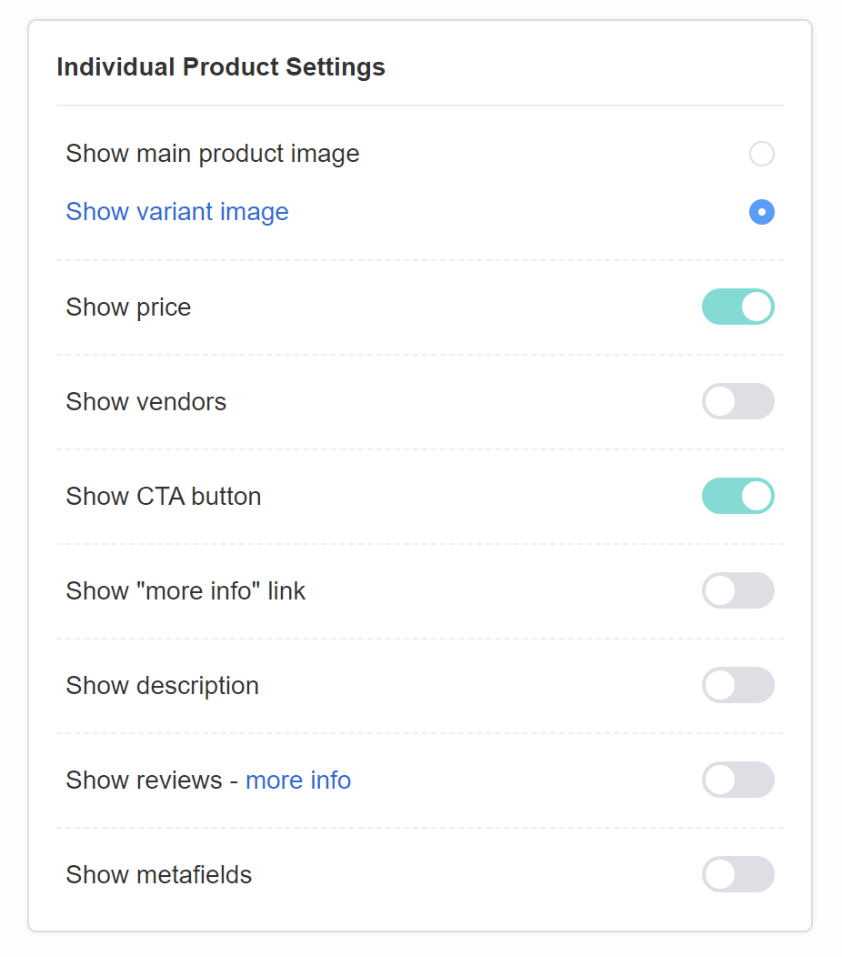
- Show main product image – Click to always show the main product image, even when a variant is recommended.
- Show variant image – Click to always show the variant image, instead of the main product image.
- Show price – Toggle to display the product price on the results page.
- Show vendors – Toggle to display the product vendor under the product on the results page.
- Show CTA button – Toggle to display the “add to cart” or “view product” button under the products on the results page.
- Show “more info” link – Toggle to display a “more info” link below the product name or description on the resutls page. The link takes you to the product page.
- Show description – Toggle to display the product description below the product name on the results page. An additional option is displayed.Truncate description – Toggle to shorten the product description on the results page and display a “read more” link which will enlarge it while clicked.
- Show reviews – Toggle to show product rating below the product name on the resutls page. After activation make sure to run a Catalog Sync to sync all the product reviews with the app.
- Show metafields – Toggle to allow showing of custom product metafields on the resutls page. To show product metafields follow the instructions in How to show product metafields in the quiz.
Style Settings
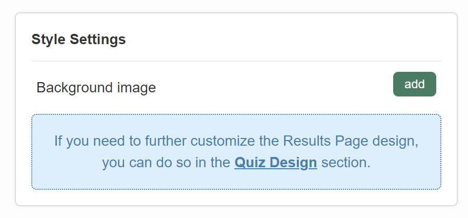
Background image – Click “Add” to upload a background image to the resutls page. Image should be max 1000px x 1000px and 2MB. An extra menu appears once activated.
- Image Opacity – A slider that allows you to adjust the opacity of the uploaded background image.
ADVANCED
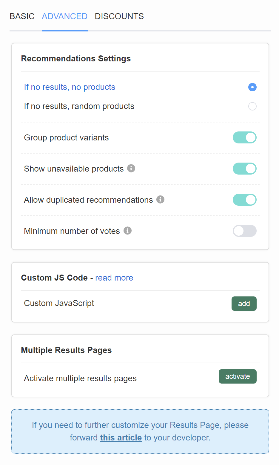
Recommendation Settings
If no results, no products – If there are no products that can be recommended a “Based on your answers, we need a little more time to give you our recommendations. Please get in touch with us.” text will be displayed instead. This text can be edited in the Quiz Settings> Messages section.
If no results, random products – If there are no products that can be recommended the app will show random products that received any votes.
Group product variants – Groups product variants as a dropdown under the main product name. Toggle to activate. Variants are displayed in the order of votes they received at the end of the quiz. If varaints receive the same number of votes, the order in which they are displayed on the resutls page will be random.
Show unavailable products – Allows products that are unavailable (out of stock) in the store to be recommended via the quiz. Toggle to activate.
Allow duplicated recommendations – Allows products to show multiple times on the results page (for example in two different product blocks or slot blocks). Toggle to activate.
Minimum number of votes – Adds an extra setting to each product or slot block which allows you to limit the products recommended in this block only to those that received X votes or more. Toggle to activate.
Custom JS Code
Custom JavaScript – Click “Add” to open the JavaScript console.
Multiple Results Pages
Activate multiple results pages – Click “activate” to open the MULTIPLE RESULTS PAGES menu.
MULTIPLE RESULTS PAGES
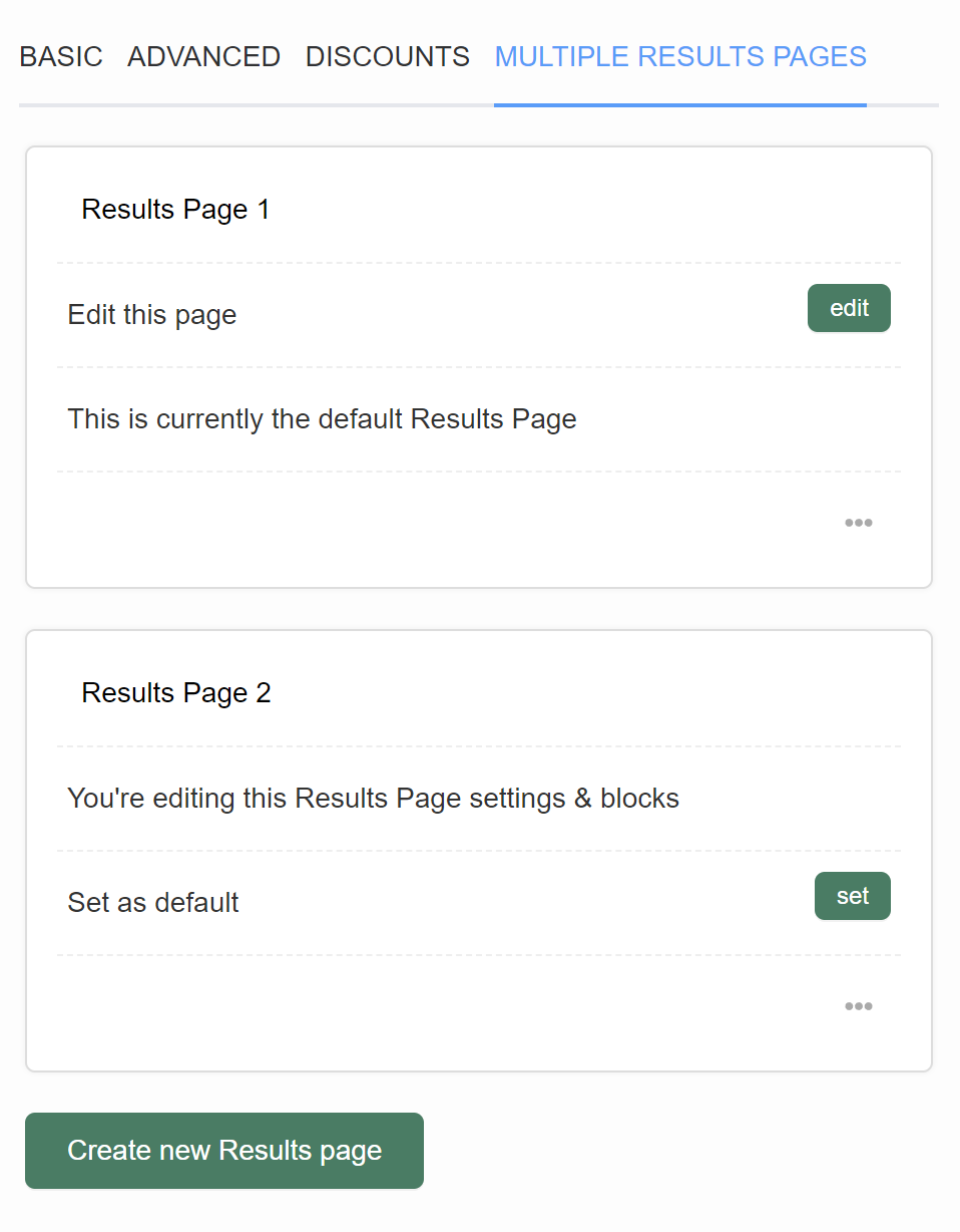
Results Page 1
- Edit this page – Click “edit” to switch to this results page and edit its content.
- This is currently the default Results Page – Indicates which page is the default one. Customer will be taken to the default results page unless you redirect them with Jump Logic to another page.
Results Page 2
- You’re editing this Results Page settings & blocks – Indicates which results page you are currently editing.
- Set as default – Click “set” to select this resutls page as default. Customer will be taken to the default results page unless you redirect them with Jump Logic to another page.
Create new Results Page – add a new resutls page to your quiz.
DISCOUNTS
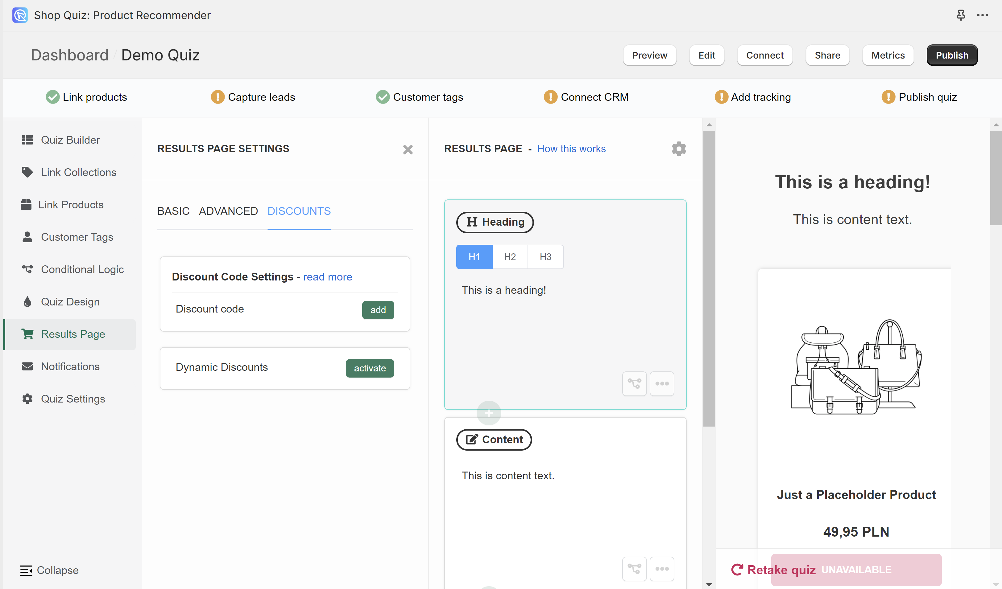
Discount Code Settings – Allows to add a static discount to your resutls page. Click “Add” to open the discount menu.
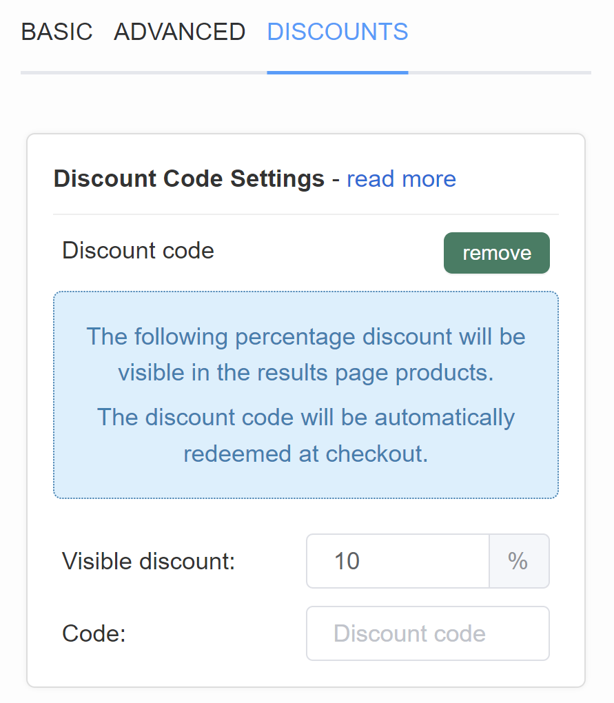
- Visible discount – Select the discount % from the dropdown. The percentage discount will be visible in the results page products. The discount code will be automatically redeemed at checkout.
- Code – Type a discount code that corresponds to this discount. You have to set up this discount code in your store > Shopify Discounts first. Follow this guide to learn How to add a discount to the quiz.
Dynamic Discounts – Allows to add a dynamic discount to your results page with a minimal cart value. Click “activate” to open the discount menu.
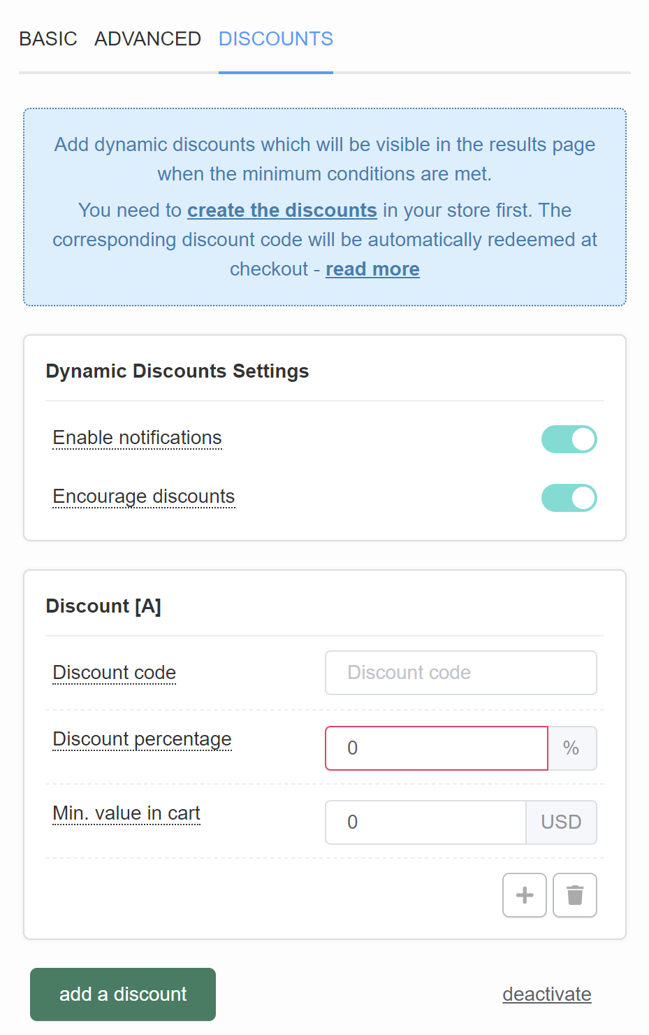
Dynamic Discounts Settings
- Enable notifications – A toast notification will appear when a customer qualifies for a discount. Toggle to enable/disable.
- Encourage discounts – The notification will also include a message telling the customer how close they are to receiving the next highest discount. Toggle to enable/disable.
Discount [A]
- Discount code – Type a discount code that corresponds to this discount. You have to set up this discount code in your store > Shopify Discounts first. Follow this guide to learn How to add a discount to the quiz.
- Discount percentage – Type the discount %. The percentage discount will be visible in the results page products. The discount code will be automatically redeemed at checkout.
- Min. value in cart – Type the value of products added to the cart on the results page above which the discount will be applied.
- + / add another discount – adds a new dynamic discount (Discount [B]).
- bin / delete this discount – deletes this dynamic discount.
add a discount – Adds a new dynamic discount below (Discount [B]).
deactivate – Deactivates dynamic discounts.
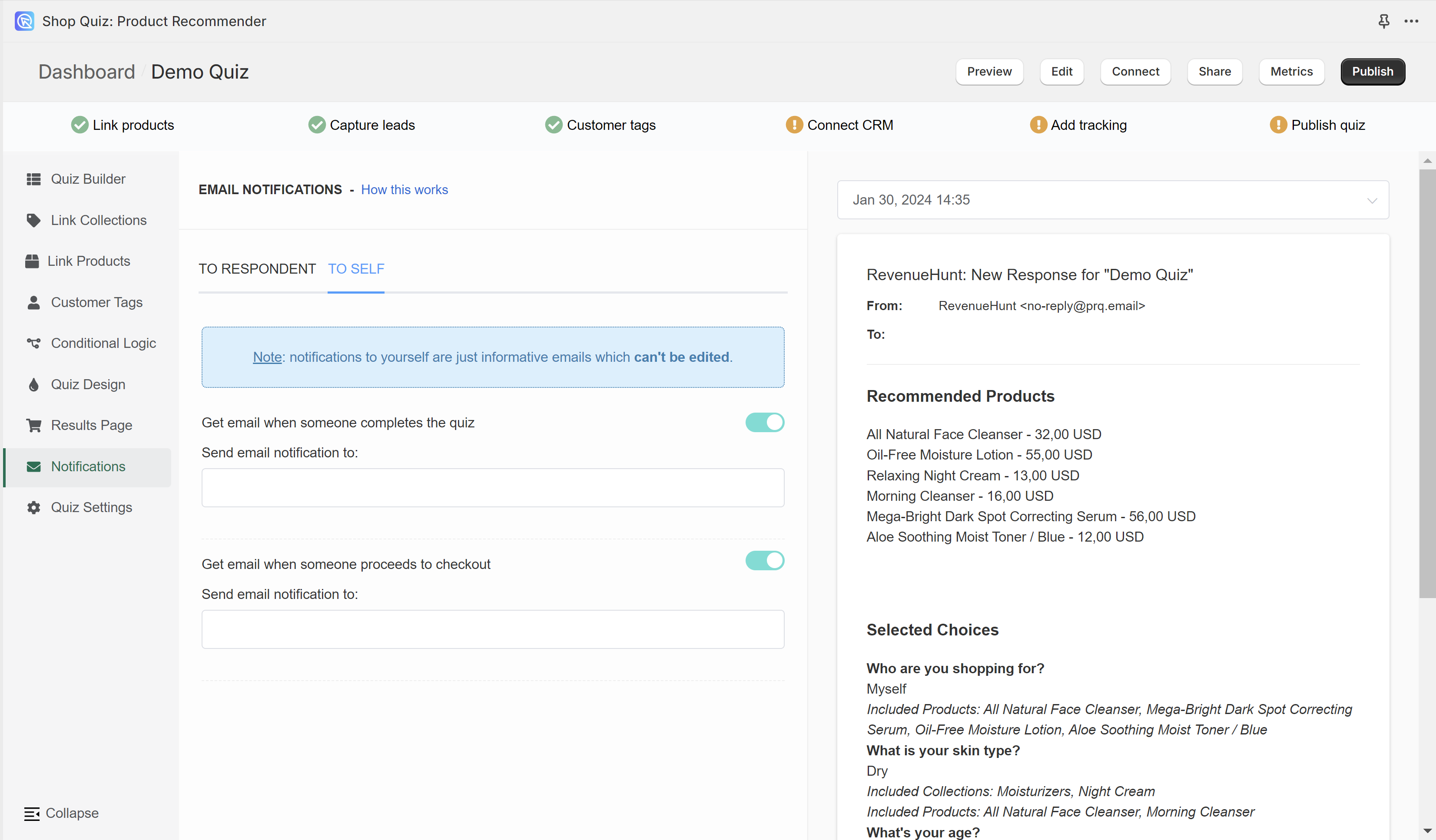
Notifications
In the Notifications tab of the Quiz Builder, you can activate and edit the emails that the customer or the store owner receives at the end of the quiz.
TO RESPONDENT
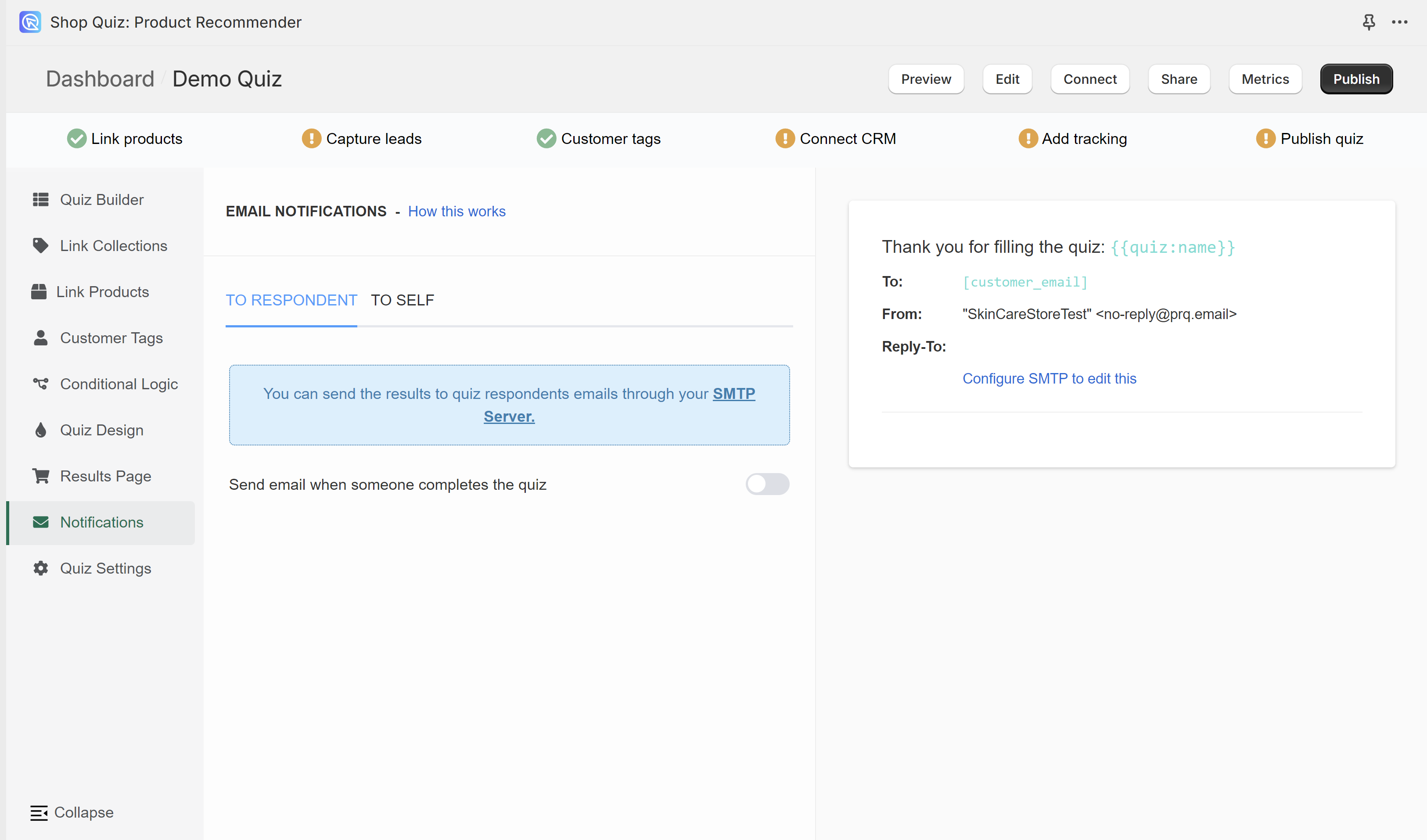
You need to have one email question in order to send notifications to the respondents. Check the Quiz Builder section to add an email question to your quiz.
To activate notification emails to the quiz takers, toggle the “Send email when someone completes the quiz” option on. Additional customization options will appear.
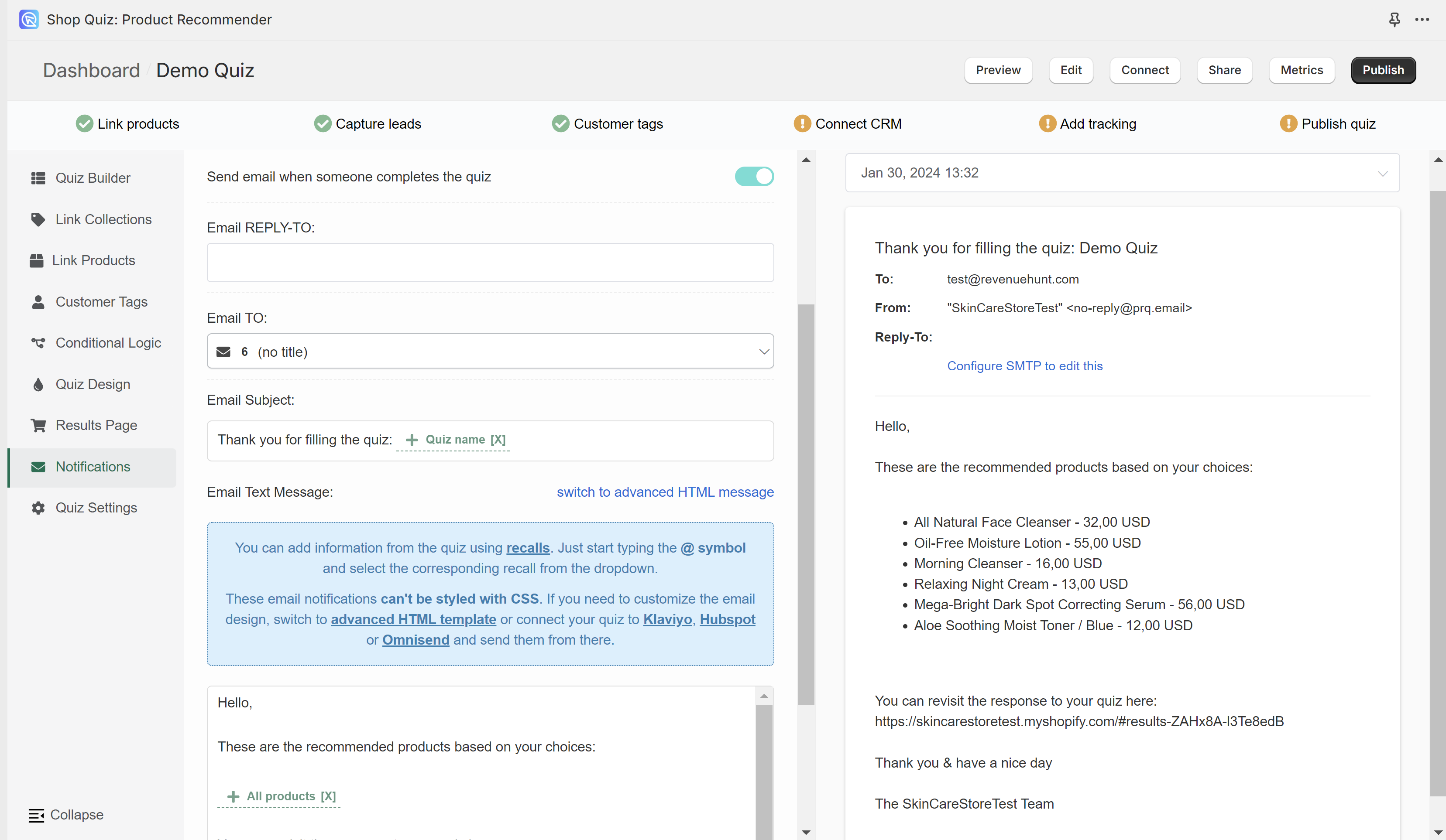
TO RESPONDENT section displays the email settings on the left and the email preview on the right.

Select a response from the list to preview how the email will look like.
Email REPLY_TO: – Fill in the email address to which the customer will be able to send a reply.
Email TO: – Select from which email question (in case of multiple email questions) the customer’s address should be taken in order to send the resutls.
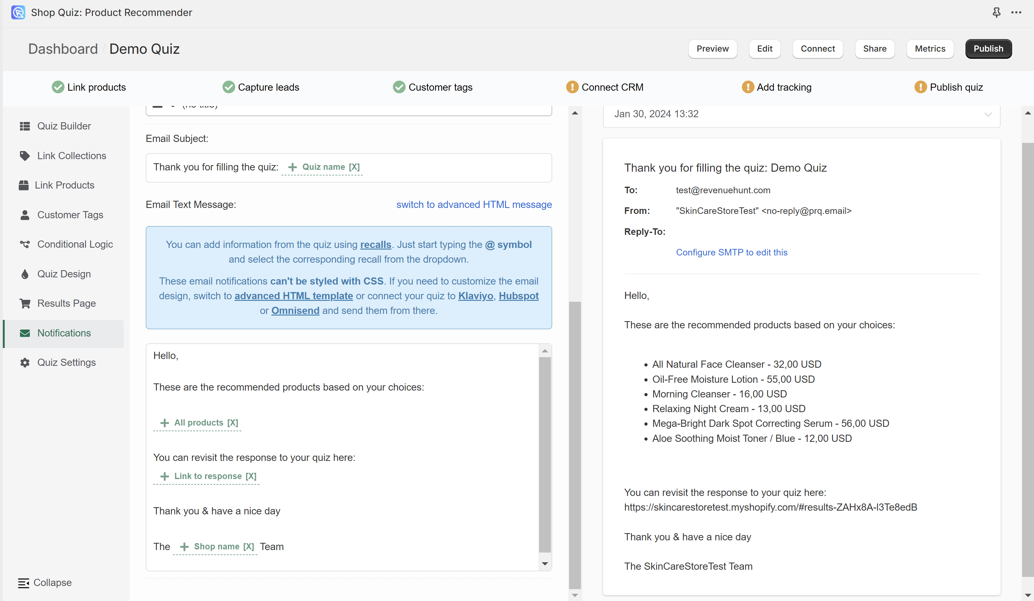
Email Subject: – Type in the email subject that the customer will see in their inbox. You can use Information Recalls to recall information in this text field (for example customer name, quiz name, answer to a specific question, etc.)
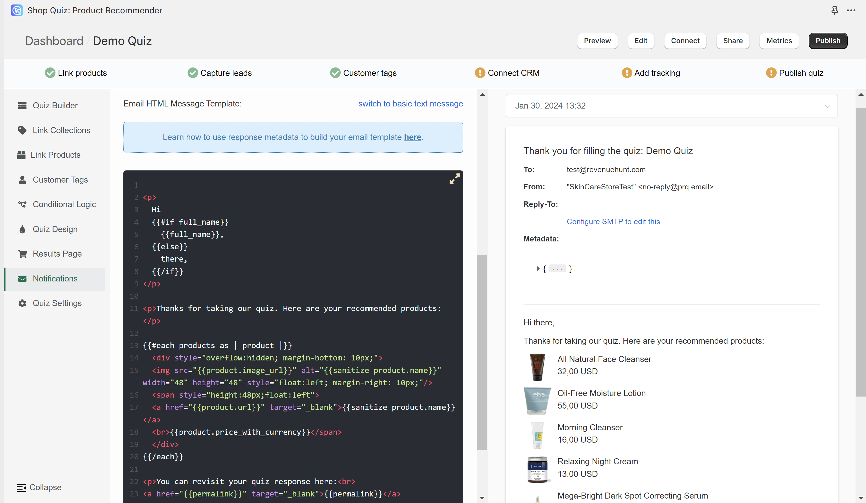
Email Text Message – Edit the content of the email sent to the customer. You can choose between the Basic text email template (cannot be styled) or an advanced HTML email template (can be styled and allows to display product images).
- switch to advanced HTML message – Switches to the advanced HTML email template. Email can be edited with HTML and metadata can be included with Handlebars.
- switch to basic text message – Switched to the basic text email template. Email can be edited with regular text. You can use Information Recalls to recall information in this text field (for example customer name, quiz name, recommended products, answers to questions, etc.).
TO SELF
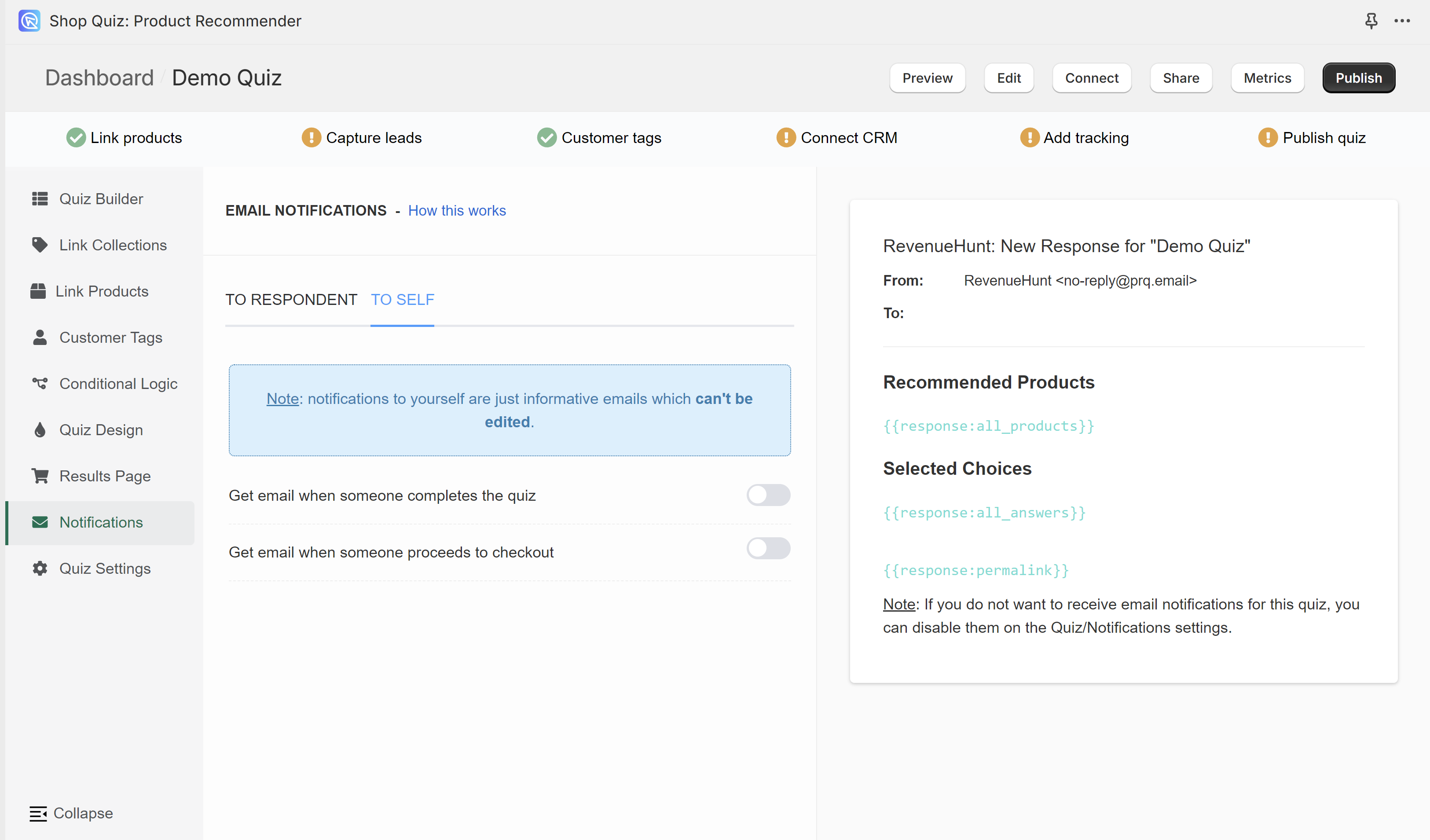
Get email when someone completes the quiz – You’ll receive an email as shown on the preview to the provided email address whenever someone reaches the results page. This email template cannot be edited.
Get email when someone proceedes to checkout – You’ll receive an email as shown on the preview to the provided email address whenever someone reaches the results page and proceeds to checkout/cart. This email template cannot be edited.
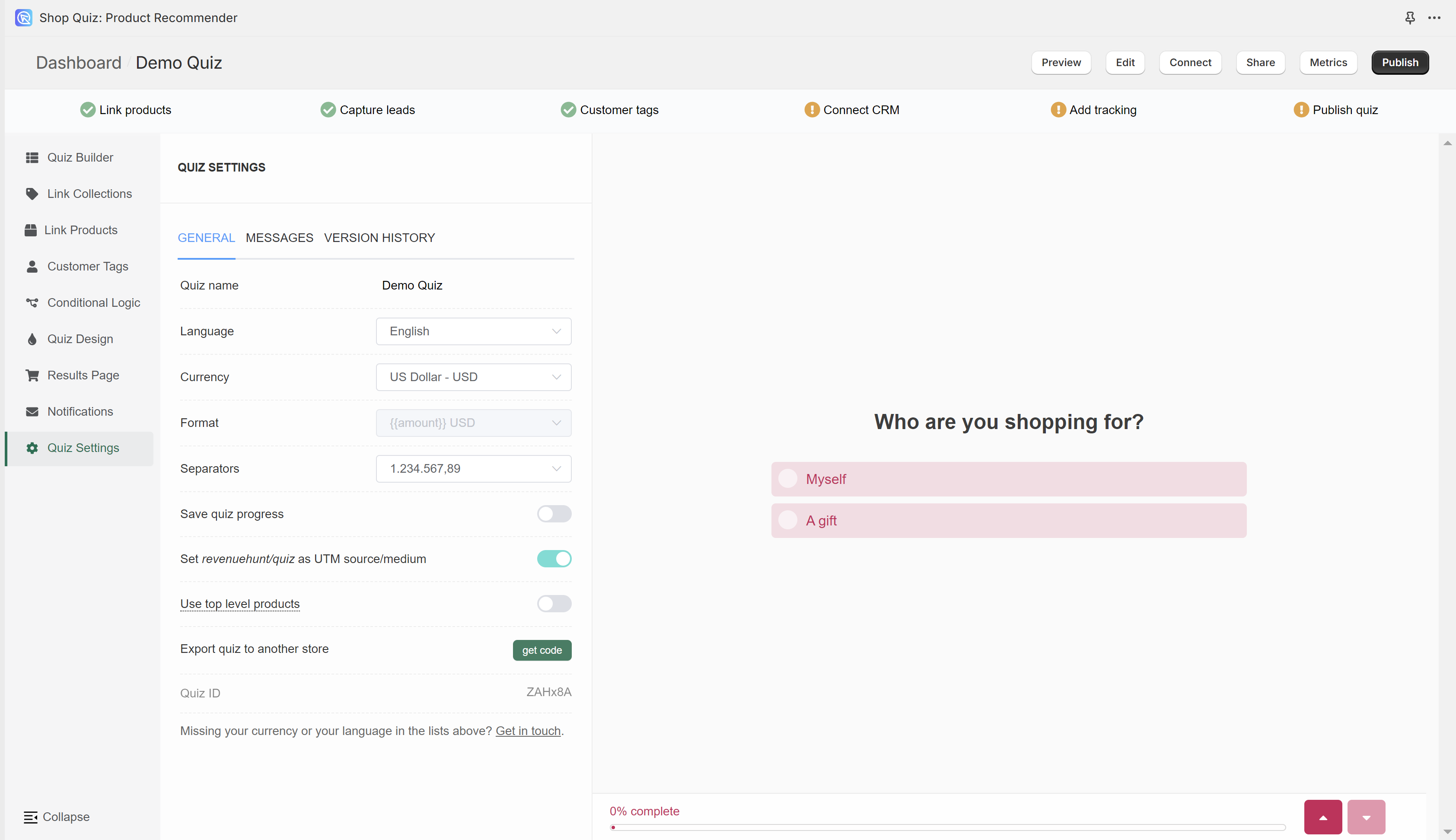
Quiz Settings
In Quiz Settings you can adjust the quiz language or currency, edit button translations and placeholder texts or restore a previously publsihed version of the quiz.
GENERAL
Quiz name – Click on the field to edit the quiz name.
Language – Choose a language from a dropdownlist to change the text on the quiz buttons and placeholders into that language.
Currency – Choose from a dropdown in which currency the product price should be displayes.
Format – For some currencies, you can choose the format in which the currency symbol will be displayed (before/after the price value).
Separators – Choose from a dropdown how the currency number should be displayed.
Save quiz progress – Activating this setting will allow the quiz to rememeber where the use left the quiz and show it from that moment when they visit the quiz page again. (For example, if the user finished the quiz and they return to it, they will see their reuslt page instead of the first slide.) Toggle to activate.
Set revenuehunt/quiz as UTM source/medium – Deactivating this setting will remove revenuehunt/quiz as a source/medium in your trackign integrations (such as Google Analytics or Facebook Pixel).
Use top level product – Activating this setting will merge all the product variants onto the main product in the Link Porducts section of the app, allowing you to easily link all variants of the same product to choices at once. Activating this setting will cause a refresh of the quiz page. Changes can be observed in the Link Products tab. All the products affected by this setting will show an [ALL VARIANTS] suffix.
Export quiz to another store – Clicking “get code” generates a unique piece of code that allows you to copy the entrie quiz from one store to another that’s using our solution. Check How to copy the quiz from one store to another for detailed instructions.
Quiz ID – Displays the current quiz ID.
MESSSAGES
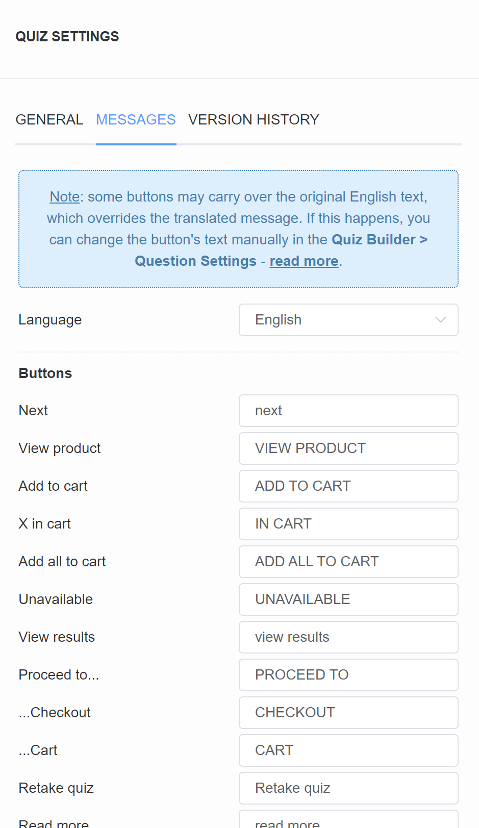
Language – Choose a language from a dropdownlist to change the text on the quiz buttons and placeholders into that language.
Buttons
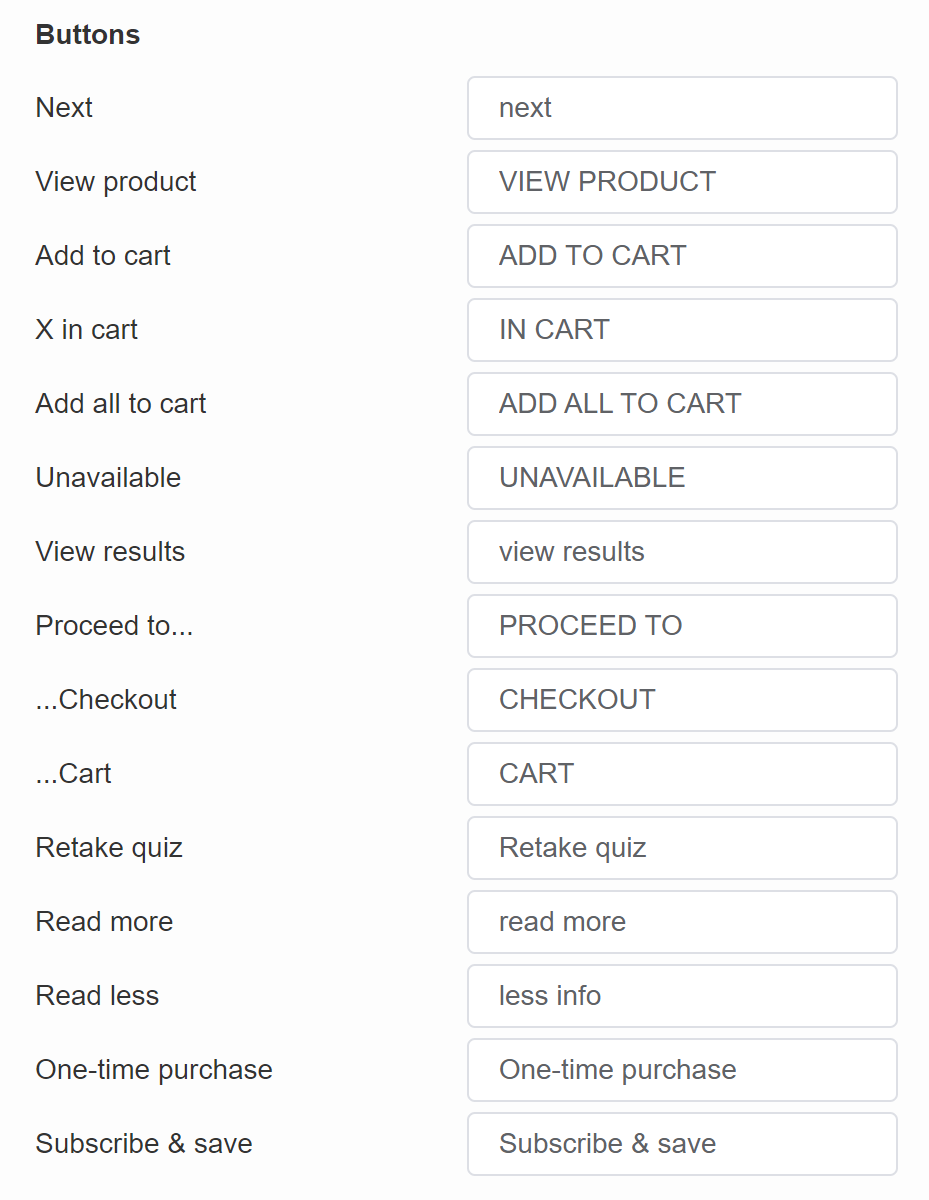
- Next – Default text on the buttons that move the user to the next slide. | Quiz
- View product – Default text on the product CTA button when checkout settings are set to “Link to Product”. | Results Page
- Add to cart – Default text on the product CTA button when checkout settings are set to “Add to Cart”. | Results Page
- X in cart – Default text on the CTA button when a customer added something to the cart when checkout settings are set to “Add to Cart”. | Results Page
- Add all to cart – Default text on the CTA button when a customer did not add anything to the cart yet when checkout settings are set to “Add to Cart”. | Results Page
- Unavailable – Default text on the product CTA button when the product is out of stock when checkout settings are set to “Add to Cart”. | Results Page
- View results – Default text on the button on the “Thank You” slide type. | Quiz
- Proceed to… – Default text on the product CTA button when checkout settings are set to “Add to Cart”. | Results Page
- …Checkout – Default text on the product CTA button when checkout settings are set to “Add to Cart” and “Go to checkout”. | Results Page
- …Cart – Default text on the product CTA button when checkout settings are set to “Add to Cart” and “Go to cart”. | Results Page
- Retake quiz – Default text on the button that allows the user to retake the quiz. | Results Page
- Read more – Default text on the product tile that opens the extended product description. | Results Page
- One-time purchase – Default text that allows to add to cart a single-purchase variant of the product if a product is a subscription product. | Results Page
- Subscribe & save – Default text that allows to add to cart a reoccurring-purchase variant of the product if a product is a subscription product. | Results Page
Placeholders
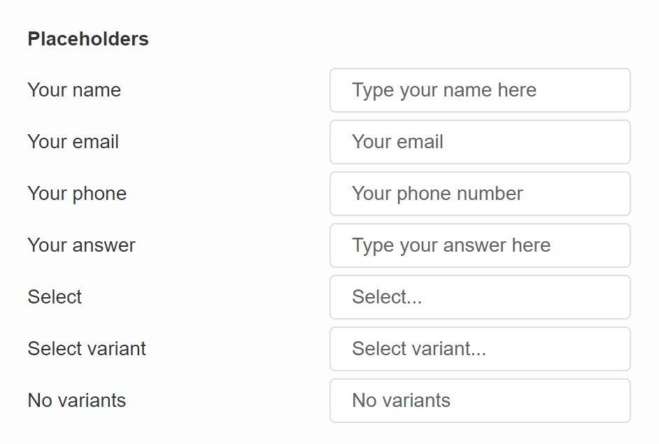
- Your name – Default placeholder text on the name question slides. | Quiz
- Your email – Default placeholder text on the email question slides. | Quiz
- Your phone – Default placeholder text on the phone question slides. | Quiz
- Select – Default text on the product tile if the recommended product has variants grouped. | Results Page
- Select variant – Default text on the product tile if the recommended product has variants grouped. | Results Page
- No variants – Default text on the product tile if the product has variants grouped but the product has no variants. | Results Page
Helpers
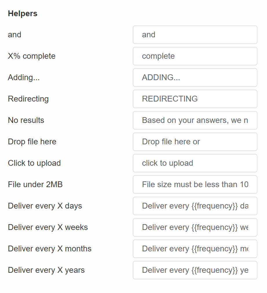
- and – Default text used in Information Recalls when recalling answers from multiple-selection questions. | Quiz & Results Page
- X% complete – Default text on the quiz progress bar. | Quiz
- Adding… – Default text when adding a product to the cart. | Results Page
- Redirecting – Default text when redirecting the user from the results page. | Results Page
- No results – – Default text displayed when the quiz cannot produce recommendations. (For example, no product were upvoted or there are no products that match all the customer criteria.) | Results Page
- Drop file here – Default text on the file upload question slides. | Quiz
- Click to upload – Default text on the file upload question slides. | Quiz
- File under 2MB – Default text on the file upload question slides. | Quiz
- Delivery every X days – Default text that allows to add to cart a reoccurring-purchase variant of the product if a product is a subscription product. | Results Page
- Delivery every X weeks – Default text that allows to add to cart a reoccurring-purchase variant of the product if a product is a subscription product. | Results Page
- Delivery every X months – Default text that allows to add to cart a reoccurring-purchase variant of the product if a product is a subscription product. | Results Page
- Delivery every X years – Default text that allows to add to cart a reoccurring-purchase variant of the product if a product is a subscription product. | Results Page
Discount Notifications
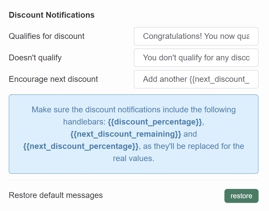
- Qualifies for discount – Default text when dynamic discounts are active in the quiz. | Results Page
- Doesn’t qualify – Default text when dynamic discounts are active in the quiz. | Results Page
- Encourage next discount – Default text when dynamic discounts are active in the quiz. | Results Page
Restore default messages – Click “restore” to set all fields back to default.
VERSION HISTORY
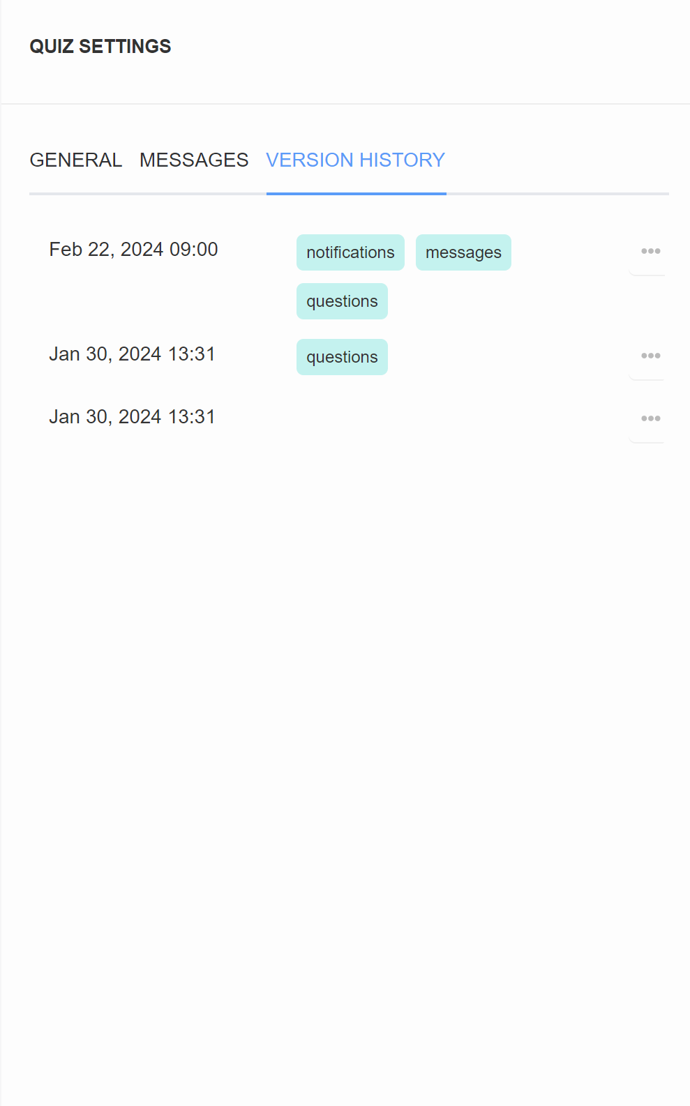
In the Version History section of Quiz Settings, you will find all the published versions of the quiz. Each version is time-stamped with the publishing date. Tags such as “questions”, “notifications” indicate what changes were made in this version of the quiz.
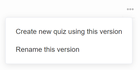
… – Click to open the restore menu.
- Create a new quiz using this version – Create a new quiz on our dashboard based on this version of the current quiz.
- Rename this version – Allows you to rename this saved version of the quiz.
Connect
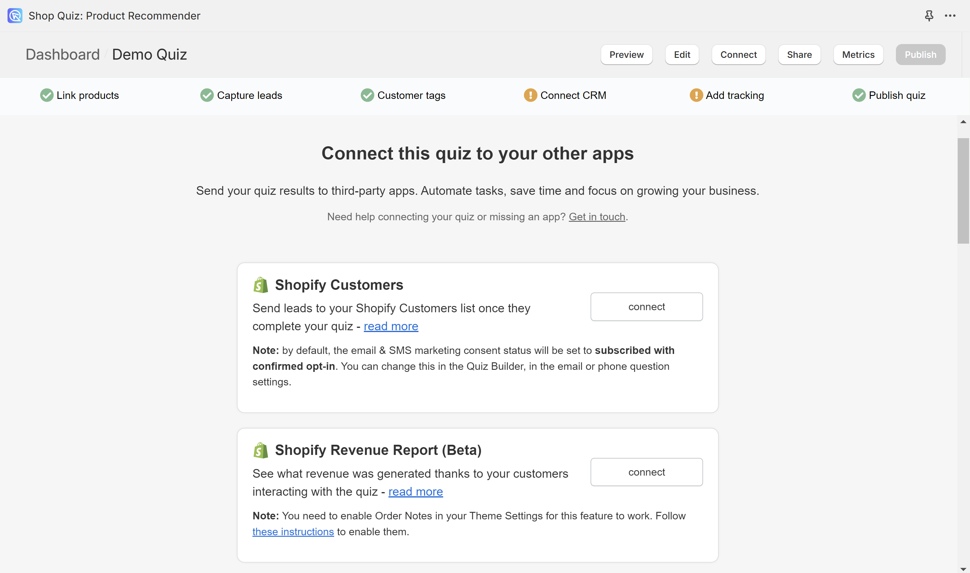
In the Connect tab of the Quiz Builder, you can connect your quiz to third-party services. Check here for the up-to-date list of our integrations.
To connect the quiz to a particular service, find it on the page and click “Connect”. Then follow the instructions displayed in the browser or in the “read more” section.
Share
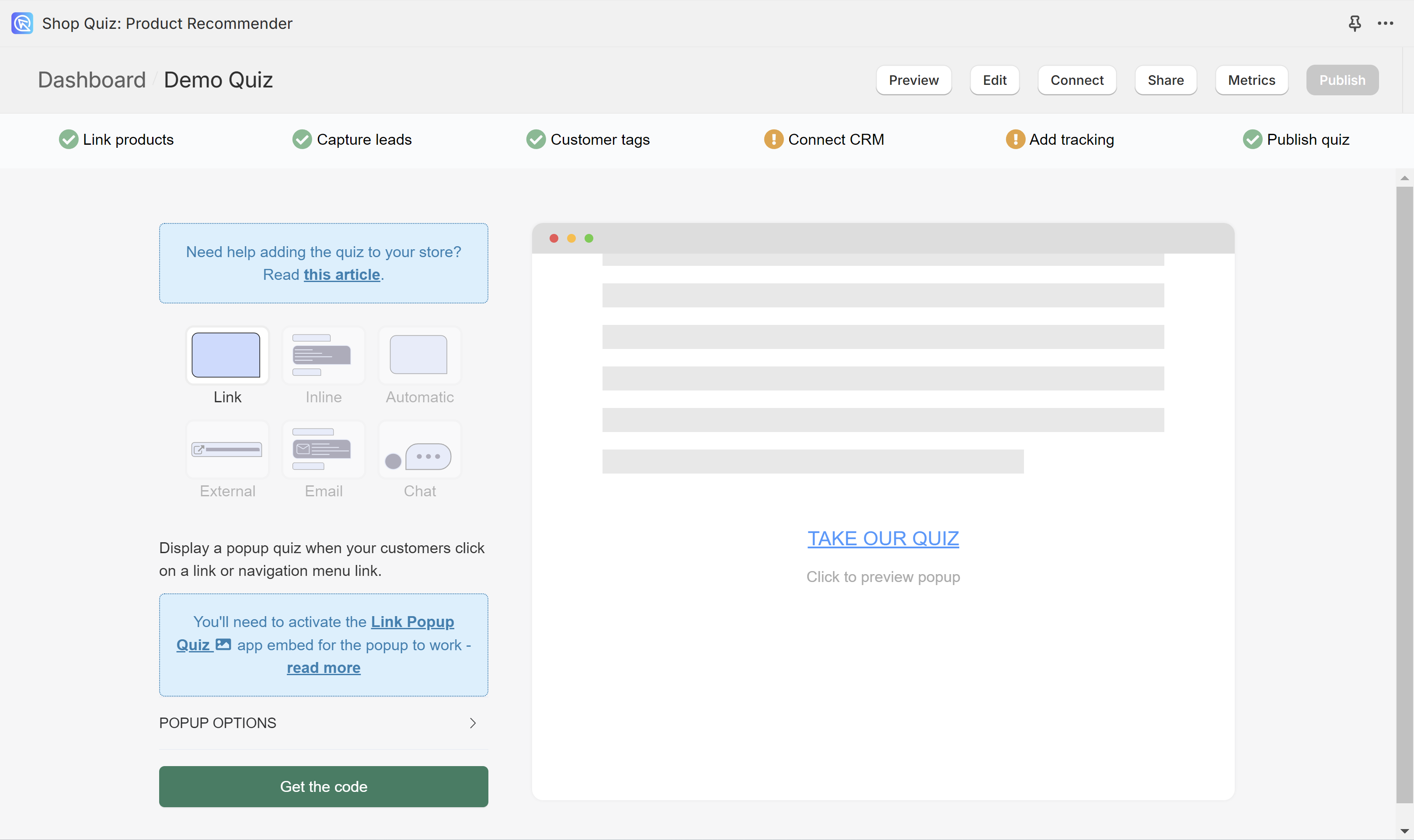
In the Share tab of the Quiz Builder, you can choose how to publish the quiz on your website or how to share it with your customers. Click on the option tiles to see instructions and extra settings.
For step-by-step instructions check How to Publish the Quiz guide.
Link
A link that will open the quiz as a popup over your page.
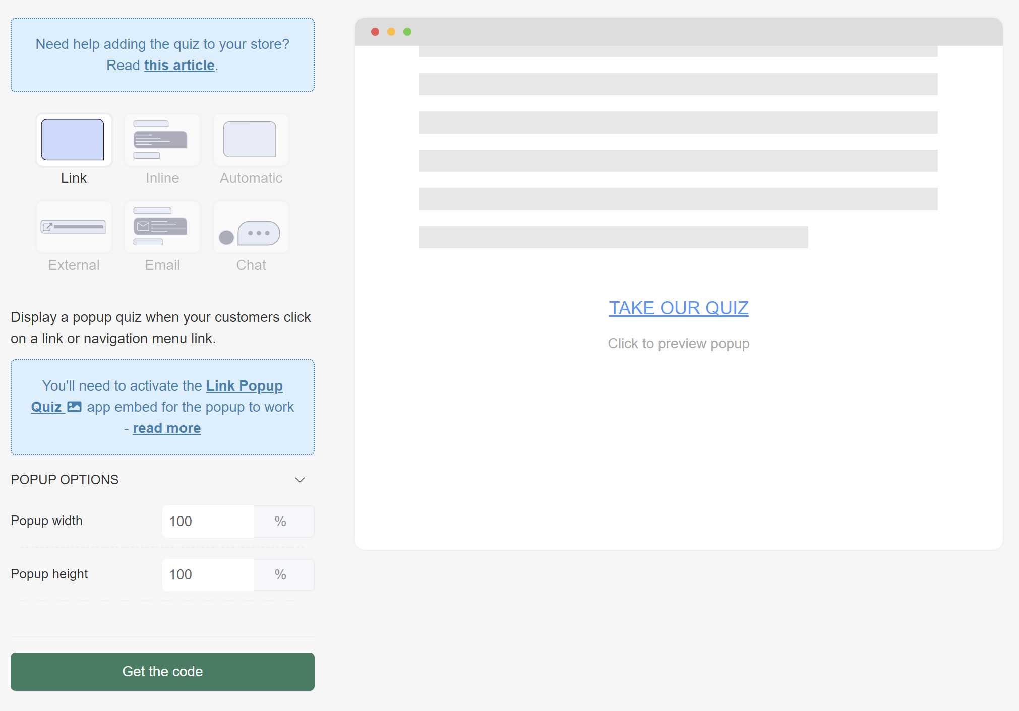
- POPUP OPTIONS
- Popup width – Adjust the width of the quiz by typing the percentage number.
- Popup height – Adjust the width of the quiz by typing the percentage number.
Inline
Quiz embedded inline with a page.
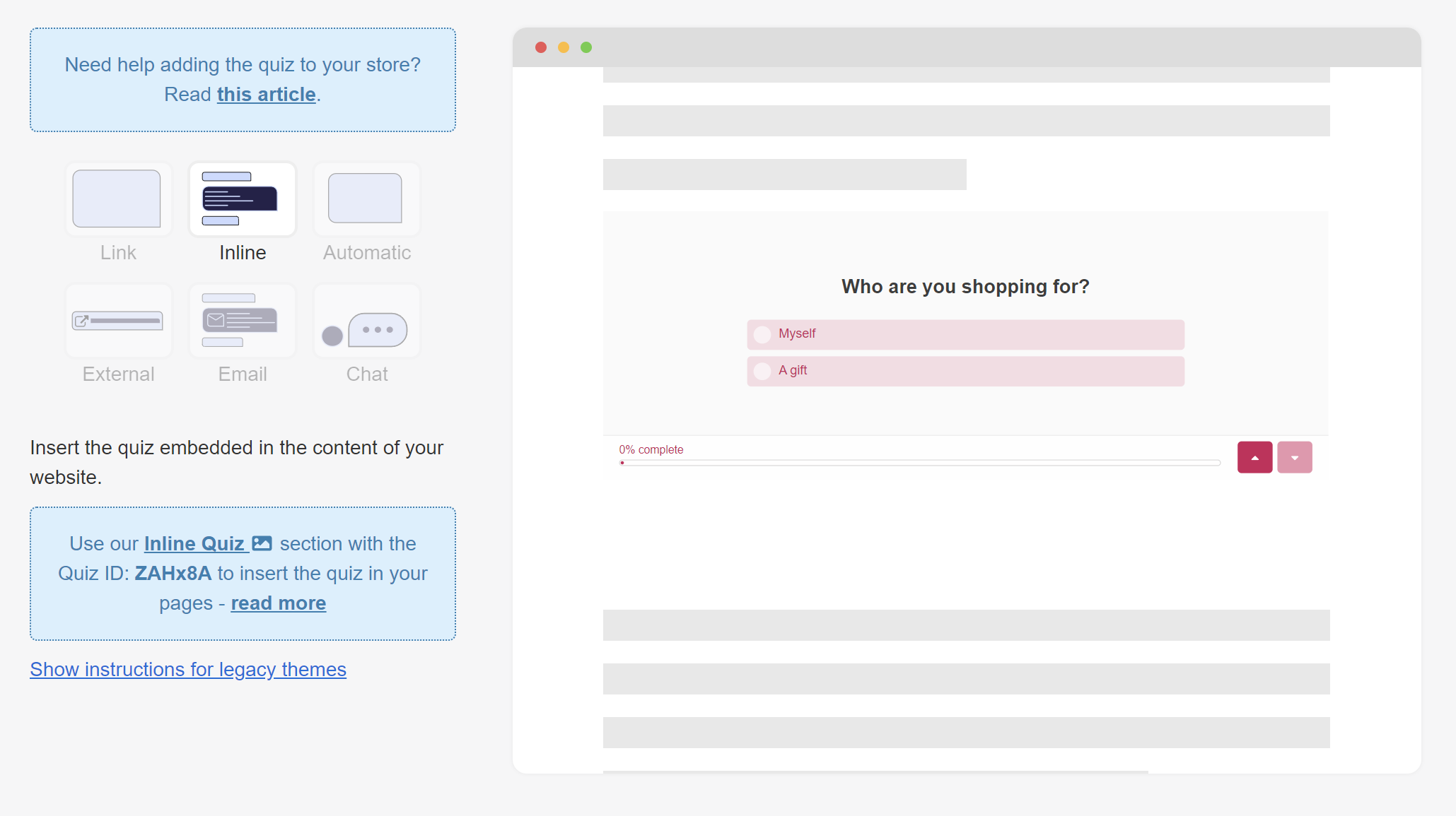
Instructions for legacy themes – Opens extra settings menu.
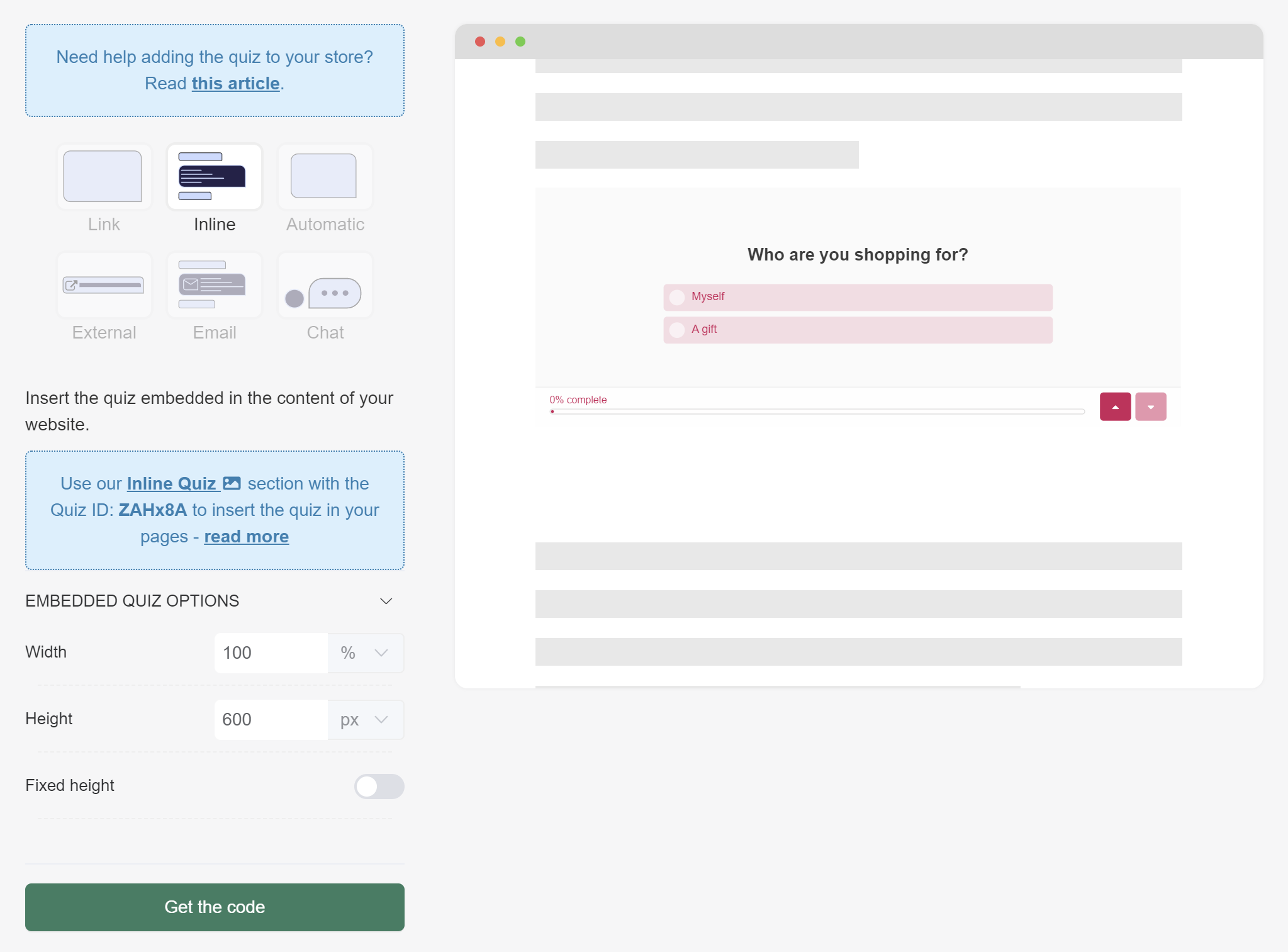
- EMBEDDED QUIZ OPTIONS
- Width – Adjust the width of the quiz by typing the percentage number or px value.
- Height – Adjust the width of the quiz by typing the percentage number or px value.
- Fixed height – Will set a fixed height of the quiz iframe as specified in the Height field above. Toggle to activate.
Automatic
A quiz popup appears after X seconds.
By default, the popup is only shown once per session.
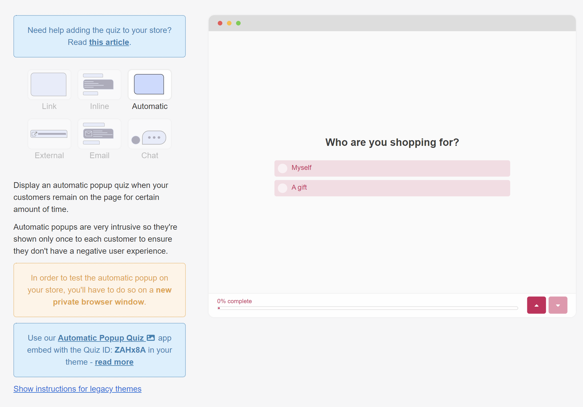
Instructions for legacy themes – Opens extra settings menu.
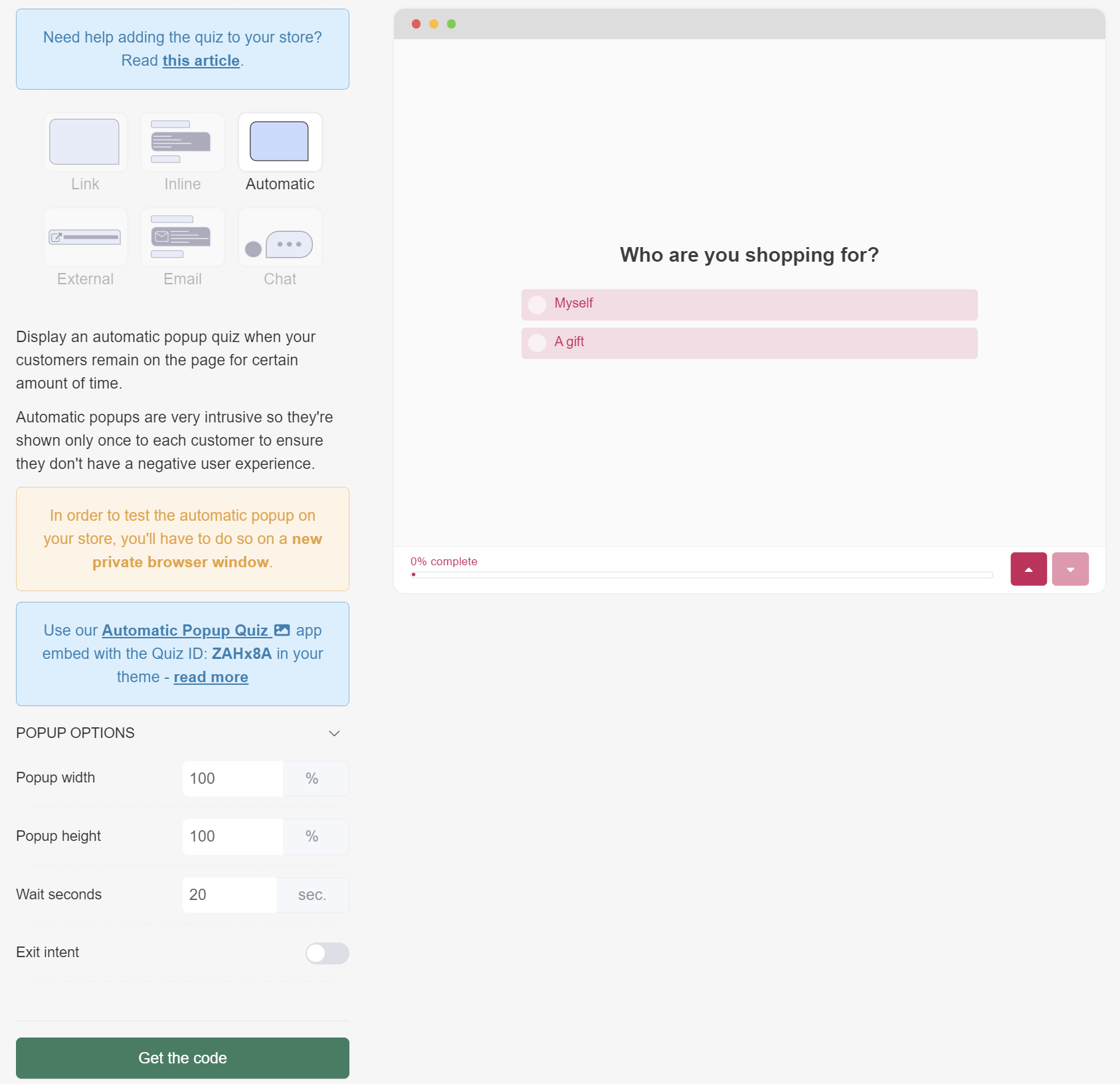
- POPUP OPTIONS
- Popup width – Adjust the width of the quiz by typing the percentage number.
- Popup height – Adjust the width of the quiz by typing the percentage number.
- Wait seconds – Set up the number of seconds after which the quiz popup will be automatically displayed. Note: Do not set a value to 0.
- Exit intent – Show the automatic popup when the customer is exit intent. Toggle to activate.
External
Direct link to the quiz for social media.
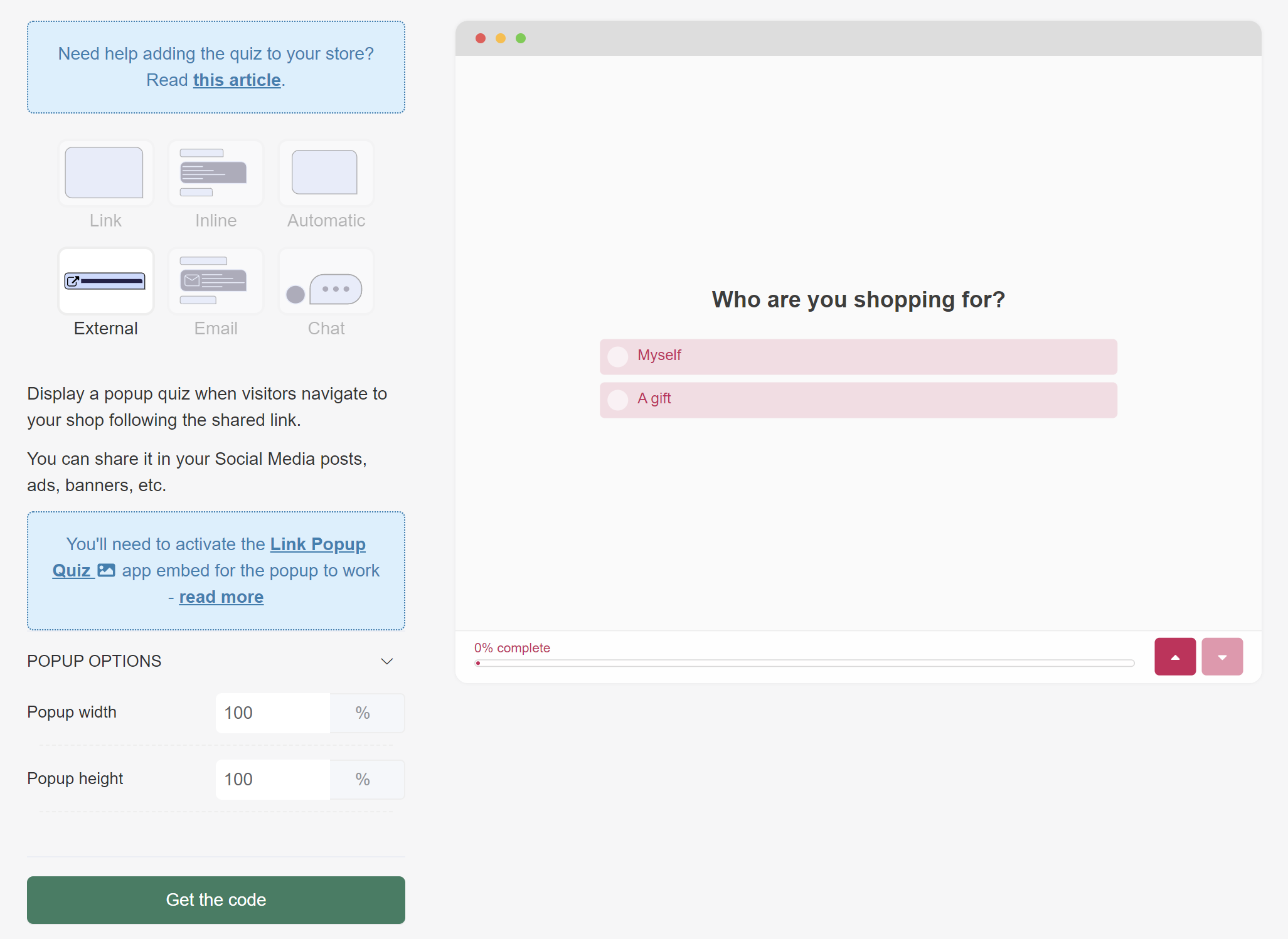
- POPUP OPTIONS
- Popup width – Adjust the width of the quiz by typing the percentage number.
- Popup height – Adjust the width of the quiz by typing the percentage number.
Quiz popup when someone clicks on this email link.
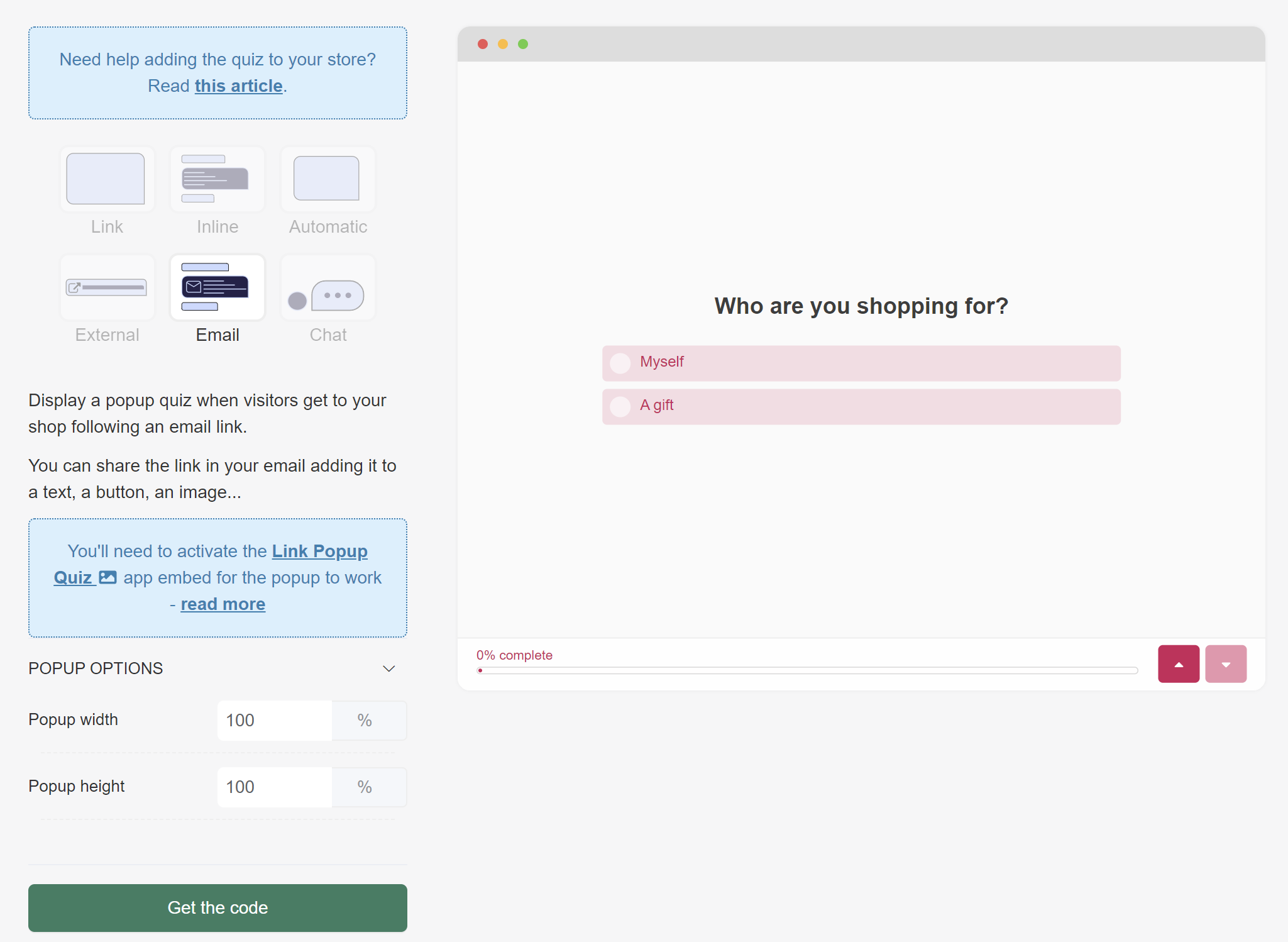
- POPUP OPTIONS
- Popup width – Adjust the width of the quiz by typing the percentage number.
- Popup height – Adjust the width of the quiz by typing the percentage number.
Chat
Quiz popup when visitors click on a chat-like button.
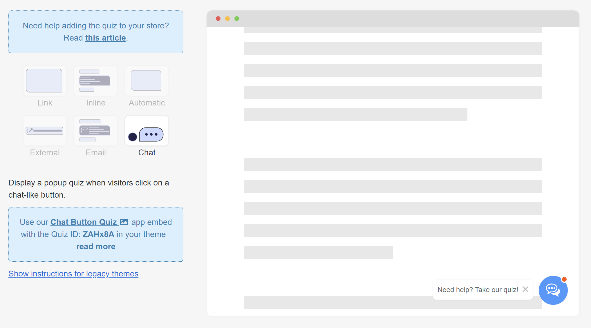
Instructions for legacy themes – Opens extra settings menu.
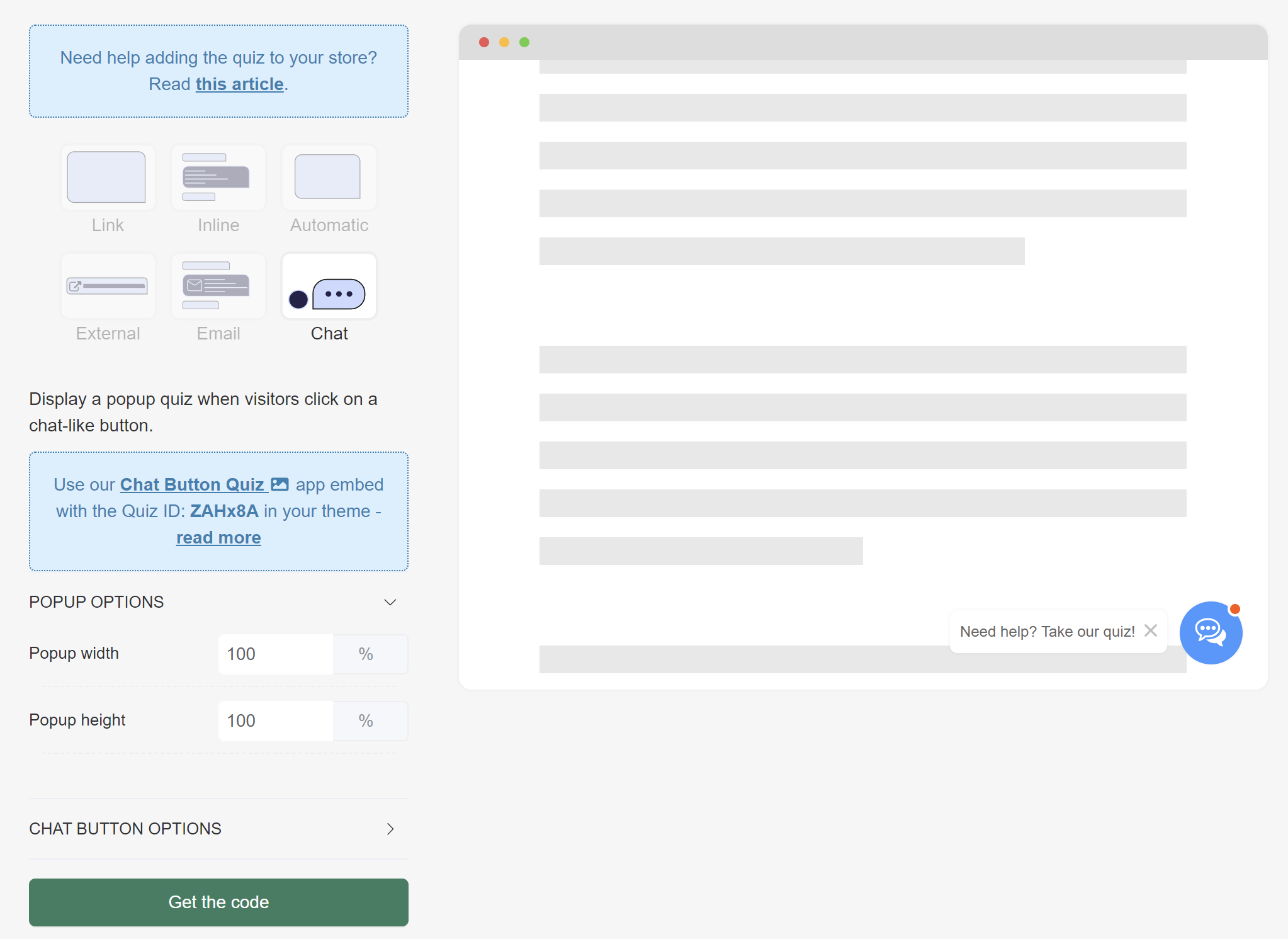
- POPUP OPTIONS
- Popup width – Adjust the width of the quiz by typing the percentage number.
- Popup height – Adjust the width of the quiz by typing the percentage number.
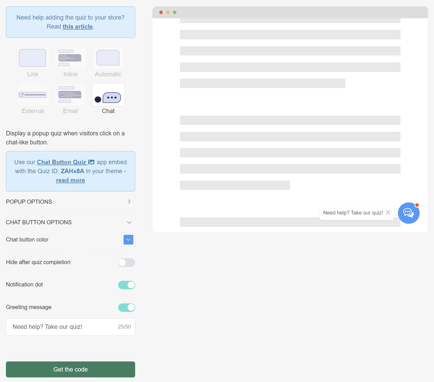
- CHAT BUTTON OPTIONS
- Chat button color – Adjust the color of the chat button by selecting one from the tool or adding a #color.
- Hide after quiz completion – Hide the chat button after the customer reaches the resutls page. Toggle to activate.
- Notification dot – Show the small red notification dot on the chat icon. Toggle to activate.
- Greeting message – Show and edit the greeting message displayed next to the chat icon. Toggle to activate.
Metrics
In the Metrics section of the Quiz Builder, you can find individual quiz responses and analytics.
responses
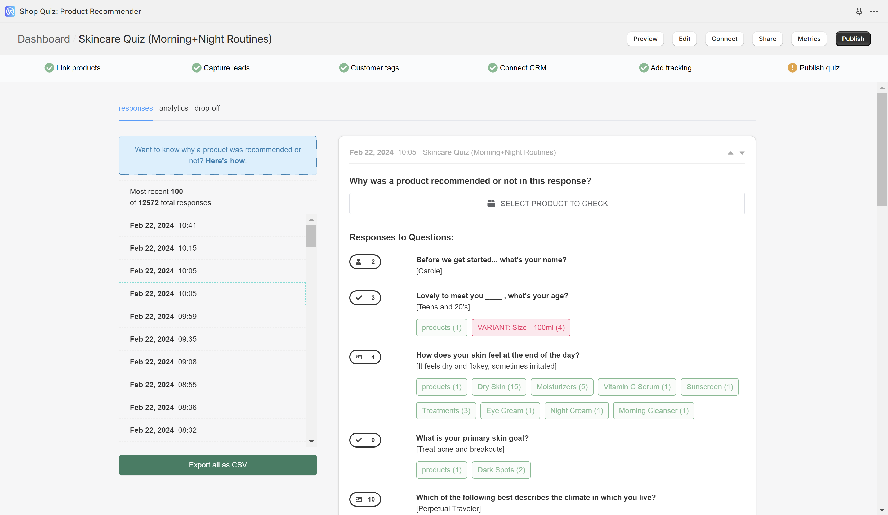
On the left-hand side menu, you’ll find the most recent 100 responses the quiz received organized by date/timestamp. Click on a date to open a specific response.
Export all as CSV – Click to generate a CSV file with all the quiz responses from the last 90 days. Once ready, a downloadable link will show up on your dashboard once the CSV file is finished generating.
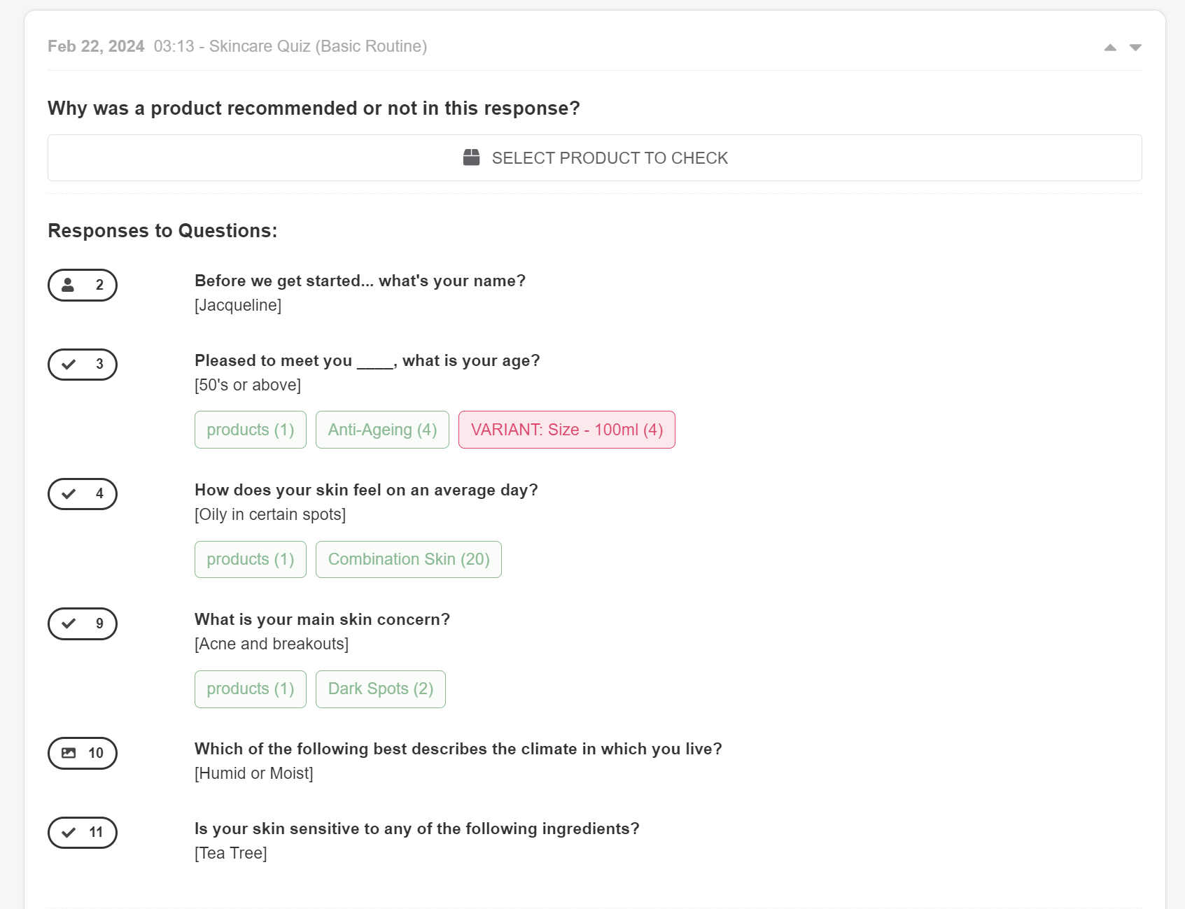
Why was a product recommended or not in this response? – This section of the app
SELECT PRODUCT TO CHECK – Click to select a product from the catalog and analyze it against the response.
Responses to Questions: – This section displays all the quiz questions, the answers the customer provided and the products/collections that were upvoted or excluded in each question.
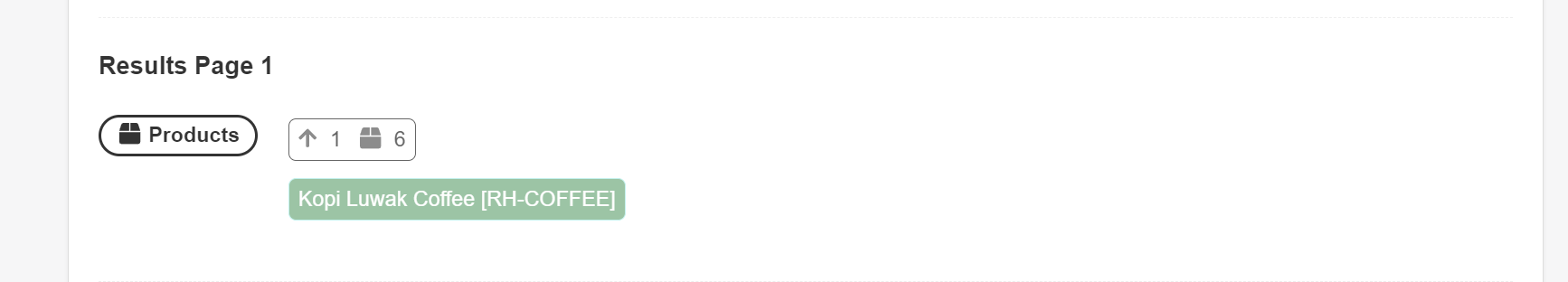
Results Page 1 – Displays the name of the results page recommended.
Products – Products were recommended in a Product block.
↑1 🎁6 – Minimum number of votes that allow the product to be shown in this product block: 1; Maximum number of products that are allowed to be shown in this product block: 6.
Kopi Luwak Coffee / Product name – Displays the name of the product recommended in this product block. Hover over the product to see how many upvotes it received in the quiz.
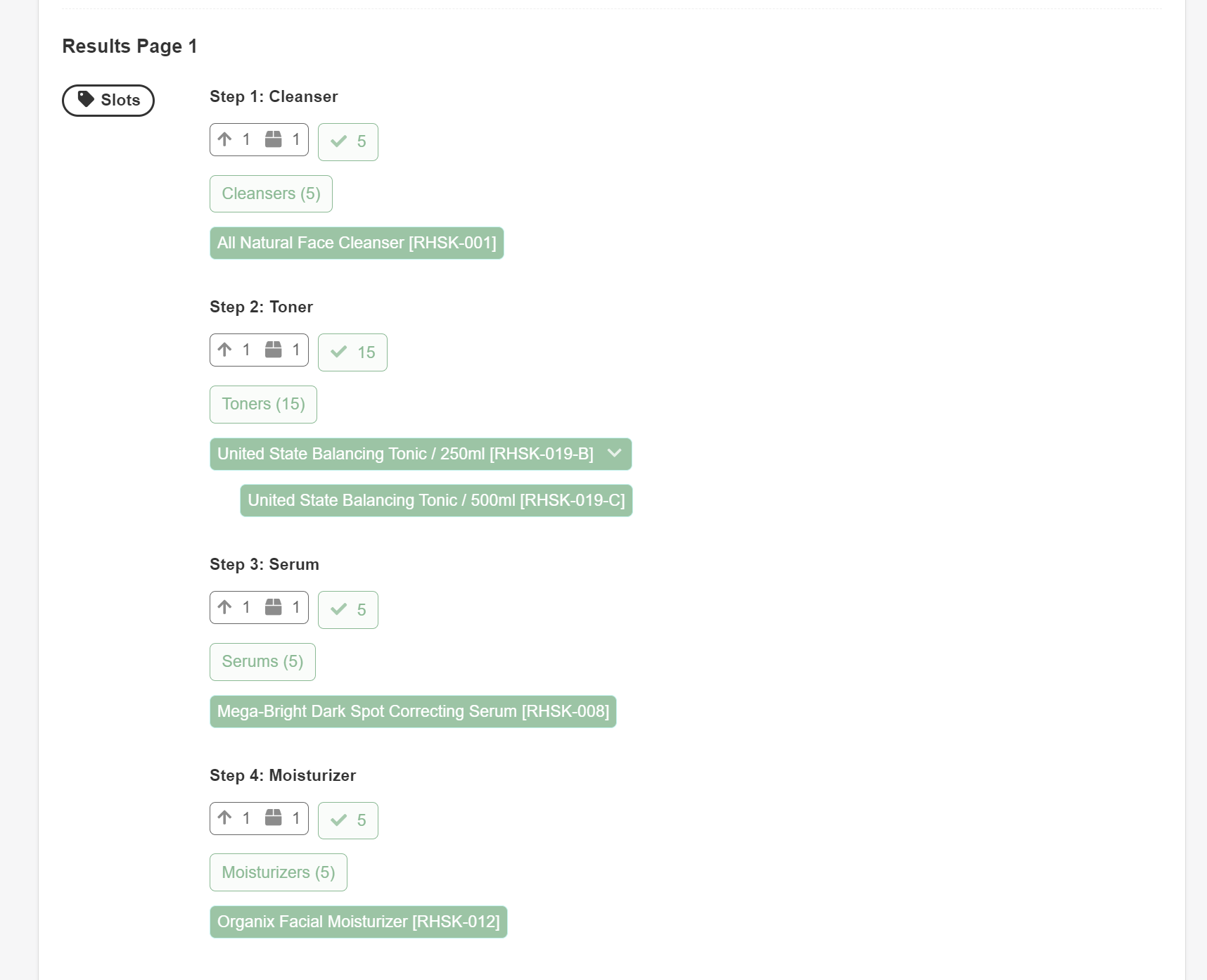
Results Page 1 – Displays the name of the results page recommended.
Slots – Products were recommended in a Slots block.
Step 1: Cleanser / Slot Title – Displays the title of the Slot block.
↑1 🎁1 – Minimum number of votes that allow the product to be shown in this slots block: 1; Maximum number of products that are allowed to be shown in this slots block: 1.
✅5 – Displays which products this slot will allow to be displayed.
Cleansers (5) / Collection (x) – Displays the collections which are linked to this slot.
All Natural Face Cleanser – Displays the name of the product recommended in this slot block. Hover over the product to see how many upvotes it received in the quiz.
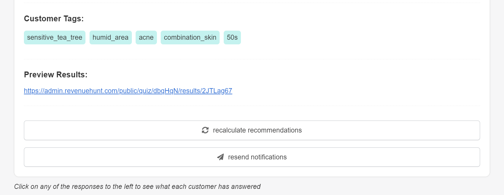
Customer Tags: – Displays the customer tags that were recorded in this response.
Preview Results: – Displays a preview link which opens this response on the results page.
recalculate recommendations – Recalculate the responses according to the current quiz setup.
resend notifications – Triggers the response again, which results in all the data being re-sent. This will cause the emails or data redirections to integrations to be triggered again.
analytics
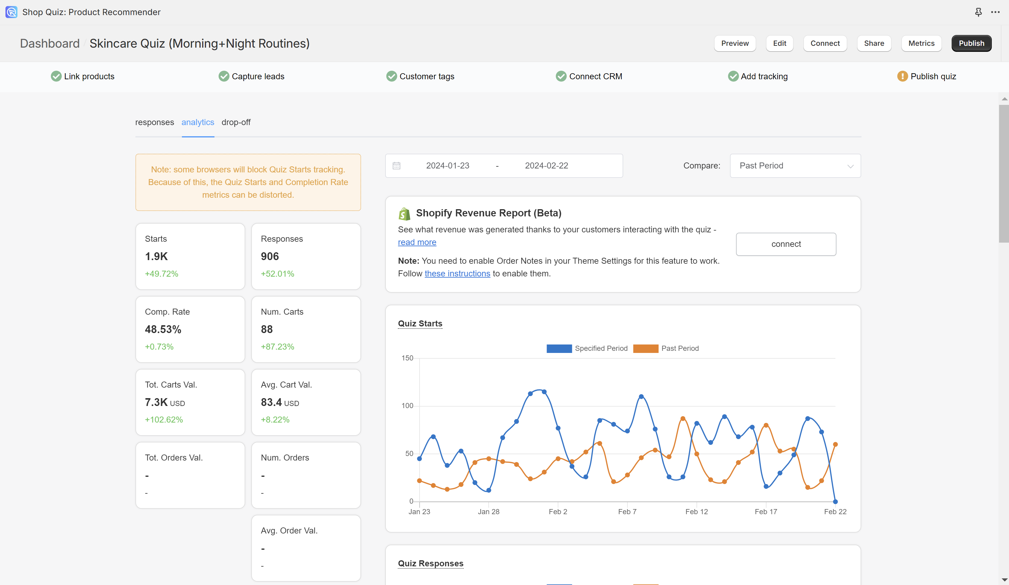
The data in the graphs are totals in a selected period of time for a selected quiz.

To change the dates click on the 📆 icon. You can change the period to select it from the moment you started using the quiz or from a given date.
Compare: – Choose how you want to compare the data in the graphs.
- Part Period – Presents data against the values from the previous 30 days.
- Quiz – Choose a quiz name against which you want to compare the metrics against.
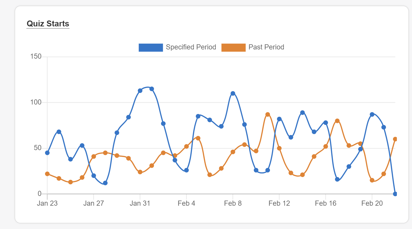
Quiz Starts / Starts – Number of people who have engaged with the quiz and have passed the first slide (clicked on the “start quiz” button or answered the first question).
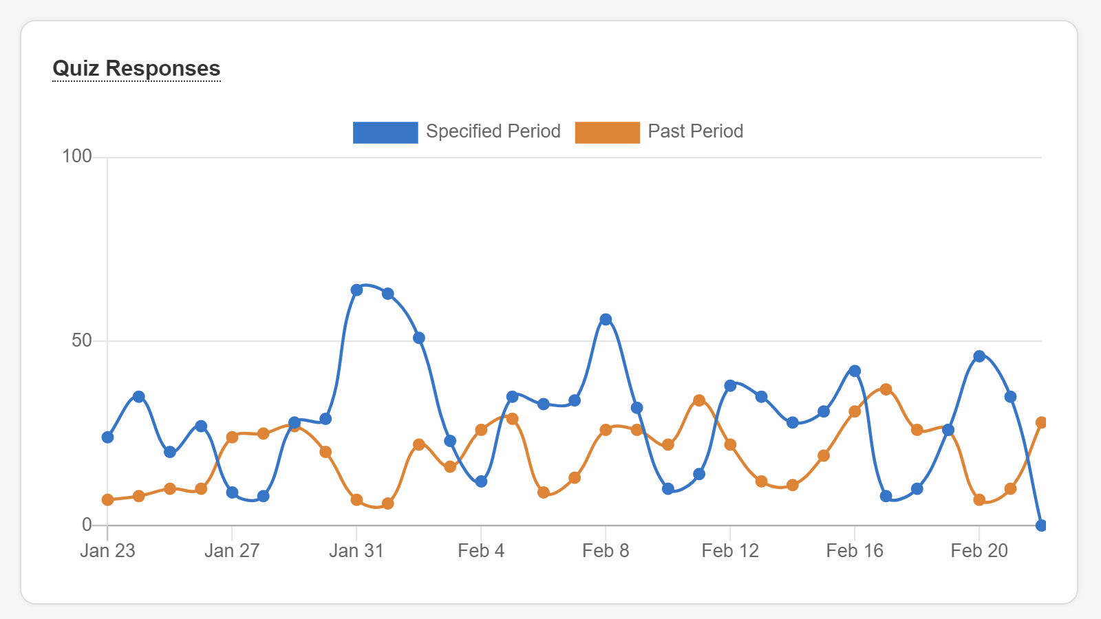
Quiz Responses / Responses – Number of people who have completed the quiz. Test responses (completed via the Test quiz button) are deleted from your metrics after one hour.
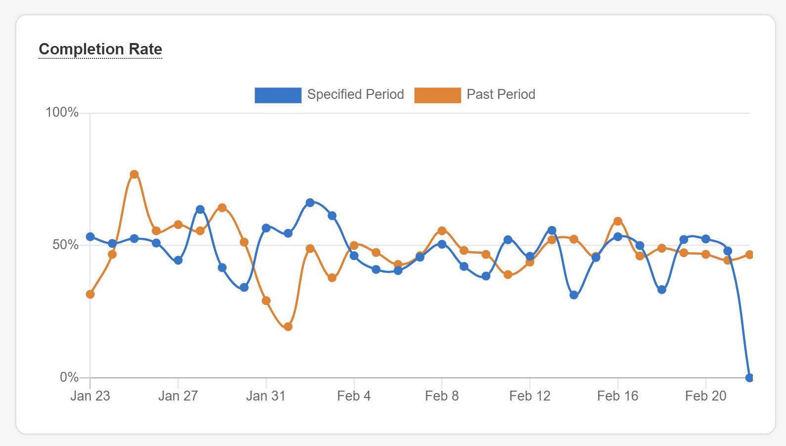
Completion Rate / Comp. Rate – Percentage of people who have engaged with the quiz and completed it.
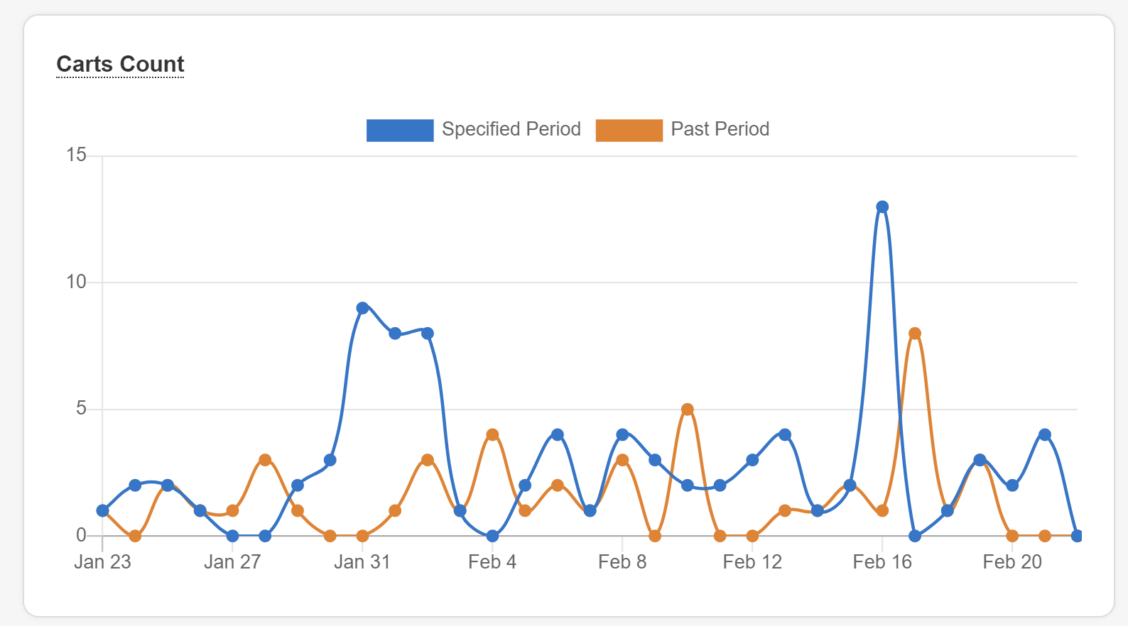
Carts Count / Num. Carts – Number of people who have selected products and clicked on the “proceed to cart” or “proceed to checkout” button.
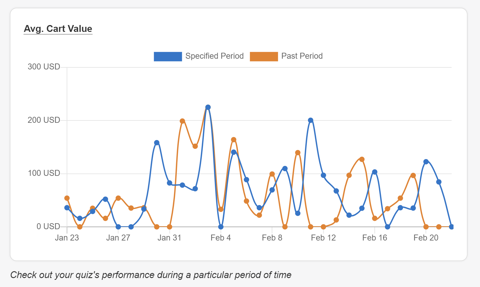
Avg. Cart Value – Average value of the products included in the carts or checkouts.
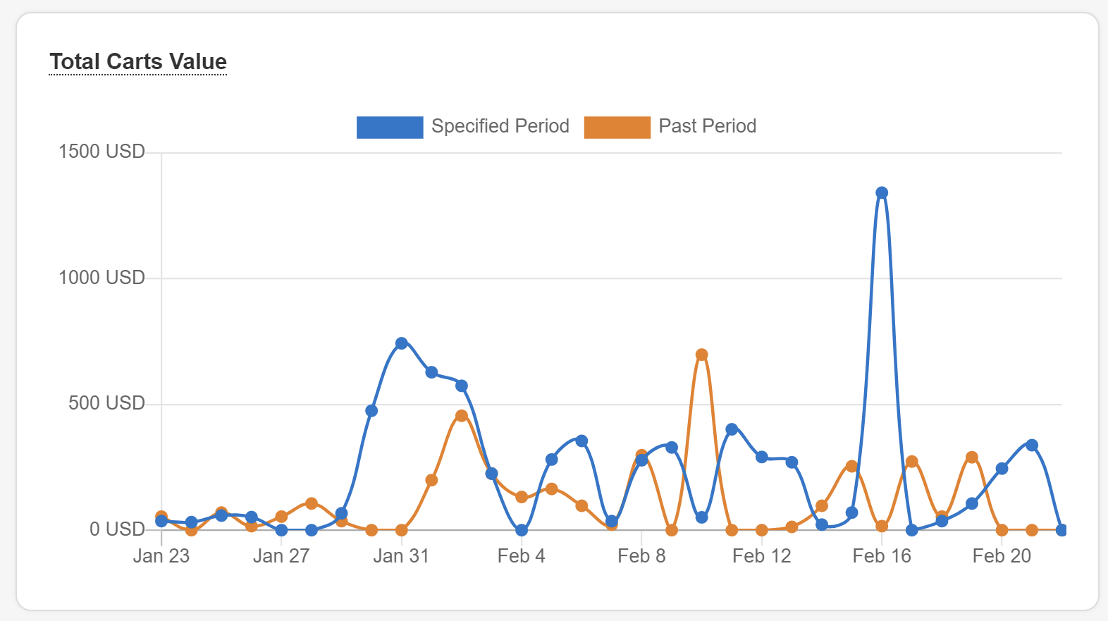
Total Carts Value – Total value of the products included in all the carts or checkouts. This does not represent the total value of purchases since you should expect some drop-off at checkout.
Number of Orders (Beta) – Number of people who have placed an order after completing this quiz. To track Order values with the Shop Quiz app for Shopify, connect your quiz to the Shopify Revenue Reports via the Connect tab.
Total Orders Value (Beta) – Total value of orders placed after taking this quiz. To track Order values with the Shop Quiz app for Shopify, connect your quiz to the Shopify Revenue Reports via the Connect tab.
Avg. Order Value (Beta) – Average value of orders placed after taking this quiz. To track Order values with the Shop Quiz app for Shopify, connect your quiz to the Shopify Revenue Reports via the Connect tab.
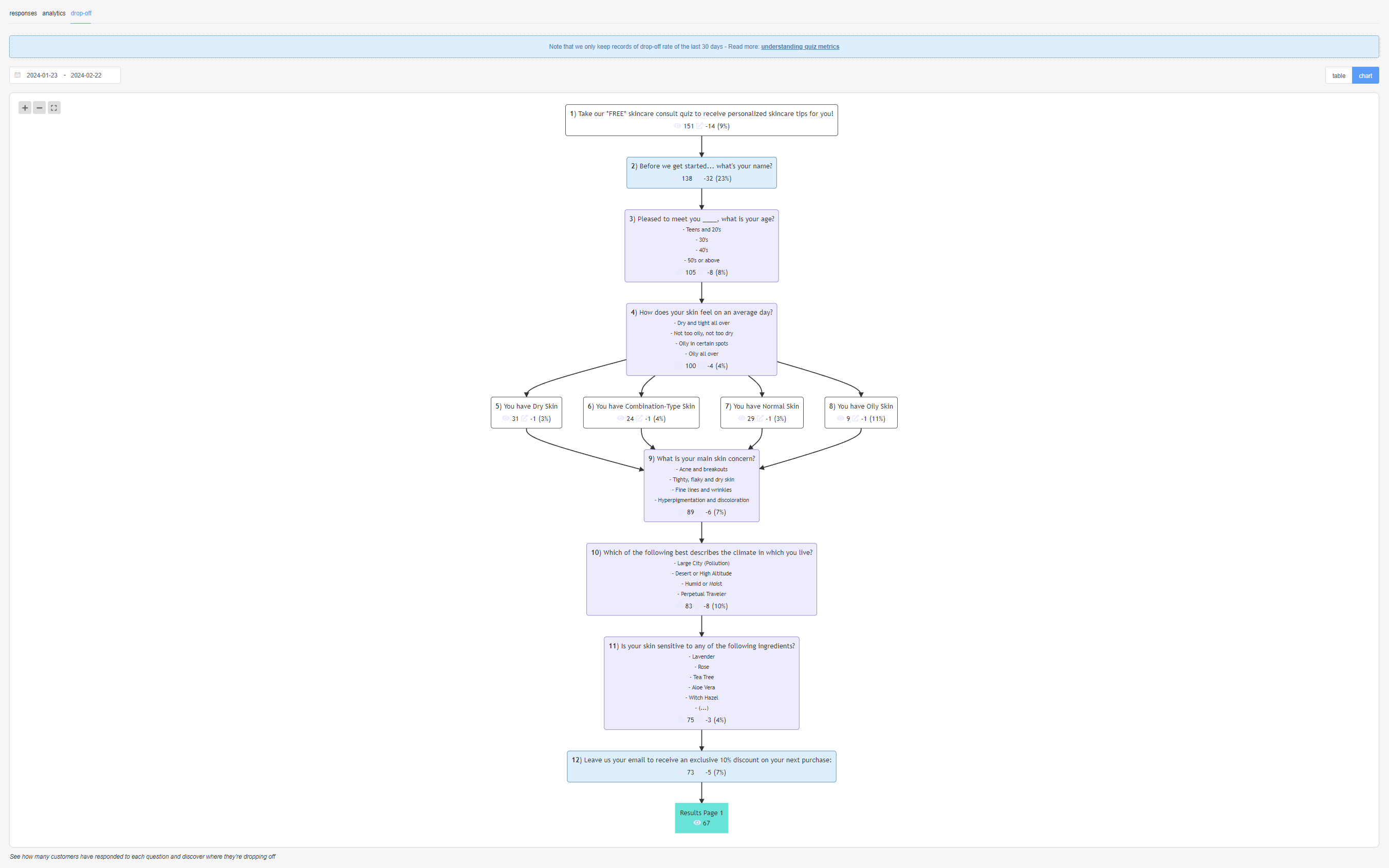
drop-off
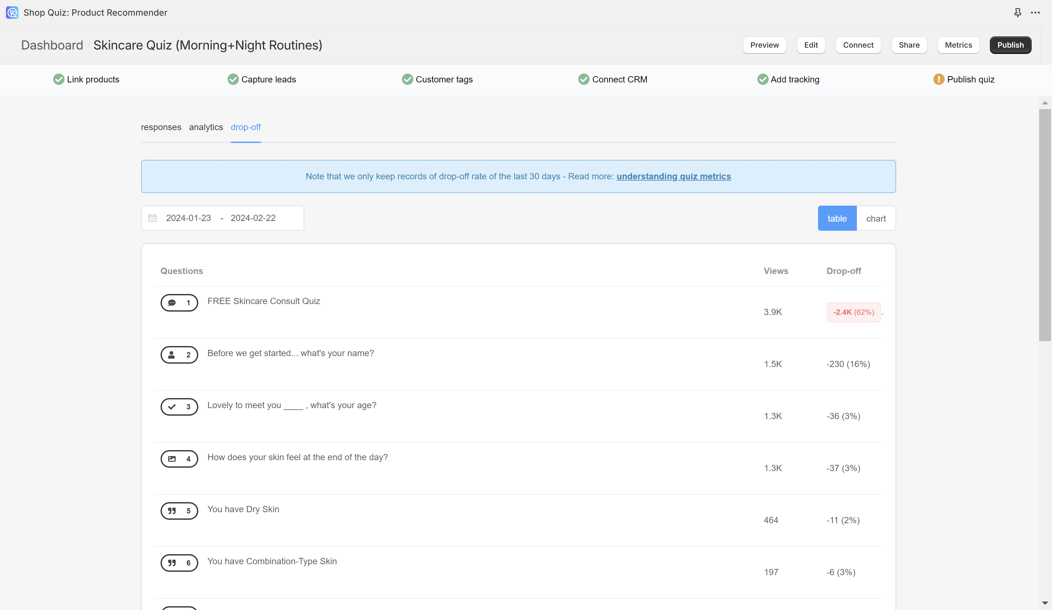
The drop-off rate is measured based on events, which are triggered whenever someone starts a quiz. Some of these start events can be blocked by adblocking plugins in browsers. If you see a difference between the number of quiz starts and the dropoff rate, that is because the number of quiz starts in the analytics tab is automatically adjusted by the algorithm to filter in also the starts blocked by the ad blocker plugin.

To change the dates click on the 📆 icon. You can change the period to select it from the moment you started using the quiz or from a given date.
table – Displays the dropoff rate for each question and the results page in a table format.
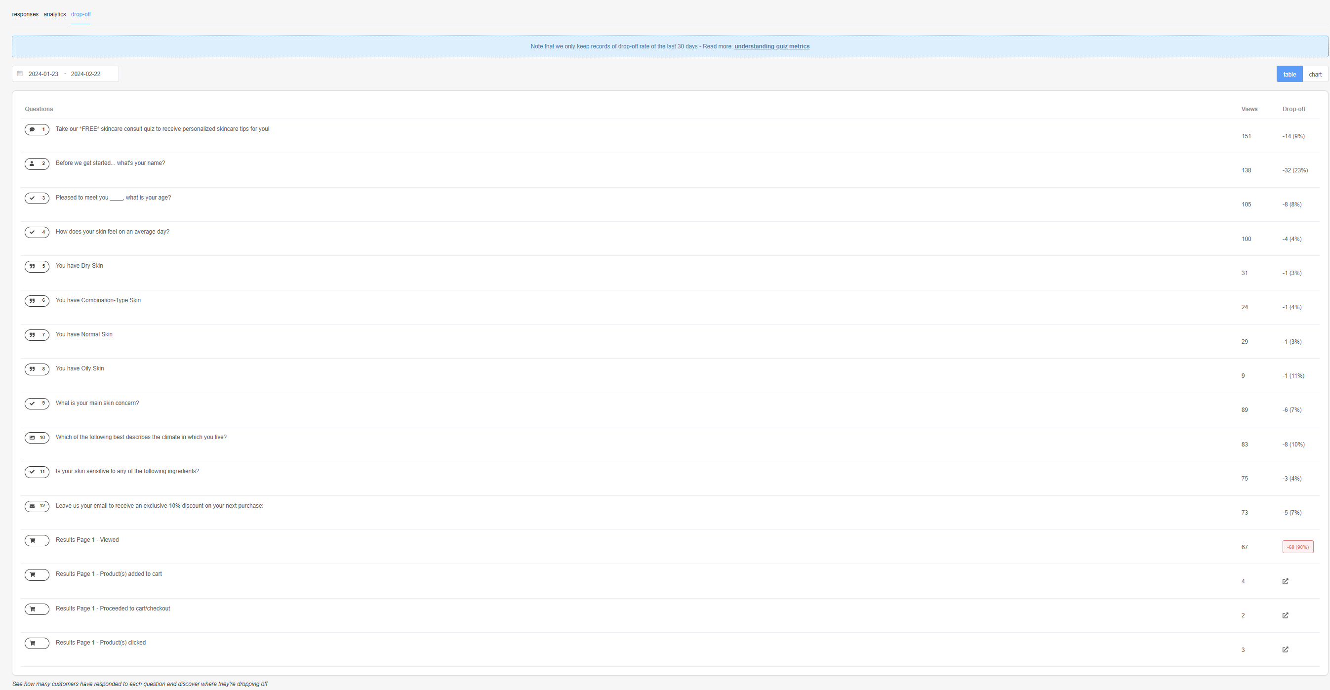
chart – Displays the dropoff rate for each question and the results page in a chart format.